Three sweet nurseries prove that style and sentimentality go hand in hand
Click on the icons in each photo below to learn the secrets behind the design of these nurseries:
Soft Place to Land
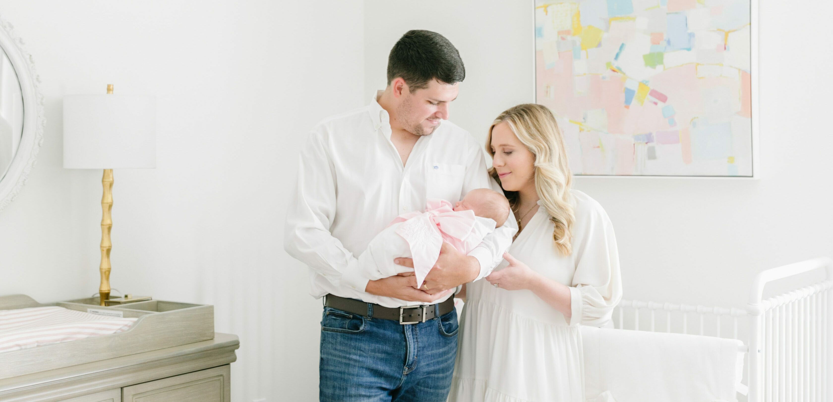
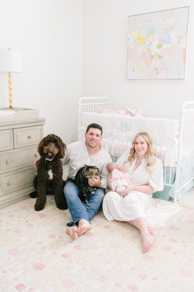
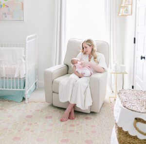
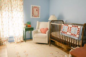
A painting from new baby Jules’ grandmother. A poem from parents Claire and Taylor Harrell’s wedding. A candle that was lit during Jules’ delivery. An array of items—old and new—came together in this pastel nursery to create a space that is as beautiful as it is meaningful. “Anyone who knows me well knows that I am extremely sentimental,” Claire says. “We wanted to be able to use the items in Jules’ room to teach her all about the people behind them, whether it’s family, friends or inspirational people in our lives.”
The rest of the room is no less impactful. Muted hues give an ethereal look, while pieces like the dresser, Hunt Slonem pillow and glider were chosen with the purpose of growing with Jules. “My advice to parents is to have fun with the nursery and let it be a reflection of your family,” advises Claire. “I can’t wait to see how Jules’ room will evolve as she grows and adds her own style to it.”
Bright Idea
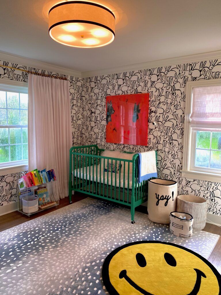
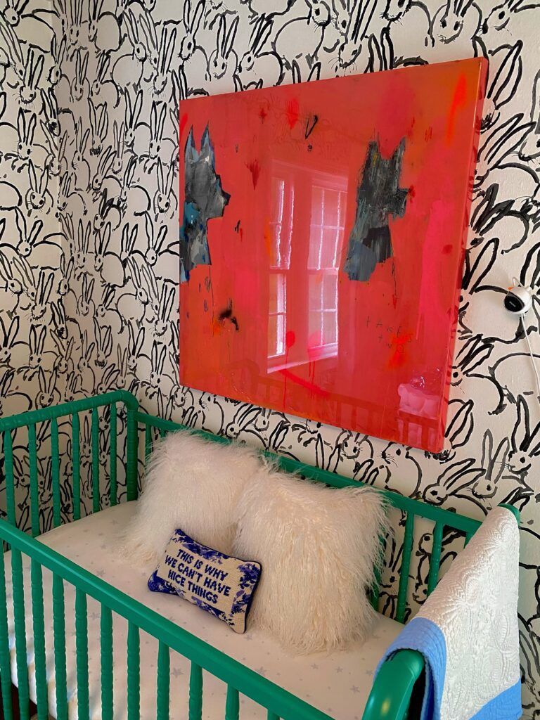
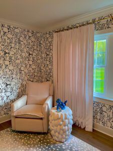
Sentimentality took a different form for mom Sara Robarts. Rather than mementos from her or her husband Ethan’s childhoods, every item—from the Hunt Slonem wallpaper to the smiley face accent rug—came to represent their journey to meeting their new son August, aka Augie. “I find sentiment in knowing that the space and every item in it is specific to Augie and picked out during such a special and exciting time in our lives,” Sara explains. “Each piece gave me the sense that I knew my son even before he was here.”
Born to Be Wild
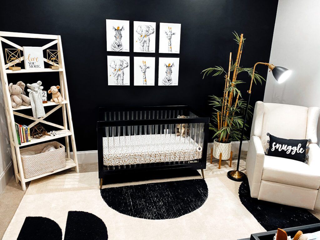
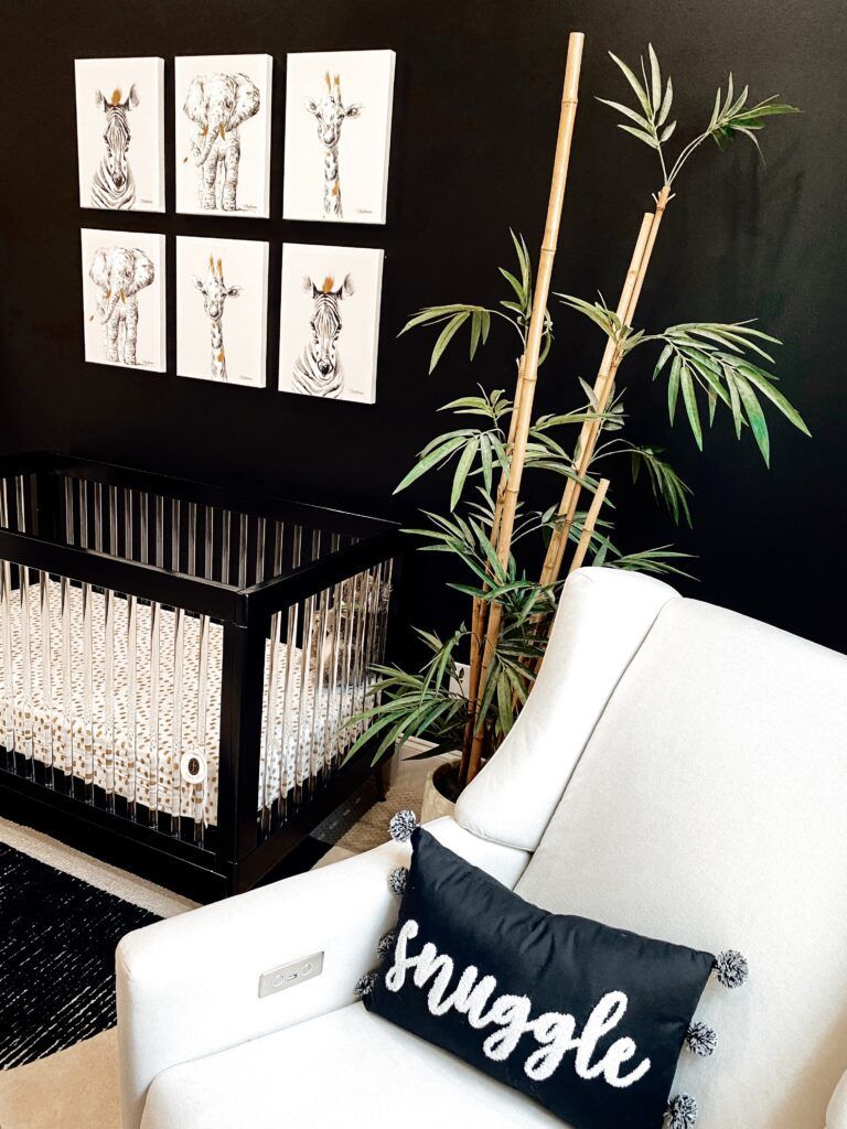
When Rachel Eggie Gibbs started designing her gender-neutral nursery, she wanted it to be anything but, well, neutral. A bold accent wall in Sherwin Williams’ Tricorn Black—the same color used in Rachel’s salon, EGGIE Salon Studio—set the stage for the entire space. “I honestly didn’t know it was bold until I sent the final picture in our family group text,” Rachel says, recalling the funny responses from her brother and other family members. “I know black and white aren’t typical for a nursery. I wanted it to still feel babyish without taking away from the modern look, so I started searching for little baby safari animal prints. Girl or boy, who doesn’t like baby animals?”
The gold-accented prints now hang above Rachel and her husband Micah’s baby girl Addison’s crib, playing off of gold touches throughout the room and maintaining the sophistication of the rest of the house. “My entire house is decorated with white, black and gold, so it flows perfectly,” notes Rachel.
Room to Grow
A nursery isn’t just a place for a new baby to physically sleep, it’s an outlet for an expecting mom while she is still anxiously awaiting their arrival. New moms Claire Harrell, Sara Robarts and Rachel Eggie Gibbs share tips on the process of designing a nursery:
1. Not every item needs to be an investment.
Children aren’t known for their cleanliness. And while some items, like curtains or a dresser, can stand the test of time, many details will just get too much wear and tear. “You don’t need to spend a fortune to create a beautiful room,” explains Claire, who opted to splurge on Jules’ curtains and glider. “Pick a few quality investment pieces that will last, but then have fun with the accessories.”
2. Look beyond baby stores.
For Augie’s nursery, Sara took her time collecting pieces from an array of sources, all with the intention of starting a collection that could grow with her son. The result is a playful but elevated look that can easily transform as the years pass. “I wanted to create something that was fun and youthful, but also something I myself could enjoy,” Sara says. “I love that each piece will still have a place in our home after the nursery is no more.”
3. It’s OK to break the mold.
Rachel was thinking outside of the box—at least in terms of a nursery—when she chose a black accent wall for her gender-neutral baby room. While it might not be everyone’s cup of tea, the selection formed the perfect foundation for a modern space that flows with the rest of her home. “I wanted the nursery to be a little softer,” she explains, noting that the room’s inspiration was the new EGGIE Salon Studio. “That’s why I brought in some of the cream and beige with the rug and glider, instead of having everything stark white.”
4. Pull items from around your home.
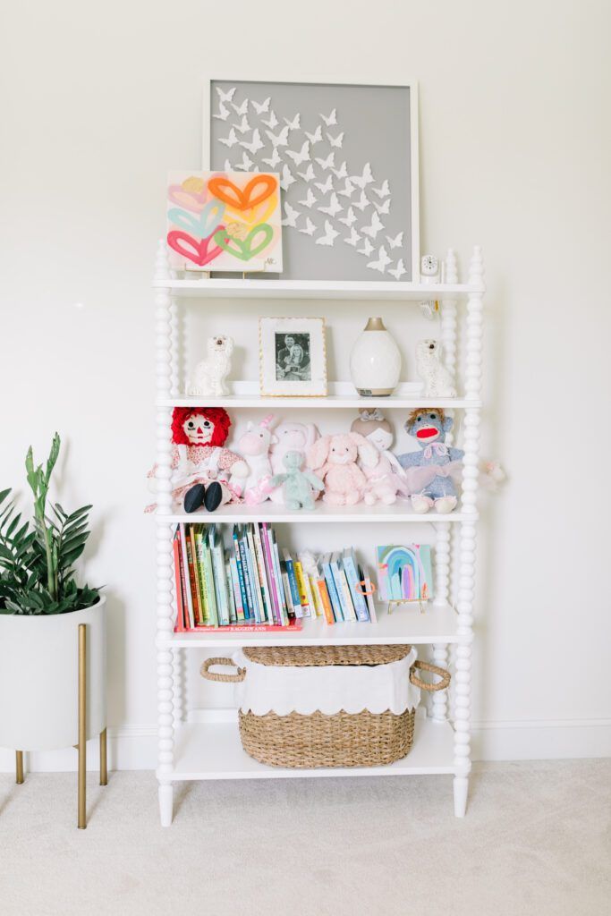
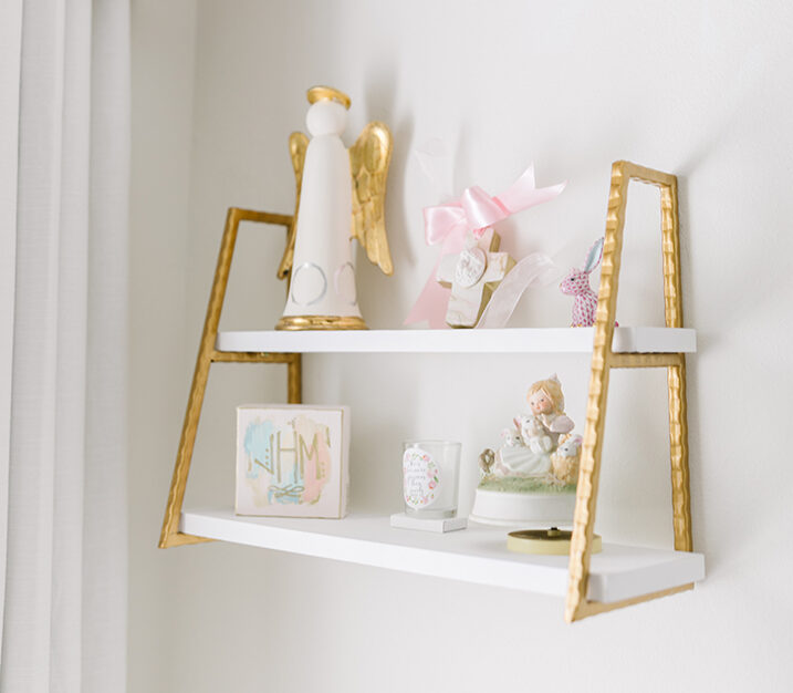
Everything doesn’t have to be brand new. Claire decorated the shelves in her daughter’s room with everything from a Helen Bolin angel that she was gifted in college to a music box passed down for generations. “I love when items have meaning and intentionality,” she explains.
5. Skip the suffocating theme.
Don’t get us wrong, we love a good theme. But the key to creating a room with staying power is resisting the urge to plaster everything with a baby-related motif. For Sara, the Hunt Slonem bunny wallpaper was a sophisticated twist on a typical nursery theme. “Augie will now forever be my little bunny,” she says, “solely because of that wallpaper.”


