Teenage dream: Rachel Cannon talks designing kids’ bedrooms
I knew, looking about my uber messy bedroom as a teenager, that despite the individual charms of National Geographic magazine clippings, floral quilts, textured throw pillows and colored lamp shades, their teamwork as a sense of style was, to say the least…ineffective. And that’s okay. Children and teenagers, after all, are downright famous for their failed aesthetic experiments—it’s all part of the process of growing up, and a necessary step toward finding a look they do enjoy.
But that doesn’t mean their living spaces need be completely devoid of direction. Rachel Cannon of Rachel Cannon Limited has figured out a way to make them work time and time again, all thanks to some clever tips and tricks for combining individuality with functionality.
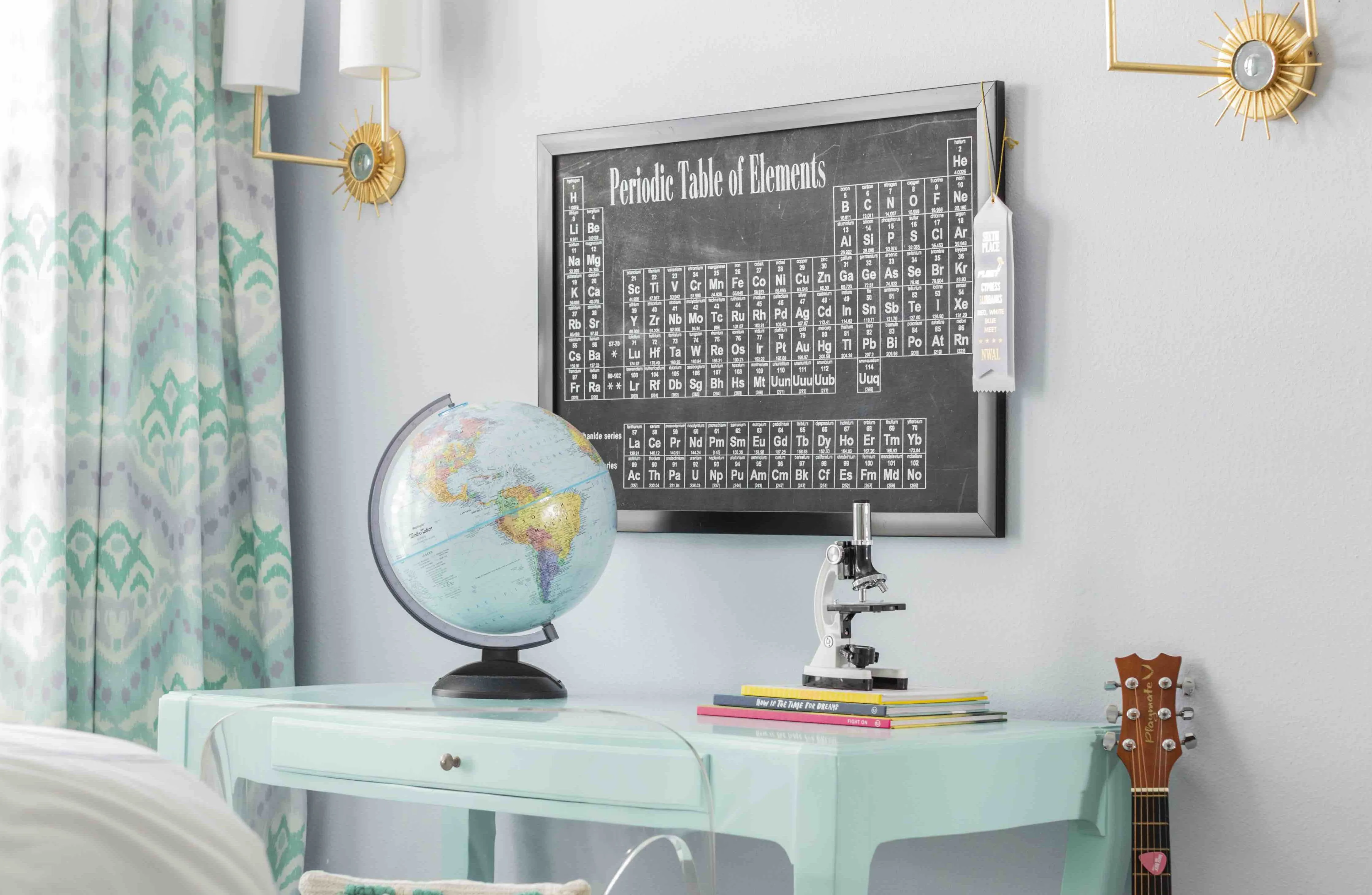
“I like to learn something about our young clients when designing their rooms,” she says. “Often, this is the first time they’ve gotten a ‘real room’ and they want to make sure it reflects their interests and hobbies. For one client, we included her love of science with a periodic table as wall art. For others, it’s using their favorite color in a way that makes them elated but is manageable for Mom and Dad, too.”
My old green-and-white checkered lamp shades, for example, may not have always given off the sort of light I wanted from them, especially when paired with the overall warm tones of the rest of my space. Figuring out how light and color work together would definitely have been a much-needed lesson.
“We typically want to take into consideration the amount of natural and artificial lighting a room has before selecting the color palette, so there really is no ideal color for all rooms,” says Cannon. “If a room has a northern exposure, we try to go with lighter wall colors; if it’s a western exposure, I try to dial back the intensity just a little. The key is in finding something that can function for all kinds of activities—lounging, sleeping, reading, studying—and often the best solution to that problem is in adding lighting at three levels in the space: overhead (usually with recessed lighting), task lighting (desk lamps), and ambient (sconces that add warmth to the room when overhead lights are off).”
Then there’s the question of space. Not all of us live in a house big enough to boast the bedrooms seen on teen TV shows, with ample square footage for solving murders, saving the universe or thwarting the plans of the local cult leader…or whatever teens on TV seem to like doing these days. Cannon’s solution? Make use of utility.
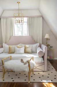
“In rooms where square footage is at a premium, we’ve had our upholsterer build a queen-sized daybed complete with storage drawers below that I designed,” she says. “I prefer bedside chests of drawers, where they fit, because nightstands typically are much smaller scale and don’t offer as much storage. If we can fit a desk, I like to include that as well, just from a productivity perspective. It’s better to do studying at a desk, rather than slumped in bed!”
I can confirm that working from bed is usually a terrible idea. My National Geographic clippings, however, are admittedly still going strong.
What did your teen bedroom look like? Let us know in the comments below.


