Room by Room: A builder’s home in Central is enhanced by designer touches one space at a time
Perhaps the highest compliment an interior decorator can receive from a builder she works with is to have them call upon her to work on their personal home. And that’s just what happened for Kristina Petit, who had been serving as a design consultant for AP Dodson Home Builders and helping clients select details and finishes for their custom homes when the firm’s owners, Brandon and Ronyell Dodson, asked her to tackle the open kitchen, keeping and dining areas in the residence they had built for their family of six.
Petit, whose flair for all things design was first honed when she earned a degree in fashion and textile design and evolved into the residential field, brought her wide-ranging experience to helping the Dodsons achieve a finished feel in the most often-used rooms in their home. They were already making the most of their property in Central, raising chickens and tending thriving vegetable and flower gardens on an expansive lot overlooking a lake, and now it was time to help the interior spaces blossom just as beautifully.
“By the time I came into the picture, the house had been built for a few years, but they never really felt like it was complete or that it was functioning as well as they were hoping it would for them,” Petit says of the home with architectural design by Donald “De” Hunt of D. Hunt Studios. “A lot of that came down to furniture choices and placement, so that’s where I came in.”
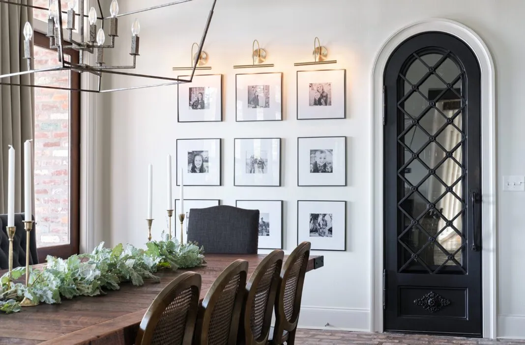
While helping to improve the practicality of the rooms, Petit also focused on infusing those initial spaces with more of the family’s personality. “They had had a custom dining table built, but it just didn’t look finished with the seating that was surrounding it,” Petit says. “It wasn’t working really well. And the keeping room was a place where they spent a lot of their time, so that was an important area to start with as well.”
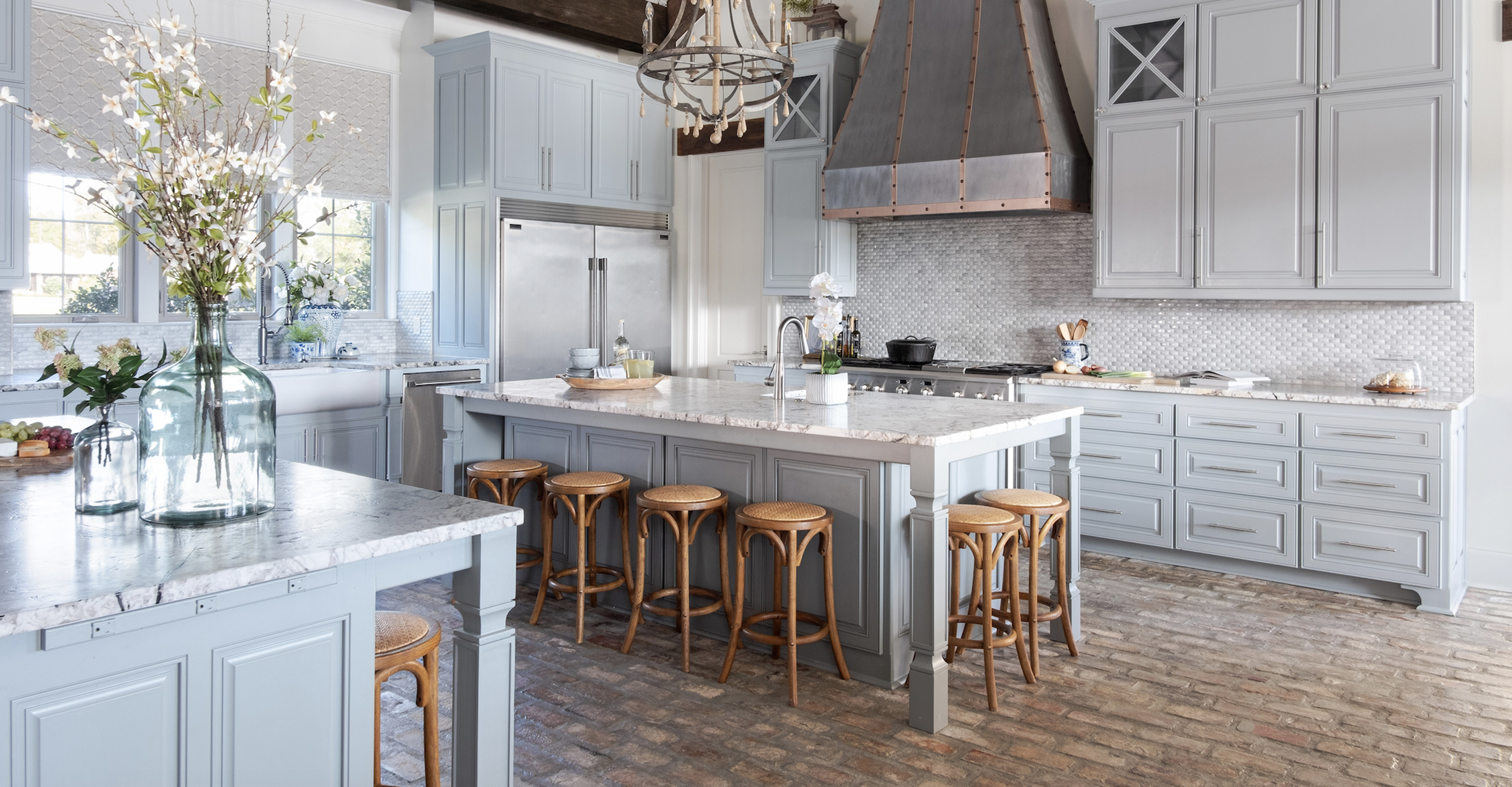
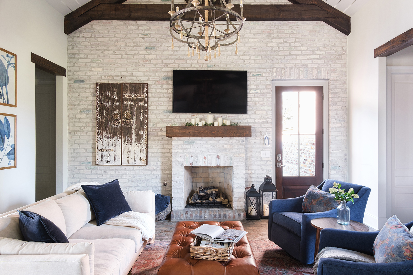
Ronyell’s love of the color blue became an overarching theme, beginning in the keeping room. “But part of the challenge was to make sure that it never felt overly blue,” Petit says. “That was a thread that connected all of the rooms, but we didn’t want it to feel overwhelming.”
In the dining area, Petit eliminated a backless bench that had been tucked in behind the table and replaced it with a high-back bench with an upholstered and tufted back. She added cane-back chairs along the table’s other side and finished the arrangement with upholstered chairs at each end. Each of the seating styles was intended to serve as an elegant counterpoint to the iron-accented table’s rugged appearance—a marriage that echoes throughout the house. “They like things that are rustic but still refined,” she says. “For example, in their kitchen and keeping room, there are some rustic elements like the chandeliers and the beams and the brick, but we wanted to also incorporate sophisticated details to keep it from feeling too rustic.”
In the keeping room, Petit made it her mission to ensure that the space would hold up to an active family with young children. “Everything is upholstered with performance fabrics, and the ottoman is leather and can be wiped down,” she says. “But we chose really great rugs and throw pillows to add that touch of refinement.”
Rather than repaint walls, Petit brought in warm color through the use of antique wood furnishings and rich leather accent pieces. “They didn’t want anything too bold, so we did sort of pops of color in the upholstery and rugs and places like that where it’s not overwhelming,” she says.
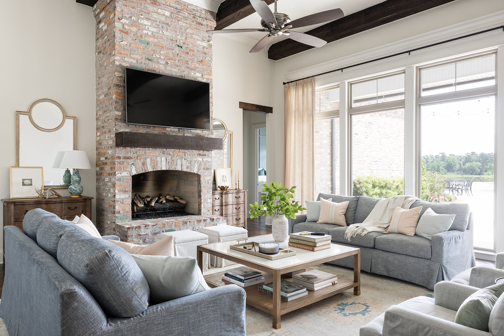
After the first design push was complete, the Dodsons asked Petit to carry her vision into their living room. “It has a beautiful fireplace in the middle and a whole wall of floor-to-ceiling windows looking out at the lake and the pool, which is beautiful,” Petit says. “But they had a ginormous sectional—I mean, the biggest sectional I had ever seen in my life—in that room, and because of its L shape it completely cut off one side of the room.”
Petit says she tends to steer clients away from sectionals because while they seem like they would be ideal for large group seating, most people don’t actually want to be elbow to elbow with the other people in the space. Not to mention the fact that they become a challenge to walk around. In this case, “it was really messing with the traffic flow in there,” she says.
To solve the seating dilemma, Petit put in two matching slipcovered sofas in a soft shade of blue, along with a pair of chairs on one end and two upholstered ottomans in front of the fireplace. “It just opened up the room a lot, and it made it so there was really enough room for everyone to have their own space,” she says. “Two kids can be on one couch, two kids on the other couch, and both of the adults have their own chair.”
In the center of it all in the living room is a large custom coffee table that Petit calls “kind of indestructible” thanks to its quartz top. No drink rings to be found here!
It’s all part of Petit’s focus on practicality, which continues in the final space that Petit helped the Dodsons with: the primary bedroom suite. The nightstands are topped by durable marble, and adjustable wall sconces take the place of bedside lamps so there’s more usable surface area for books and decorative details.
The primary bedroom was the one area where Petit did take a paintbrush to a wall, washing the focal-point wall behind the bed with a deep gray-green shade that draws attention to its trimwork detail and alludes to the lake and nature beyond the windows.
This suite quickly became Petit’s favorite of all the spaces she had taken on in this room-by-room interior project. “I just think it’s beautiful and calming without being boring,” she says, “And it points to the views of the water and the nature outside.”

