Here’s how to make bold colors work in any space
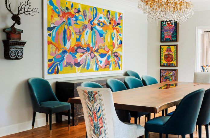
The reign of neutrals has dominated design schemes for many years now, and it’s easy to understand why. A light, bright backdrop serves as polite accommodation for almost any artwork, furniture piece or coffee table accessory, and takes little effort to execute. But too much of a good thing can grow boring after a while, which is why designers like Rachel Cannon have made a mission of testing their skills by attacking bold colors head on—not as an exercise in eccentricity, but as a method of finding new ways to build cohesiveness and harmony.
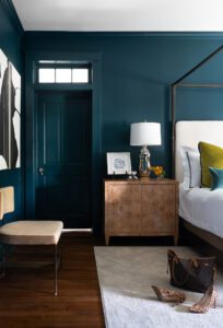 In Cannon’s rulebook, two aspects must be addressed before going all out with the color wheel. The first: considering the effects of cool versus warm paint colors. The second: testing colors in natural versus artificial light.
“There are a lot of misconceptions about color in general, the first being that dark colors make a room feel small—and by default, somehow depressing,” says Cannon. “In fact, it is warm colors that pose the higher chance that a room will feel small. This is because warm colors advance (which is why they feel energetic) and cool colors recede (which is why they feel calming). So, a dark red room will feel much smaller than a dark blue room.”
Lighting can alter these effects, however. Not every window can face the generous sun of the south, after all, nor does every lamp or overhead fixture emit the perfect tone of electric light.
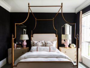 “Natural light is the best way to gauge how a color will look in a space, but you also need to take into account how artificial lighting will affect it,” says Cannon. “Fluorescent lighting tends to brown-out warm colors, while LED lighting in the 5-, 6-, or 7000K range can act as a very low-grade black light, distorting all color. It’s crucial to examine your chosen color under natural and artificial light. And if it doesn’t work in the artificial light, but it does in the natural light, change your artificial light source’s temperature. Personally, I like 2700-3000K LED.”
With Cannon’s tips in tow, we feel confident that this summer may finally mark the year we’re navigating due east of neutrals, taking on the rise of renegade new colors.
See how Cannon put bold colors to work in a wow-worthy way in this story from the inRegister archives. For more information on Cannon, visit rachelcannonlimited.com or follow @rclinteriors.

