Natural light and neutral interiors bring a fresh space into focus
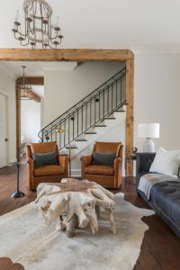
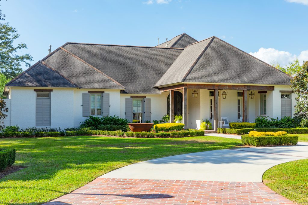
Her clients hadn’t even put in an offer on the newly built Oak Estates home when interior designer Jillian Freiberg got her first glimpse inside. Built just two years prior by CRAFT Homes, the bones were good. Wood beams. Brick arches. Dark hardwoods. And, most importantly, plenty of French doors.
Flooding the home’s main living and dining spaces with the ethereal glow of natural light, the doors were the answer to the prospective homeowners’ desire for a bright upgrade from their previous home, which had been filled with dated wood and brassy fixtures.
“The main thing the homeowners were looking for was something much lighter than their old house,” explains Freiberg. “They brought me in very early on just to make sure the house flowed with their vision for a fresh start for this new chapter in their lives.”
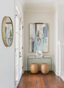
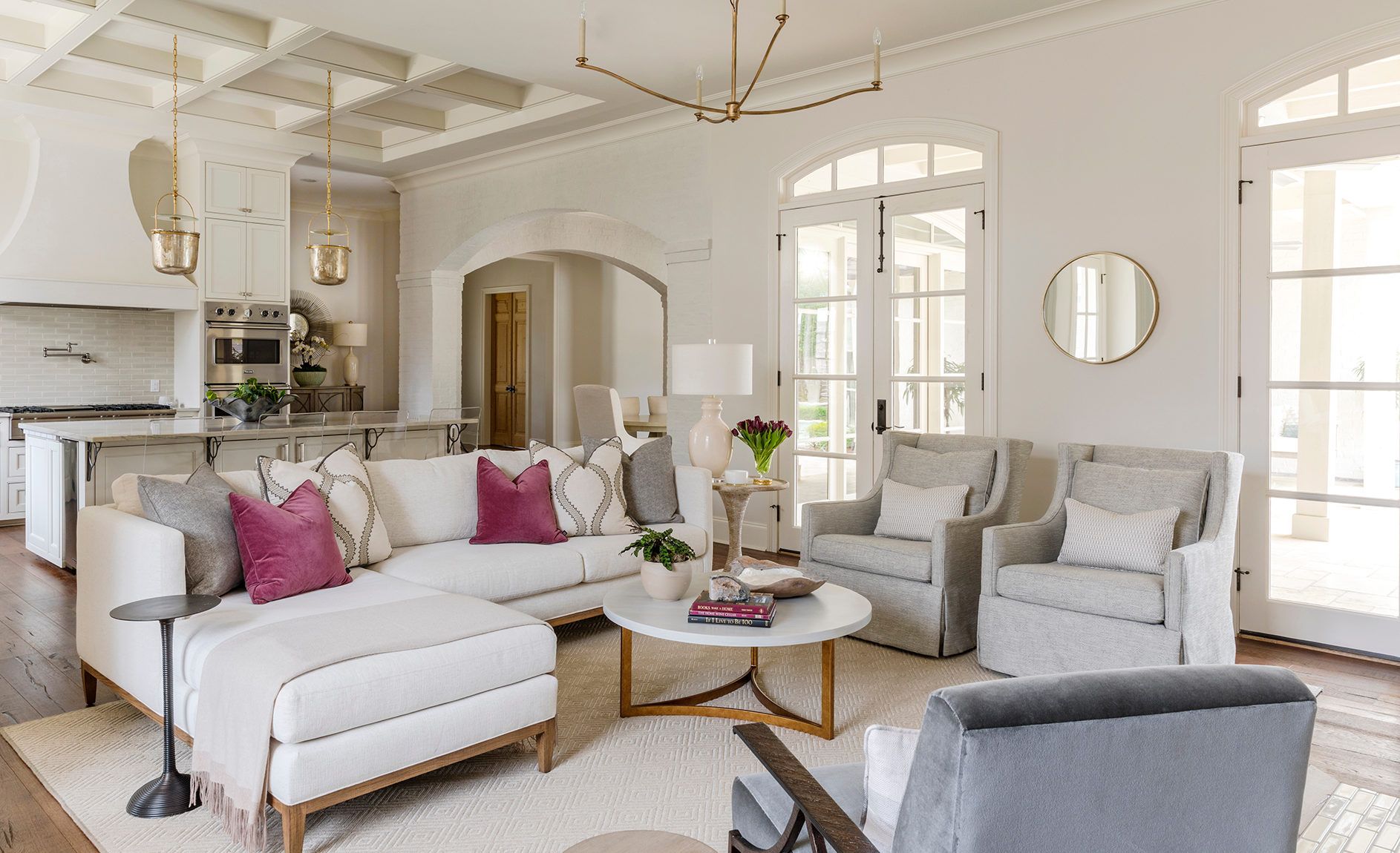
With Freiberg’s seal of approval, the house was purchased and it was time to fill the new space with new furniture. Since the homeowners were fully committing to the idea of starting fresh, they maintained very little from their previous residence, with the few pieces including an ocean-evoking blue canvas by Lynn Sanders that hangs in the foyer, as well as plum-hued velvet throw pillows on the sectional sofa in the den.
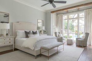
“The pillows were the springboard for a lot of the design,” says Freiberg. However, rather than using contrasting colors to make the pink pop, Freiberg employed a backdrop of neutrals. Textures in creams and grays create a layered and complex look, despite their muted tones. The effect carries from room to room to establish continuity while maintaining the light and bright feeling the homeowners were seeking.
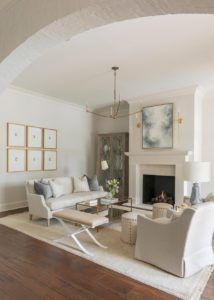
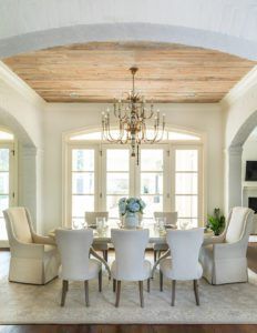
“They wanted to keep it light but they also wanted it to be practical, since they are big entertainers. Their top priority was making sure guests were comfortable in their home,” explains Freiberg. “The best tip I have for this is using performance fabrics like Crypton, which we used in the formal living room and on the dining chairs.”
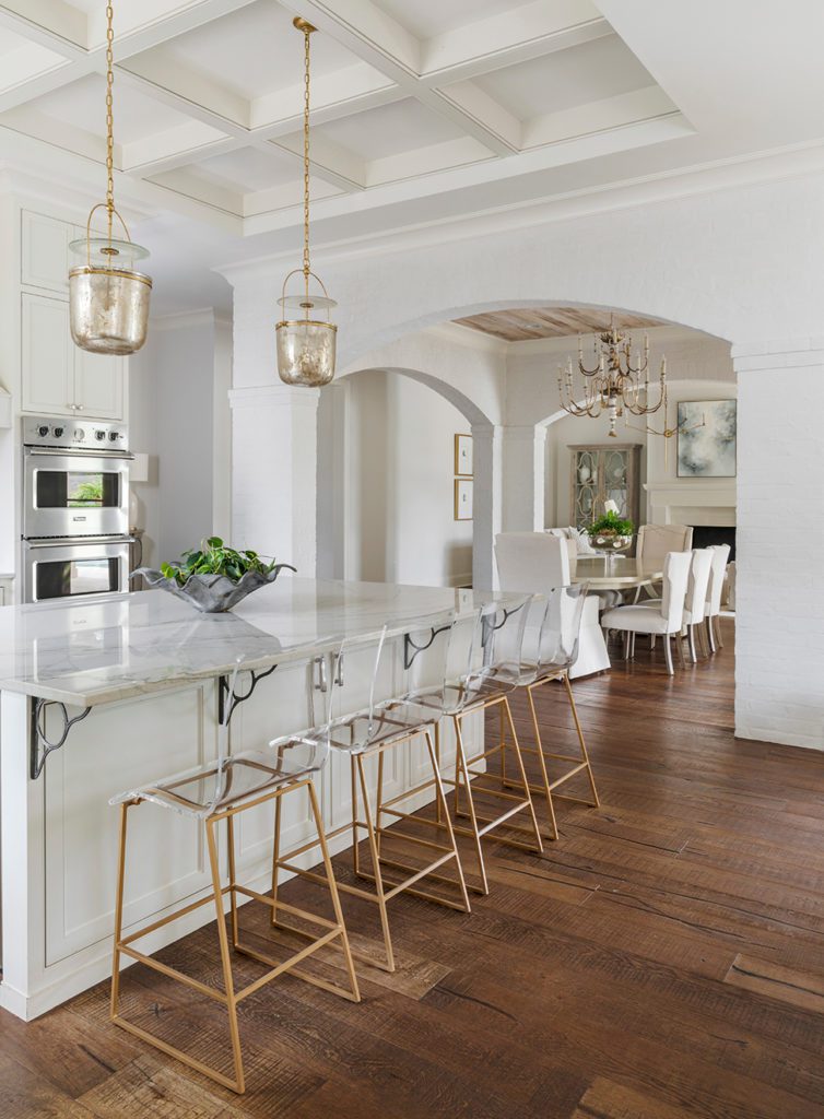
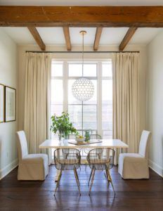
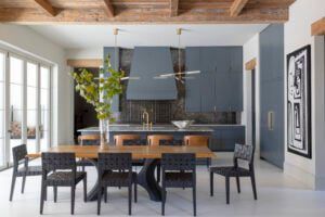
It’s not all about color when it comes to creating a fresh space, though. According to Freiberg, the style of furniture is of equal importance. Thanks to a plethora of images collected by the homeowners and passed on to Freiberg, as well as cues from the home’s architectural style, a transitional look combining modern pieces, such as the breakfast nook chairs, and traditional shapes, like in the formal living room couch, seamlessly comes together.
“The two biggest elements that I focus on when designing a space are variety and balance,” Freiberg notes. “You have to have a mix of materials to make a room feel dynamic and interesting, yet there also needs to be a sense of balance in both style and visual weight for the mix to end up being successful.”
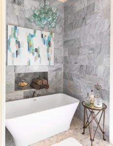
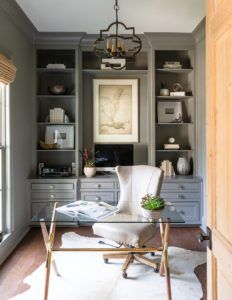
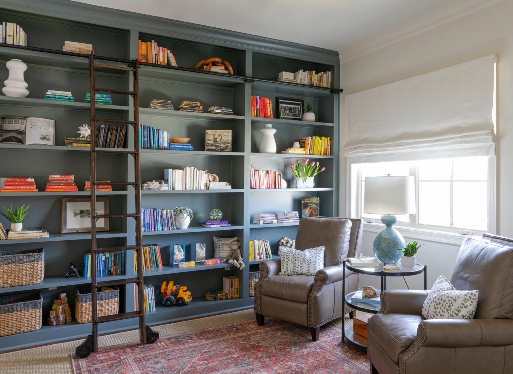
But success isn’t just about aesthetics. Responding to the clients’ needs and lifestyle is essential. For Freiberg, that involved a few changes that went further than furniture. A wall-to-wall bookshelf was added to the upstairs lounge area in order to convert the space into a library suited for the homeowners’ love of reading while also providing ample space for storing the various toys of their grandchildren. The biggest change, though, came in the master bath, where Freiberg replaced a built-in jetted tub with a rectangle-shaped freestanding version by MTI Baths.
“The homeowner had her heart set on having that freestanding tub,” says Freiberg, noting that reworking the surrounding tile was essential in the conversion. “To make the space more fun, we added a whimsical bubble chandelier and a canvas by local artist Jennifer Poe over the tub.”
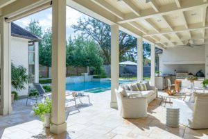
Throughout the home, it’s that balance of fun, sophistication and functionality that creates the welcoming and peaceful look that Freiberg and her clients were hoping to achieve. Against a backdrop of neutrals, each of the spaces carved out for enjoying the company of friends and loved ones has the potential to be transformed by those inhabitants themselves, as well as by the south Louisiana beauty that lies just outside the windows.
“The homeowners wanted this new house to be a reflection of this bright, new phase,” explains Freiberg. “Overall, I think we created something that is like a clean slate, a fresh start.”
Click on the photos in the gallery below for a closer look at this home:

