A new view: A lakefront home was designed to take advantage of its setting
Like riders on a carousel, they glide by in groups of two and three all day long, powerwalking and pedaling while peeking at the newest structure along this marshy inlet of University Lake.
The most dedicated and most observant of these mile-loggers have seen this property transformed over the past few years. A former home here was leveled. Dirt was stirred and new foundations were poured. Bricks were laid. Doors were hung. Flowerbeds were filled around a new iron fence. Finally, the elegant finishing touches are all in place, and though they may be intent on pounding the pavement, passersby can’t help but pause their workouts.
“Every time I’m out front, people stop and ask about the house,” says interior designer Meghann Landry of McMillin Interiors, who along with firm founder Bill McMillin helped guide Sandra and Bill Balhoff through the process of building this home in one of the most picturesque parts of town.
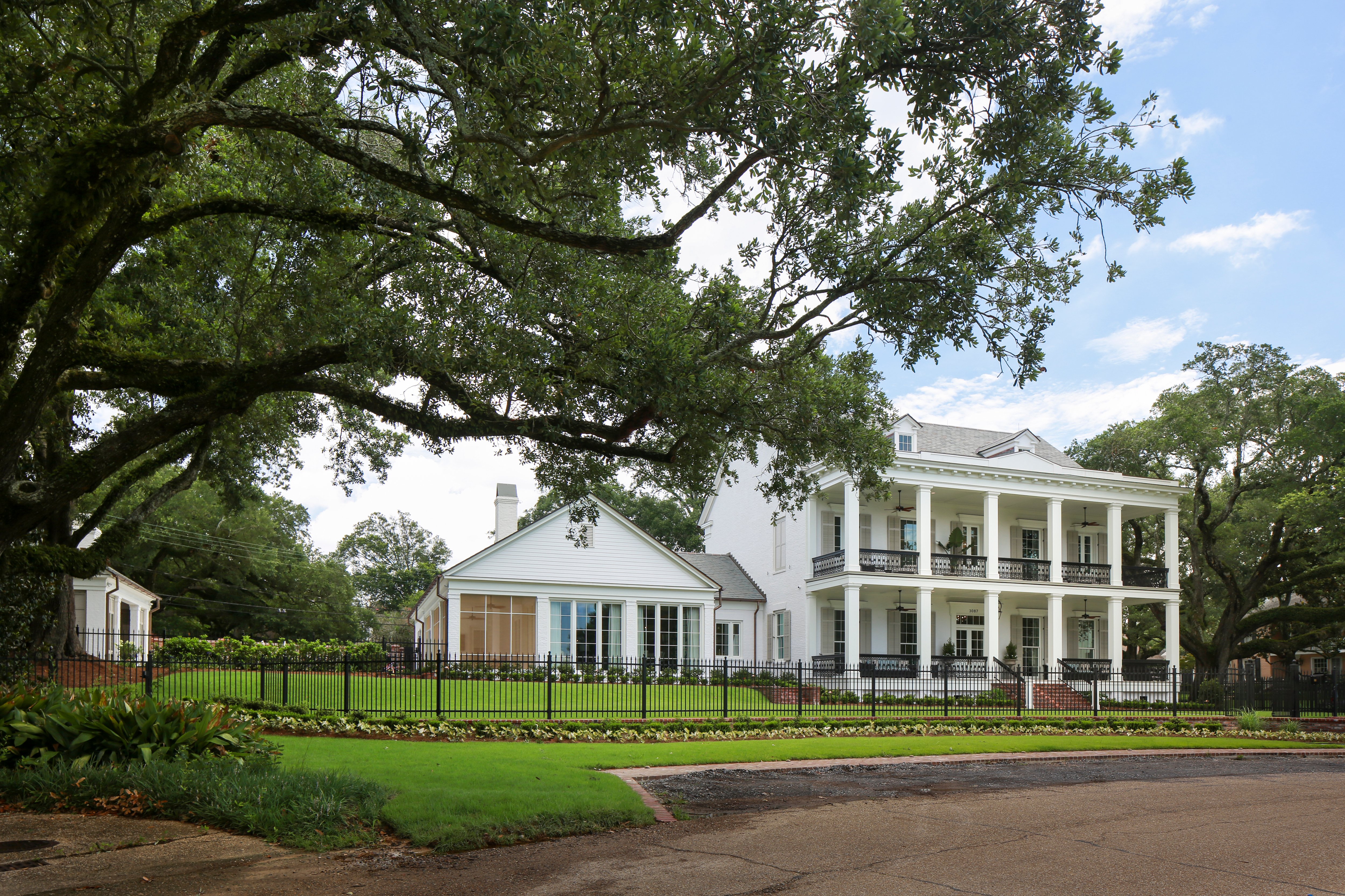
The Balhoffs broke ground on the Greek Revival-style residence during the summer of 2016, and—just in time for their 40th wedding anniversary this month—the couple are now settling in and enjoying seeing their vision of a gathering spot for large groups of loved ones come to life.
“We both come from big families,” says Sandra, “so it was our hope to have an environment that was welcoming to our children, grandchildren and other family members.”
The Balhoffs had lived in Westminster for many years, but they dreamed of a place where they could “spread out and make memories,” says Sandra. “After searching the Baton Rouge neighborhoods, we kept returning to the lakes and LSU area.”
Finding a design team for their forever-home project was an easy task. They had worked with McMillin since they were first married and had become so close to the designer that their children affectionately call him “Uncle Bill.” Along with McMillin and Landry, they called on architect Tommie Cockfield of Cockfield Jackson Architects and builder Chad Roper of Alfred Roper Construction to translate their ideas.
“We’ve been with them since the beginning of this project—from before the beginning, actually,” says McMillin. “There is nothing they are looking back and wishing for now, because they really thought about everything before the plans were drawn up. We had an initial six months of meetings where we were simply assigning spaces and considering details that would be important for daily use. We wanted to have everything laid out in the way it would be most functional.”
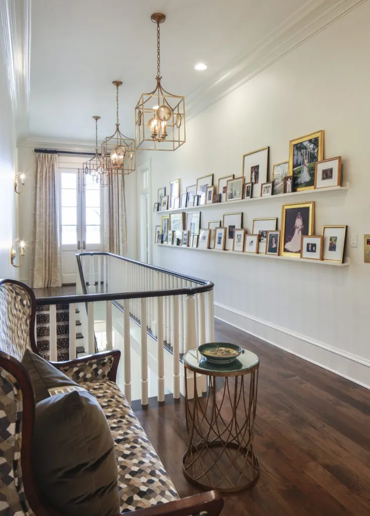
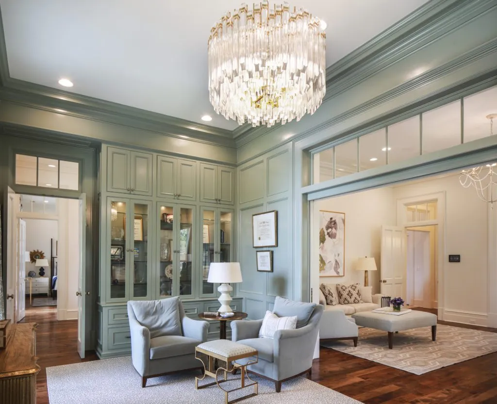
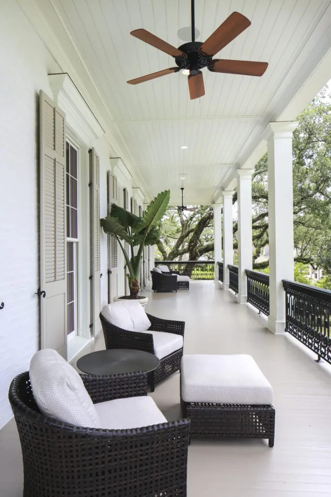
The couple’s priority list of features for their new home included unobstructed views, a big room where family members could congregate, and a second, smaller living space for quieter moments. Cockfield helped ensure that the home’s scale and proportions would perfectly suit its classic style; each of the two stories has 12-foot ceilings, for example, instead of the more often seen 9 or 10 feet on the second floor, and the porch and balcony are a generous 12 feet deep. The architect also added traditional Southern details including dentil molding, pilasters and square columns, and ornate iron railings on the exterior, along with a graciously wide center hall and transom windows over interior doorways.
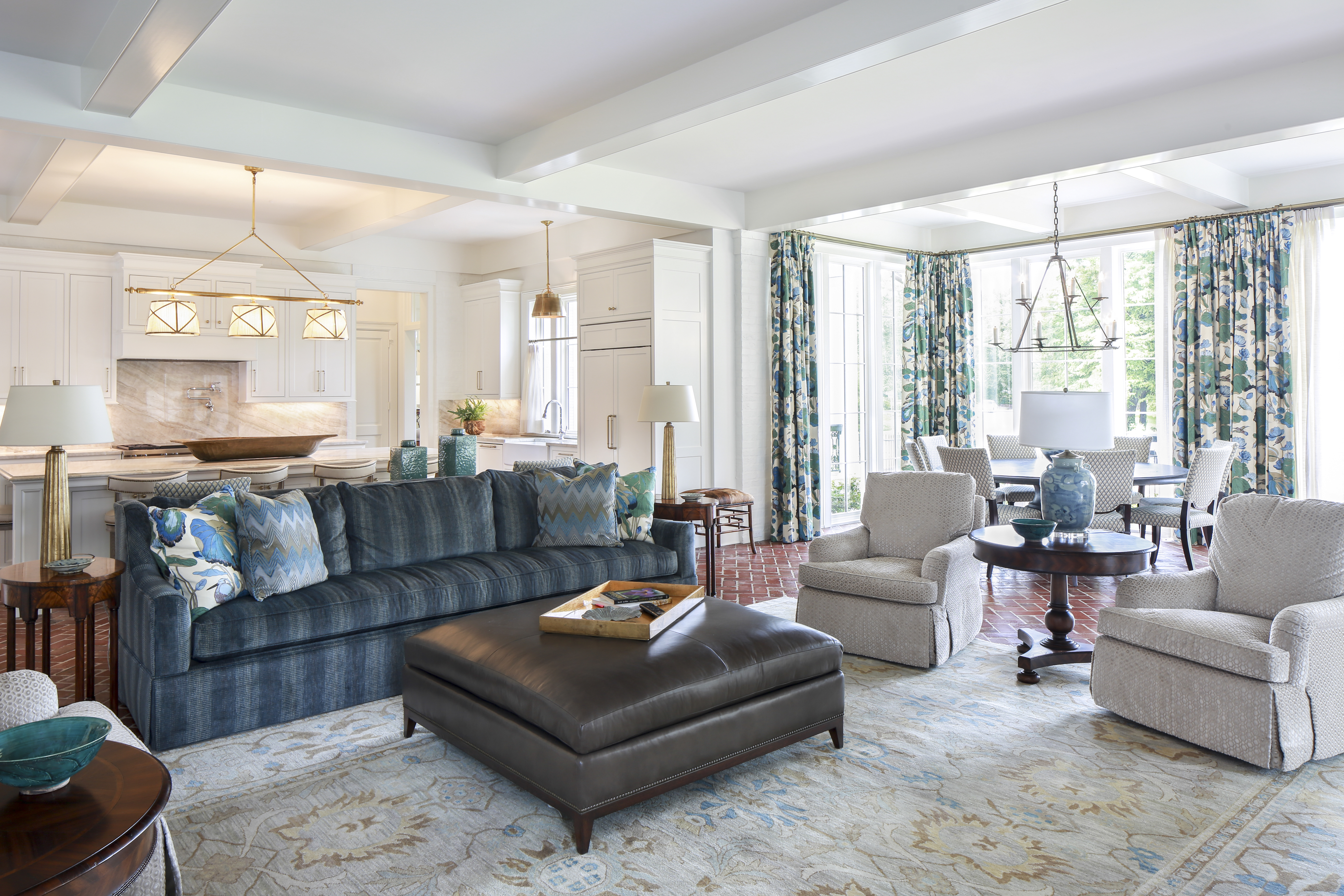
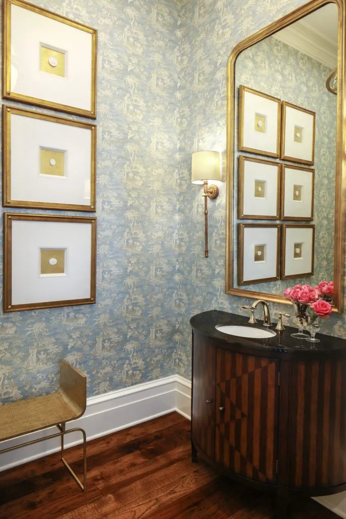
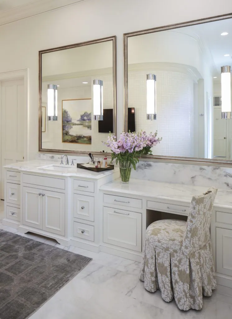
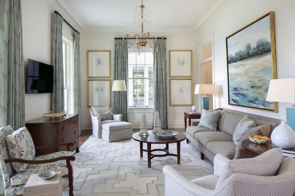
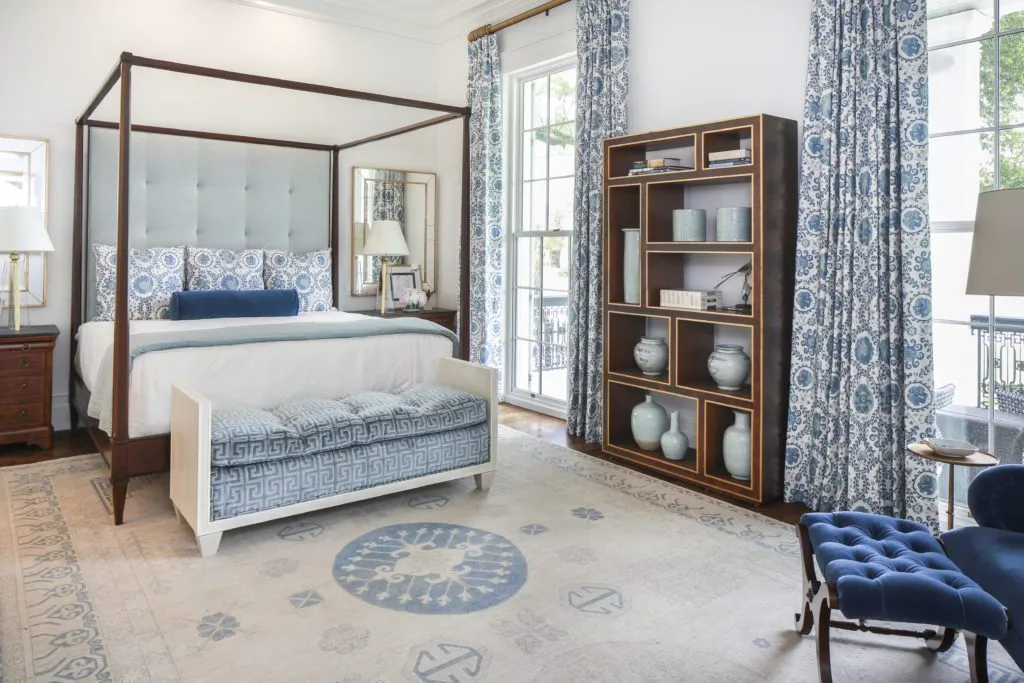
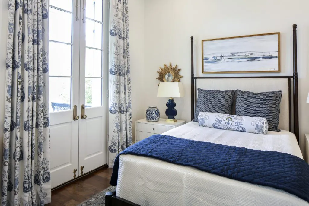
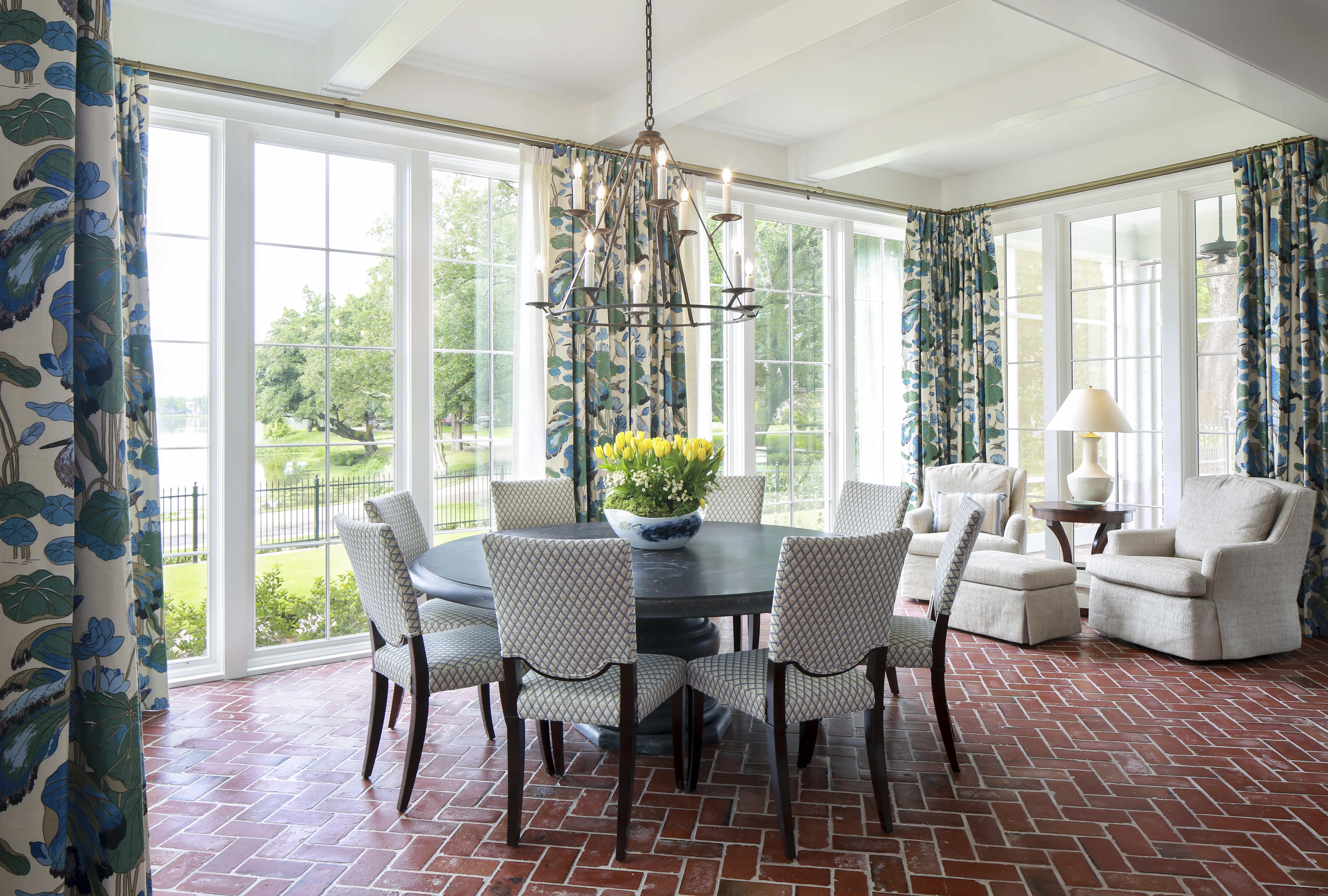
Construction ensued, with Landry collaborating with the Balhoffs on the selection of everything from appliances to stone to plumbing and light fixtures. While there may have been a myriad of choices to make, Sandra and Bill were set on one key detail: a timeless blue-and-white palette. “They love blue,” Landry says. “We used that as the main theme and then added other colors that would enhance each room. It’s as classic as the design of the house is, but it still feels fresh.”
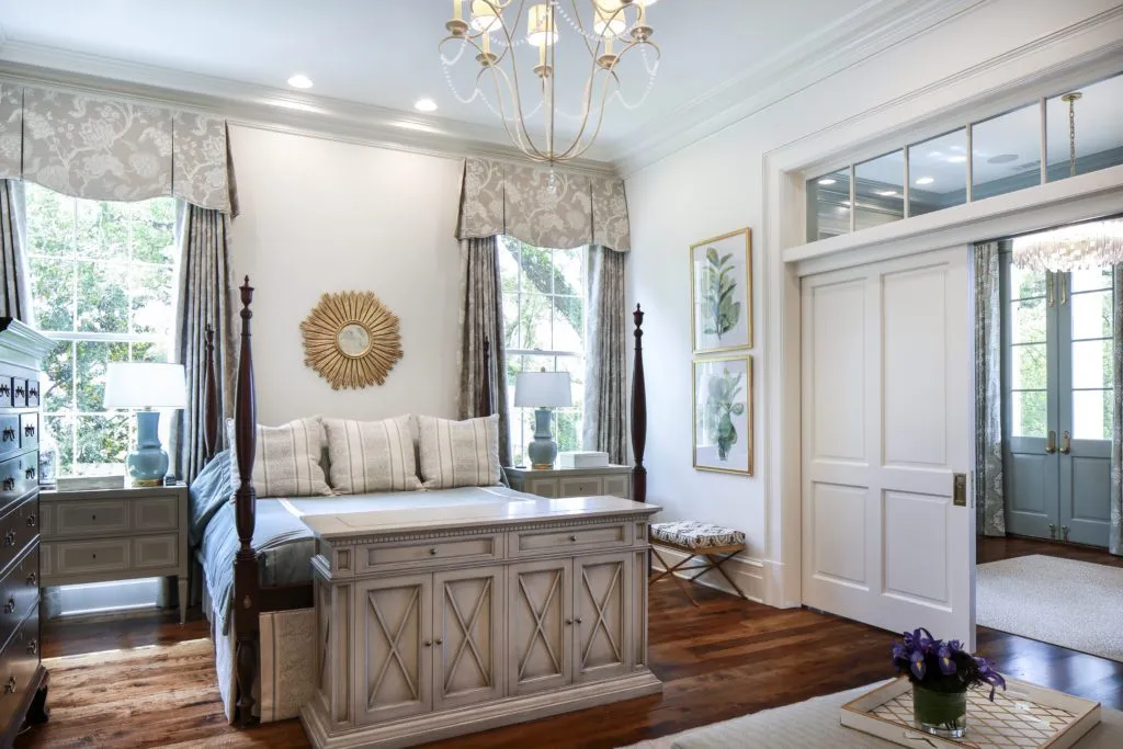
The chosen hues were incorporated into a striking array of patterned draperies from centuries-old across-the-pond textile makers including GP&J Baker, Bennison and Sanderson. Underfoot, each custom Stark rug reflects the tones of the window treatments. “They wanted everything to be a little lighter than in their last house,” Landry says.
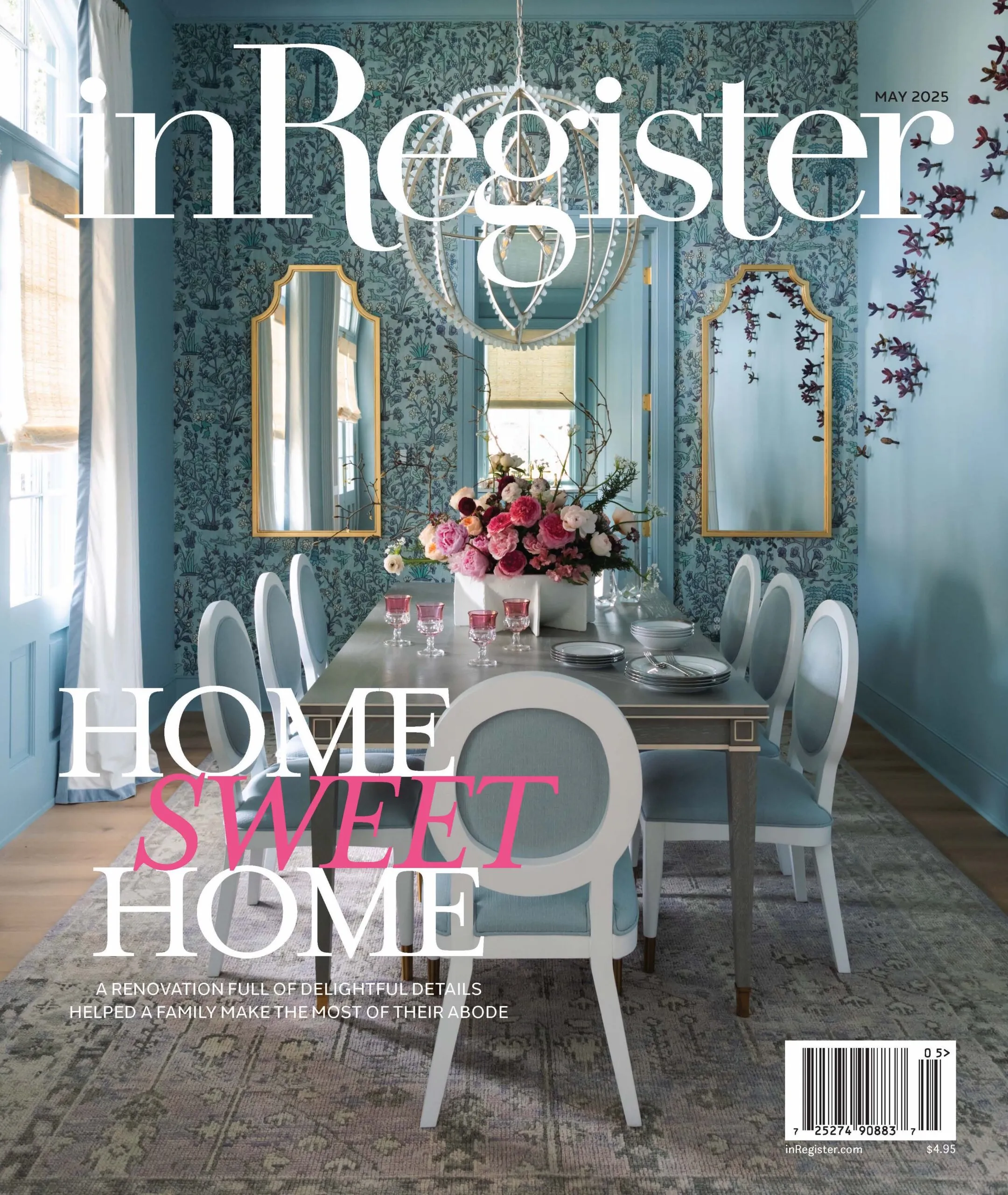
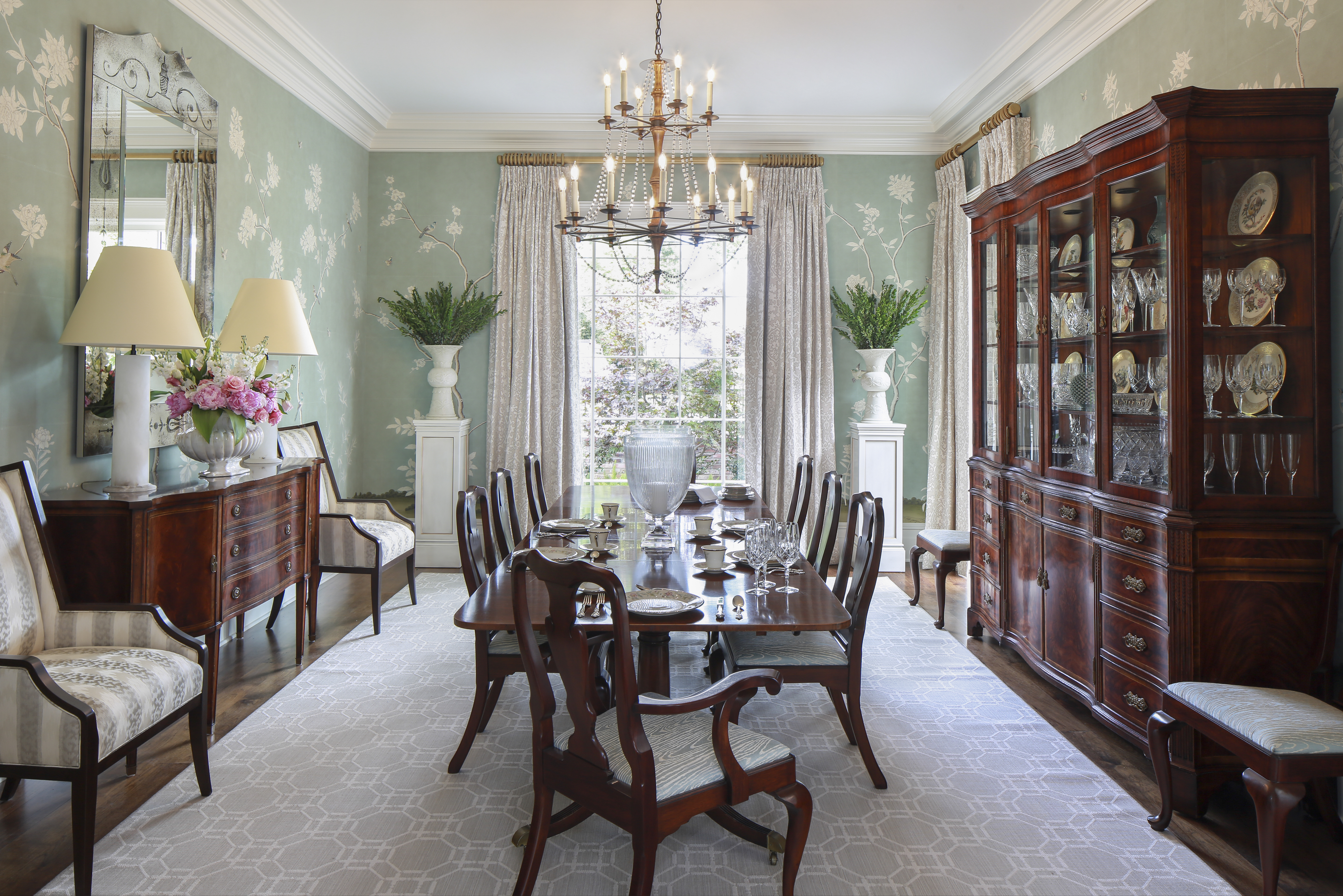
All of the furnishings are also custom pieces that fit the scale of the rooms they inhabit, the designers note. Even the dining-room wallpaper—a handpainted 18th-century botanical design by Gracie—was altered to have its branches “thinned” for a less busy effect.
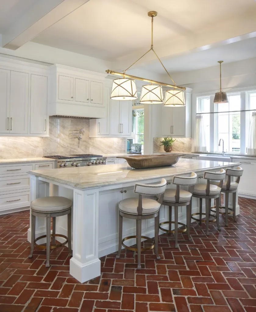
Landry also paid great attention to making a statement in each room through lighting. The wide entry hall is home to two antiqued mirrored-glass chandeliers in a subtly Art Deco style, while an updated two-tier crystal-beaded chandelier hangs in the dining room, and the kitchen island is illuminated by a shaded three-light pendant in antiqued brass. “We didn’t want to give them lighting that would be expected,” Landry says.
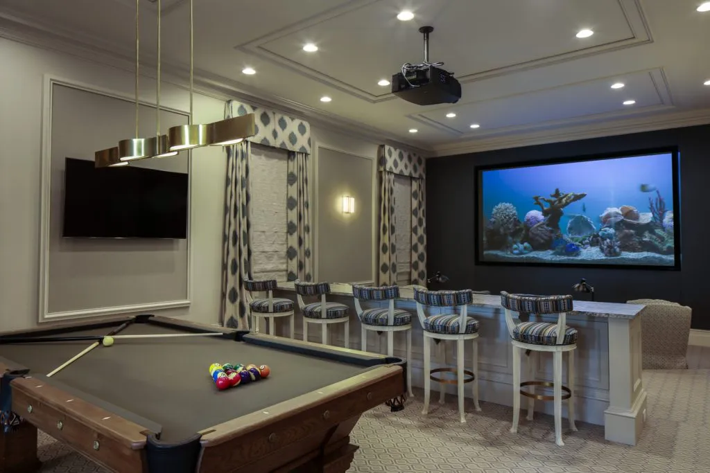
With the home built to accommodate family members of all ages, it was essential to include kid-friendly touches, including stain-resistant upholstery and easy-care brick floors in the family room. Just beyond the center hall, tall French doors lead to another fun feature: the spacious media and game room, which holds both a billiard table and multiple levels of seating set before a 126-inch screen. Even with the doors open, the leather theater seats are hidden from sight until a visitor steps inside. “They wanted it to be a functional space but to still be pretty,” says Landry, who used classic patterned fabrics on curtains and upholstery that minimize the media-room vibe. “Their family is really so important to them, and it just makes me happy that they can enjoy this space and the rest of the house together.”
The designers also managed to incorporate meaningful pieces that had been with the couple for all of their 40 years together. The Henkel Harris bed that they obtained from McMillin when they were first married is once again the centerpiece of their master bedroom, but more modern painted nightstands give it an updated feel. And the dining table that once belonged to Bill’s parents is still a hub for big family meals. The location may have changed, but the emphasis remains on sharing time with the ones they care about most.
“This is the first house we have built, and we heard stories of how difficult and stressful a process it usually is,” says Sandra. “Our experience was not like this at all. The professionals that we used were so talented and worked so well together that it was actually a fun experience. We are blessed to have realized our dream.”
See more pictures from inside this home in our gallery below:

