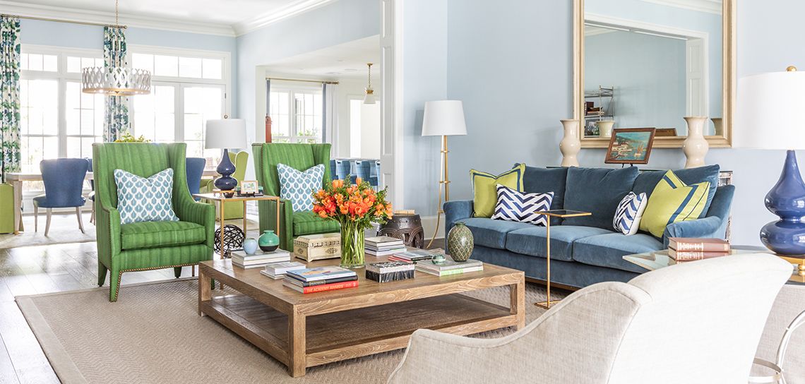
Living color: The mood is light and bright in this renovated Bocage home
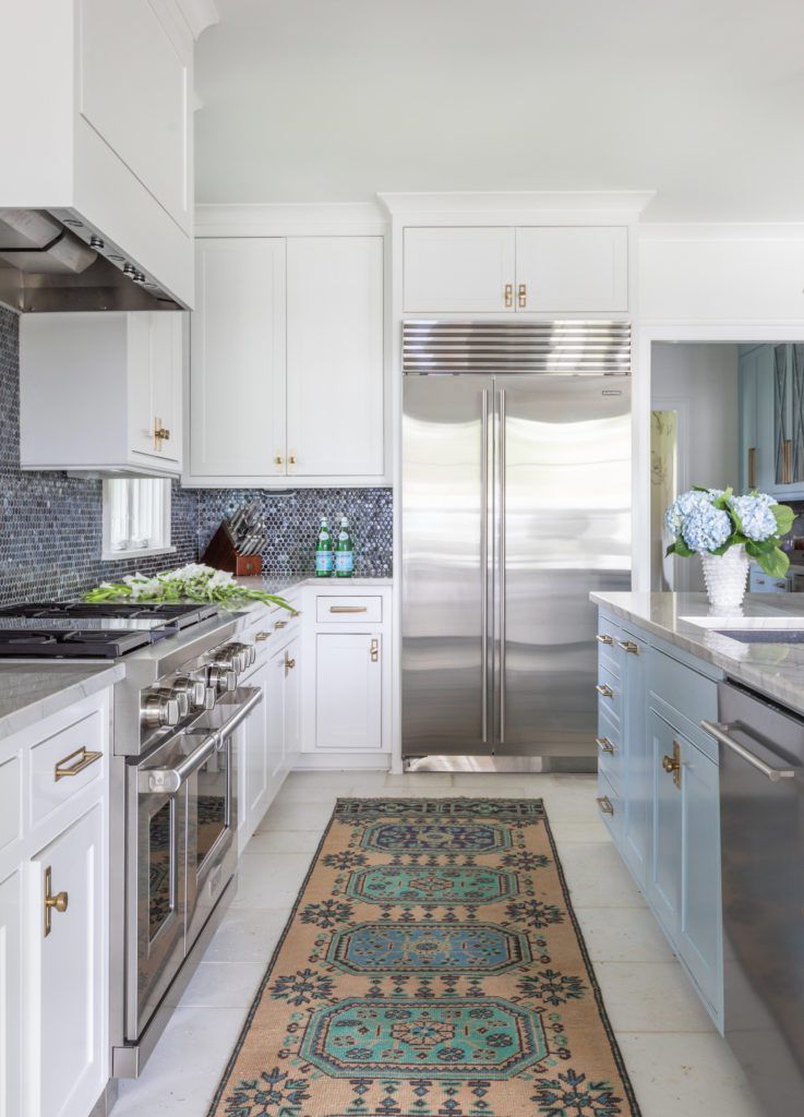
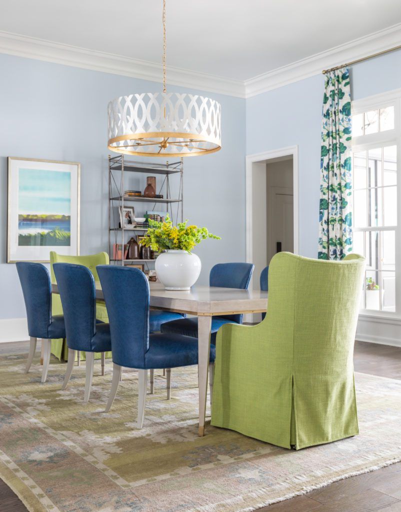
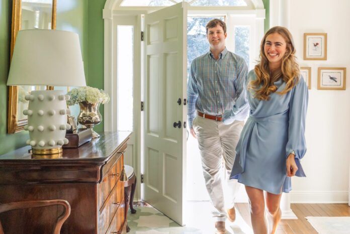
The Wolf stove sizzled under the spatula of Jay Ducote as housewarming party guests crowded around. Mansurs chef Chris Motto plated up pretty dishes on the patio for a 1920s-themed murder-mystery dinner. But today, instead of fancy food, Katie and Rob Mason’s long breakfast room table is topped with thousands of tiny jigsaw puzzle pieces.
Thanks to a thoughtful renovation, the Masons’ home is as fitting for quiet family moments like this as it is for lively gatherings of friends and neighbors—a duality that suits the couple perfectly.
“Rob and I have different personalities,” says Katie. “I’m an extrovert; I get my energy from other people. He’s the opposite. But this space works well for both of us.”
The Masons were living in Pensacola in 2017 when Rob, a retina surgeon, accepted a position in Baton Rouge. The hunt was on for a home, and the couple quickly found this spacious residence on a corner lot in Bocage. “We liked the neighborhood a lot, with its central location and so many young families,” Katie says.
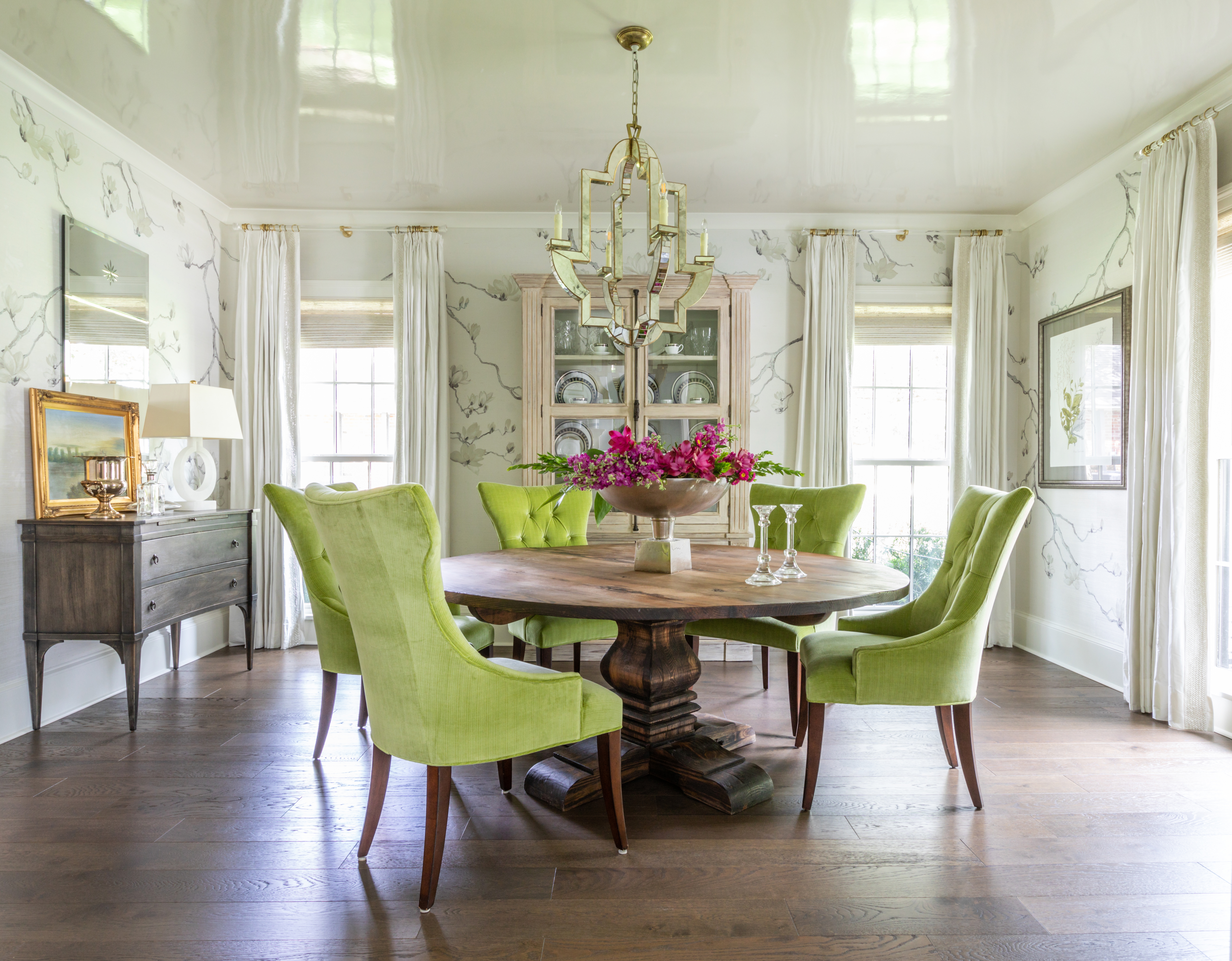
But the house itself, built in the 1960s, had undergone a series of haphazard renovations over the years that left it feeling disjointed. The couple knew they needed to rethink the dark interior appearance as well as the unusual layout, which included a small second story.
To kick off their efforts to transform the structure, the Masons first found interior designer Rachel Cannon of Rachel Cannon Limited. “I saw her work online and really liked her aesthetic,” says Katie, who like Rachel revels in the use of vibrant colors. “I called her, and we immediately got along great.”
Cannon was instantly in tune with the Masons’ vision for the house, which included raising the 8-foot ceilings, adding more useful space, and lifting the overall mood with a palette of bright colors while remaining within a timeless framework. “Katie is very smart,” Cannon says. “She just knows herself and her taste so well.”
Architect Chuck Oliver of C.M. Oliver Architects was selected to execute the significant structural changes. “The Masons asked me to take a house that was already nice and make it more functional,” says Oliver. “The home was already ‘open,’ but it just lacked order. Everything seemed cobbled together. We made the decision to eliminate the second floor area so that ceilings could be raised. We needed to replace that area, so the decision was made to add a new second floor over the master suite.”
With the addition of builder Robert Scheffy of Scheffy Construction, the pieces of the remodel team puzzle were all in place. The entire process took about a year and was not without its challenges. “During construction, the master suite went from renovation to complete rebuild,” says Oliver. “The existing construction wouldn’t support the new area, and it just made sense to rebuild.”
From the street, it was easy to tell that this house was getting a fresh look—Oliver centered the front door for symmetry and added a proper porch, shutters for scale and texture, dark windows and doors for a more contemporary look, and a circular front driveway. The interior changes were less apparent initially but equally bold, especially when it came time for Cannon to infuse the house with Katie’s preferred palette.
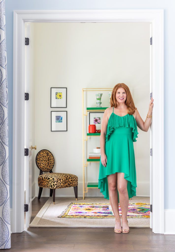
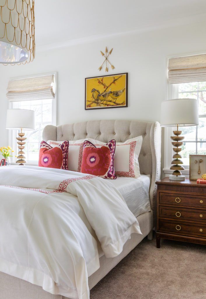
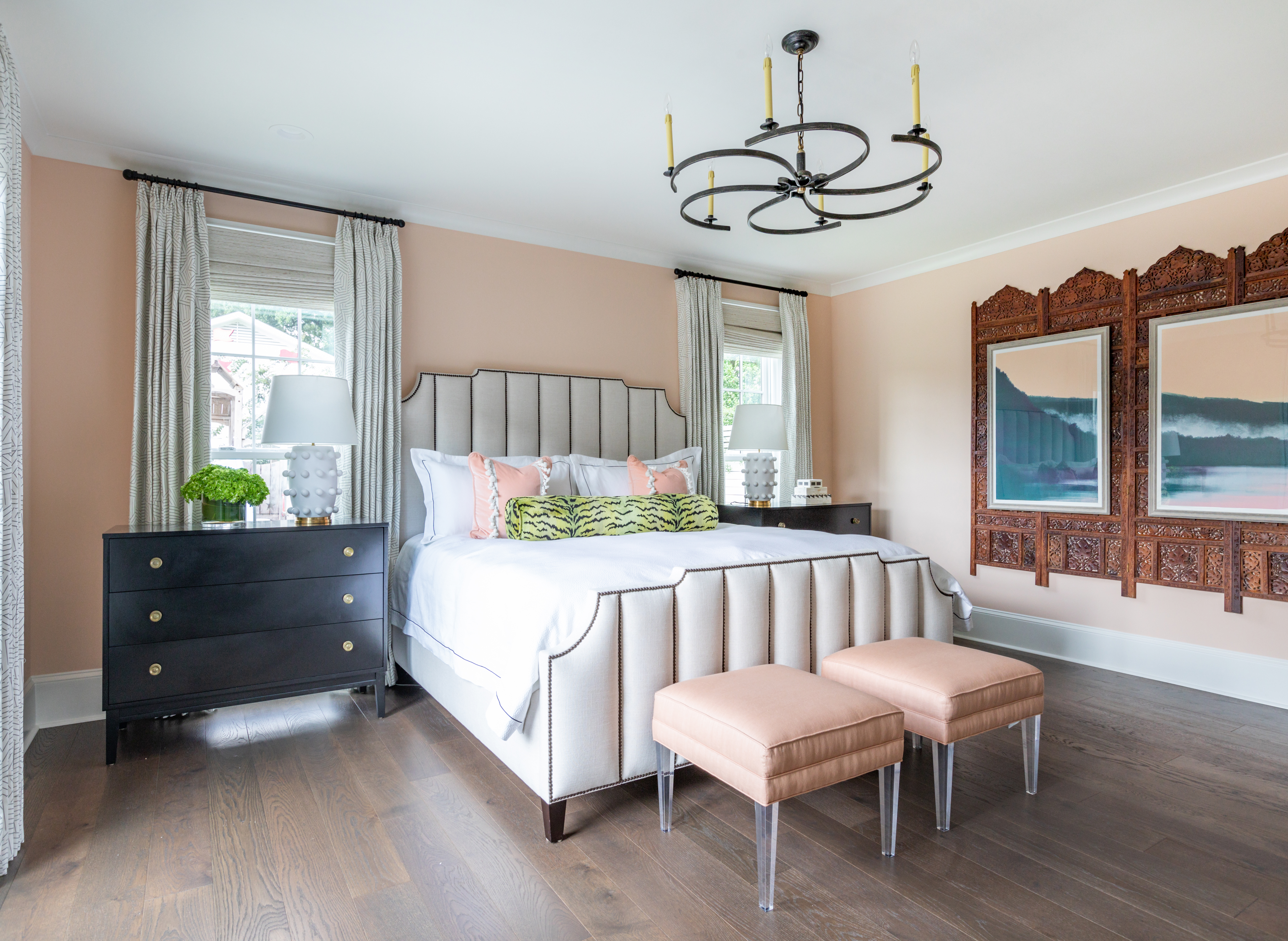
“She loves blue and she loves green,” Cannon says of her client. “Katie’s the kind of person who doesn’t put handcuffs on you creatively, though, so even when I picked a shade of peach for the master bedroom walls, she was totally on board. I knew it needed to be colorful but not garish. Timeless and classic don’t have to mean no color.”
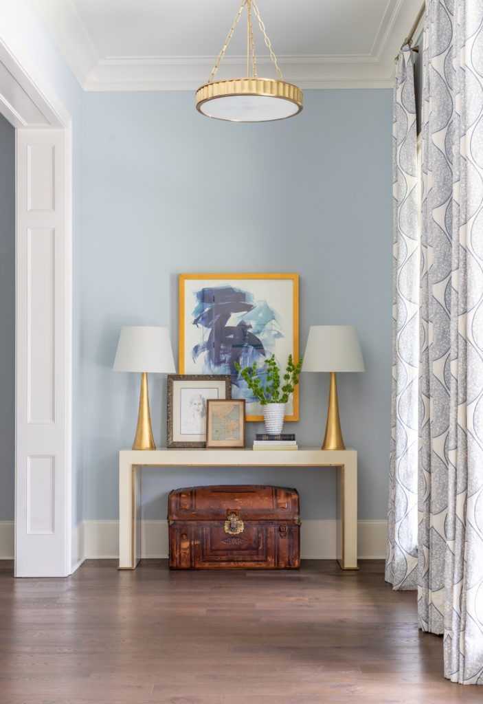
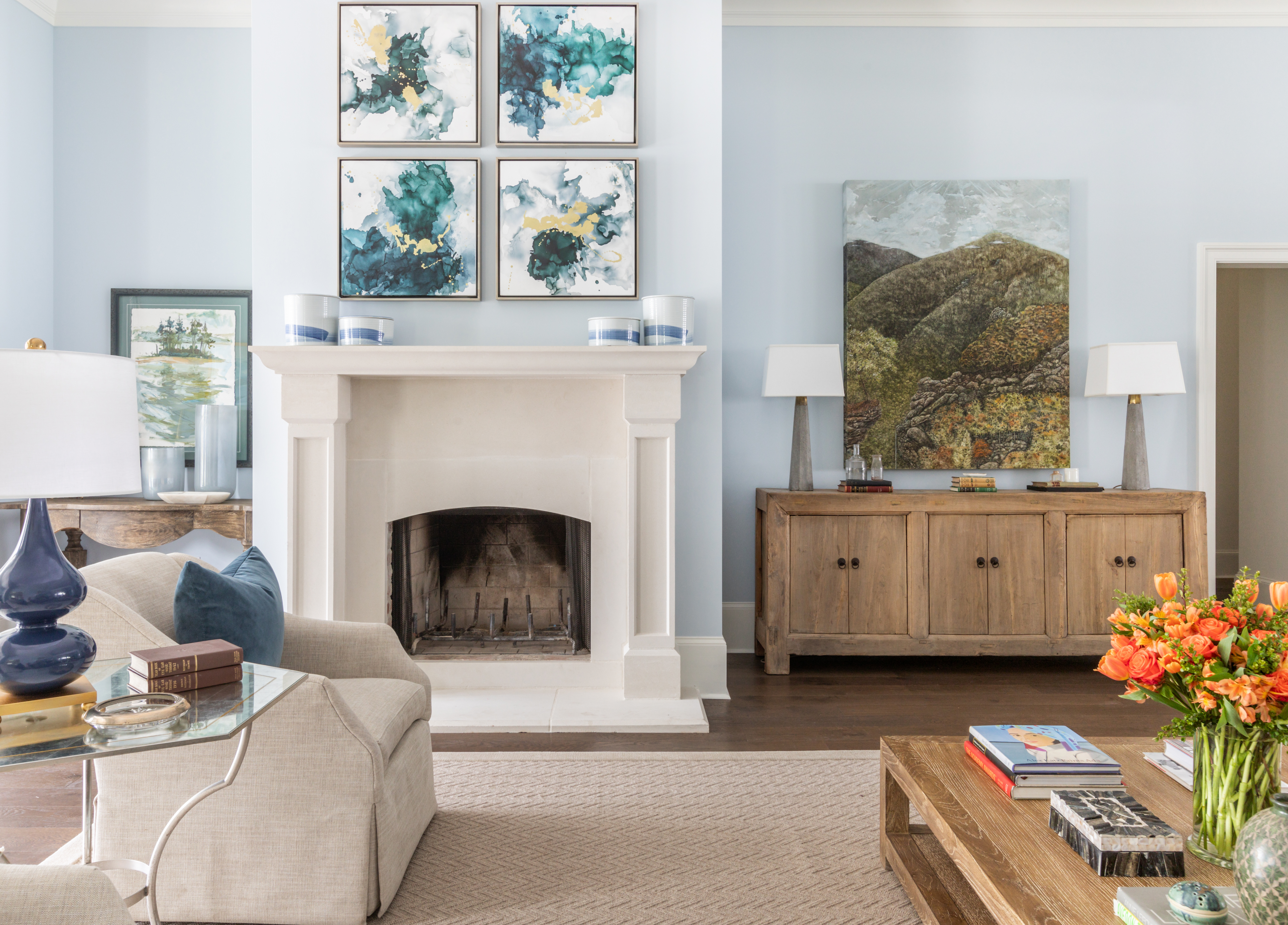
Selecting artwork and accessories to fill the house was as easy as “shopping” through an array of paintings and objects that the couple had brought to Baton Rouge from Katie’s home state of Alabama and beyond. “They came with a lot of stuff they had collected over the years, and that informed the style of the rooms,” Cannon says. “There were some sentimental things that we made sure to use, and they had all this art, so it was just easy.”
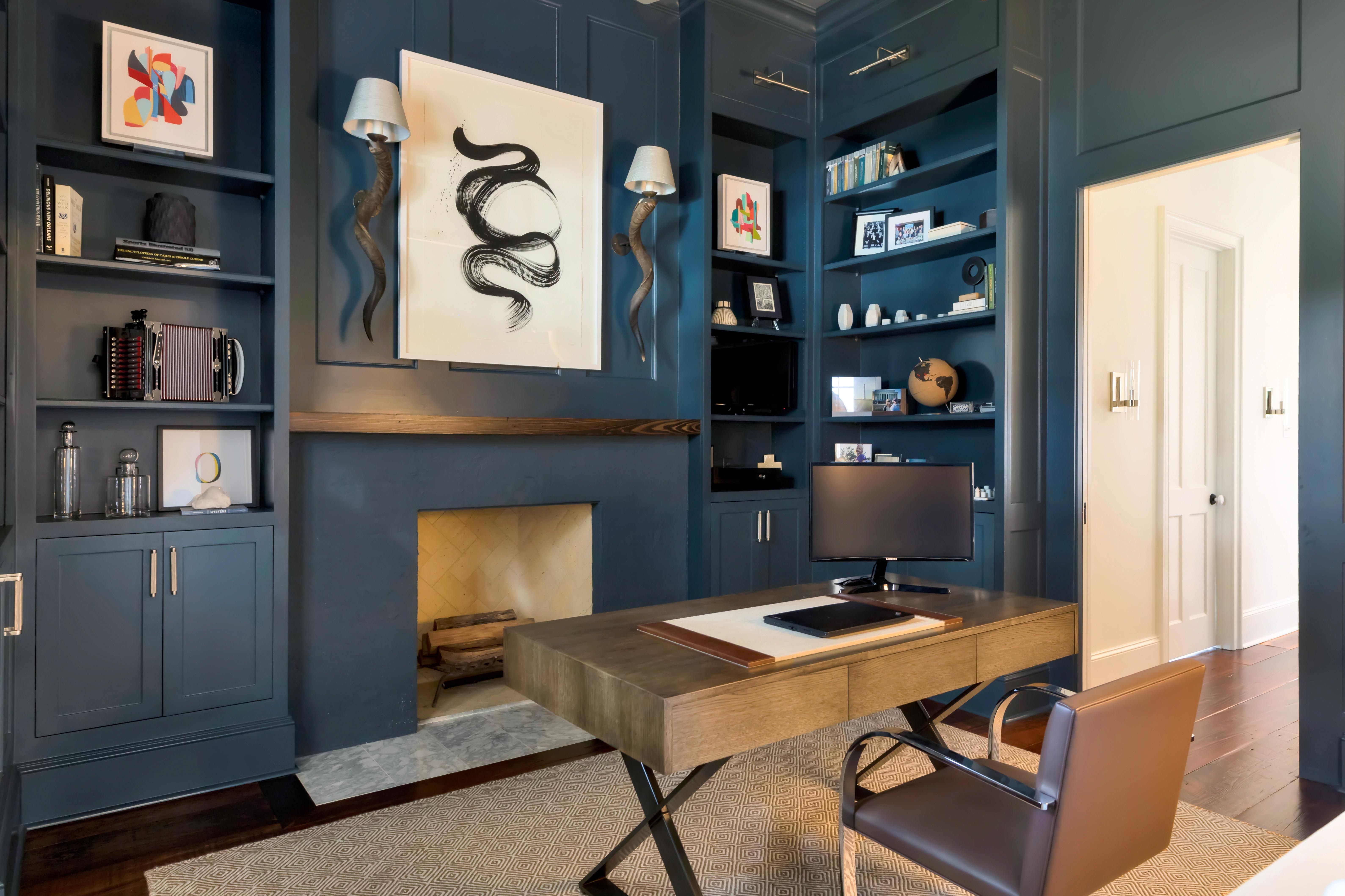
In fact, pieces with stories behind them support the design in every room. Antique medical books for eye doctors share space on the breakfast room bookshelves with pottery pieces by Southern artists. Katie’s sun-filled office is home to a chair designed by Frank Lloyd Wright when Rob’s uncle worked for him, and behind her desk is a painting of the Empress Hotel in British Columbia, the province in which Rob’s grandmother lives. Walking through the house, Katie points out photographs of flowers taken by a family friend, paintings by her father’s best friend, and a chest that belonged to a battlefront physician during the Civil War.
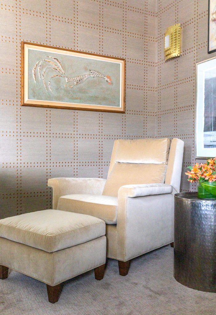
Once the renovation and redesign were complete, the Masons welcomed their curious neighbors to finally see inside during a huge housewarming party catered by Jay Ducote and his team. That was only the first of several get-togethers the couple has hosted, including themed dinner parties attended by their neighbors and Christmas festivities with family. It’s always a lively time when friends gather inside these reconfigured walls, and yet distinct spaces like the warm-hued media room down the hall and Rob’s office upstairs mean all these family members have comfortable retreats for after the excitement ends.
Katie is content to know that the renovation addresses the needs and the tastes of this family at this unique moment in their lives. “People have a certain restrained attitude about decorating when they think a house is going to be their forever home,” says Katie. “We have a different mindset. We don’t do ‘forever home.’ We just want to make the most of the home we’re living in now.”
Quiet, Please
The case of Katie and Rob Mason—the extrovert and the introvert—is all too common, though seldom considered, in the world of interior design. What’s the best way to make a home’s layout work for a person who craves calm as well as someone who thrives in a communal space full of energy? Answering that question has become a full-fledged quest for Rachel Cannon, who in addition to her more typical interior design offerings now advises clients on customizing their spaces for peaceful cohabitation between introverts and extroverts.
Cannon’s introvert initiative began with the late-2019 launch of her podcast, Loudmouth Introvert, which aims to help introverted creative entrepreneurs grow their businesses in an extrovert-focused world. “As the community began to grow, I remembered a conversation with Barbara Anne Eaton where she told me her mother always designated one room in their house as a quiet room,” Cannon says. “It hit me that maybe this is one of the reasons I dislike open floorplans—I’m an introvert and I like quiet spaces. That’s when I thought, Oh my gosh, I should be pioneering this movement! Rather than following the trend that says open spaces are the only way to build or remodel homes, I wanted to gather all the people like me who love walls and rooms and speak directly to them with this message.”
As Cannon learned and now attests, there’s a science behind this passion. Introversion, she says, is a temperament encoded in each person’s DNA, and introverts need quiet rooms to recharge their internal batteries and recover from the toll of the day’s activities. “We actually have less dopamine in our brains than extroverts do, and we find internal stimulation to be more rewarding than external,” she says. “It’s all incredibly fascinating to me and indicates a real need for interiors to be designed to support both types of temperaments.”
After years of focusing on creating beautiful rooms, Cannon says she feels a calling to impact her clients’ lives in more meaningful ways. “Doing this work has brought about an even deeper level of understanding of how our environments affect our mental and emotional health,” she says. “We need spaces that honor and nurture the dynamics between people.”
See more photos from this home in our gallery below:


