Feeling the blues: A kitchen renovation with one statement shade
The third time was the charm. That’s how many renovations Sara Brignac’s kitchen underwent during her family’s 18 years in their Mid City cottage. As Brignac’s family grew, the room evolved too. The interior designer behind local design studio Workshop 31 Twelve, Brignac molded each stage of the kitchen’s life to her family’s needs while honoring the house’s 1932 charms. Over the years, the countertops were graced not just with cooking supplies, but with her kids’ birthday cakes and homework projects. Framed by windows with views of sweet olive trees and crape myrtles, the kitchen burst with life inside and out. “I think that’s what made us want to spend so much time in there,” Brignac says. “It felt very connected to the outdoors, very much like a sunroom. It would just be light and bright all day long. It was very welcoming.” After nearly two decades in the house, Brignac and her family moved onto a new home last summer—but she says it will always be one of her most special projects.
Keep reading for some of Brignac’s favorite details in this space.
1. Blue’s clues
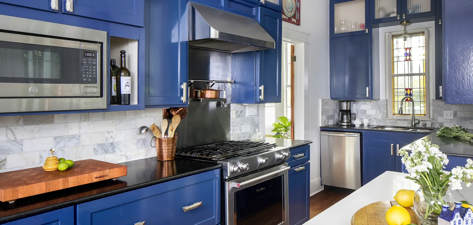
Benjamin Moore’s “Admiral Blue” in high gloss transformed the original white cabinets into a statement moment. “With it being a darker color, I was afraid it would suck up all the light in the kitchen. But I think the high gloss counteracted that,” Brignac says. “It’s very reflective. All the light bounces off it and makes the hardware pop.” A gray-and-white Carrara marble finish was a style upgrade on an otherwise classic subway tile backsplash. Honed black granite counters grounded the space.
2. Look up
The home’s unique ceiling height—9 feet, 3 inches—turned out to be just right. “It’s just enough to give you room for molding, but also makes the room feel cozy, particularly at night when you don’t have sunlight. High ceilings can sometimes feel cavernous and shadowy at night,” Brignac says. “If I could build every house with a 9-foot-3 ceiling, I think I would do it.” In the kitchen, it was also a chance to maximize every bit of wall space and bring the cabinetry up to the ceiling. It provided plenty of space for storing countertop appliances, paper towels and pantry staples. In the lower cabinets, Brignac invested in deep pull-out drawers for utensil storage and a trash bin. “In an older, cottage-style home, you don’t have a lot of pantry space, so we used every last bit of storage space we could.”
3. Let there be light
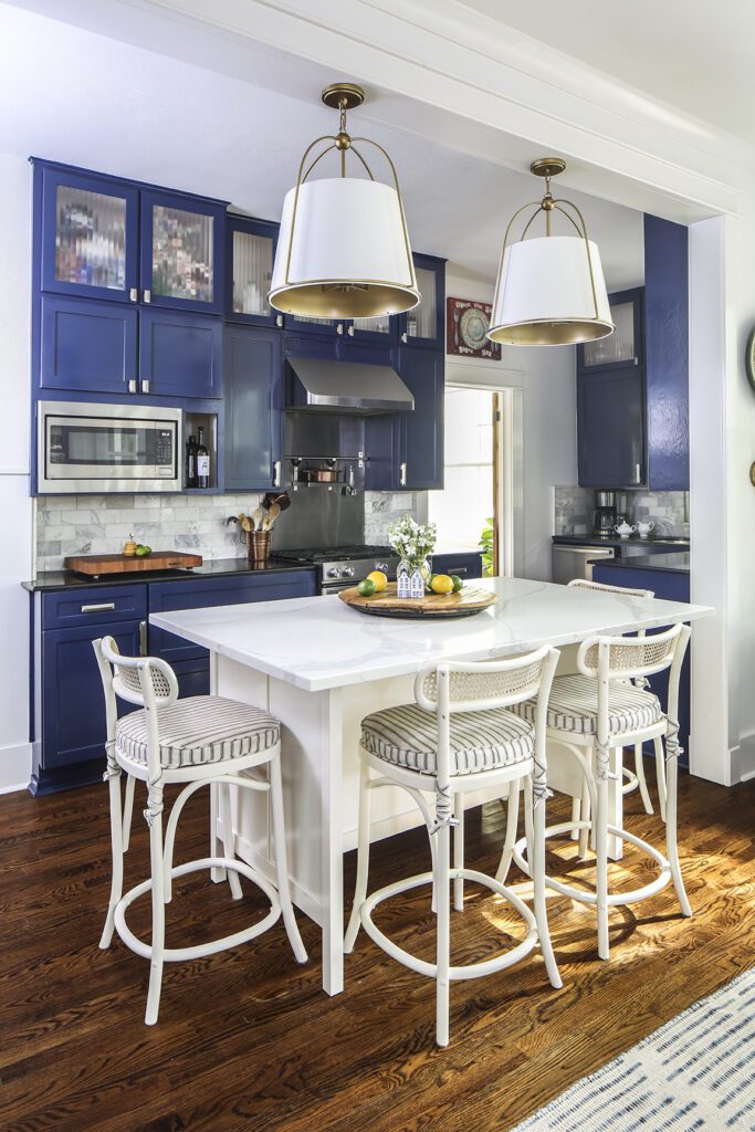
At night, a mix of recessed lighting and a duo of bistro-style, oversized pendant lights provides all the necessary illumination for cooking and countertop schoolwork sessions. “We loved that the inside of the pendant lights had a painted brassy finish. It gave this beautiful, soft, warm glow,” Brignac says.
4. Island time
For the kitchen island, Brignac searched high and low for a stone with minimal veining that still had movement to it. Brignac contemplated marble, but quartz felt like the right compromise for a space that might take a beating from constant cooking and art project paints and markers. “My husband is a wonderful chef, so it had to stand up to things like lemon juice and wine,” Brignac says. The finishing touch: four counter stools from Ballard Designs. Cane details add a touch of vintage style. The plush striped cushions and low back don’t break up any sightlines in the kitchen, while keeping things comfortable enough for regular use. “You need a back to have a comfortable barstool,” Brignac says.
5. Mix and match
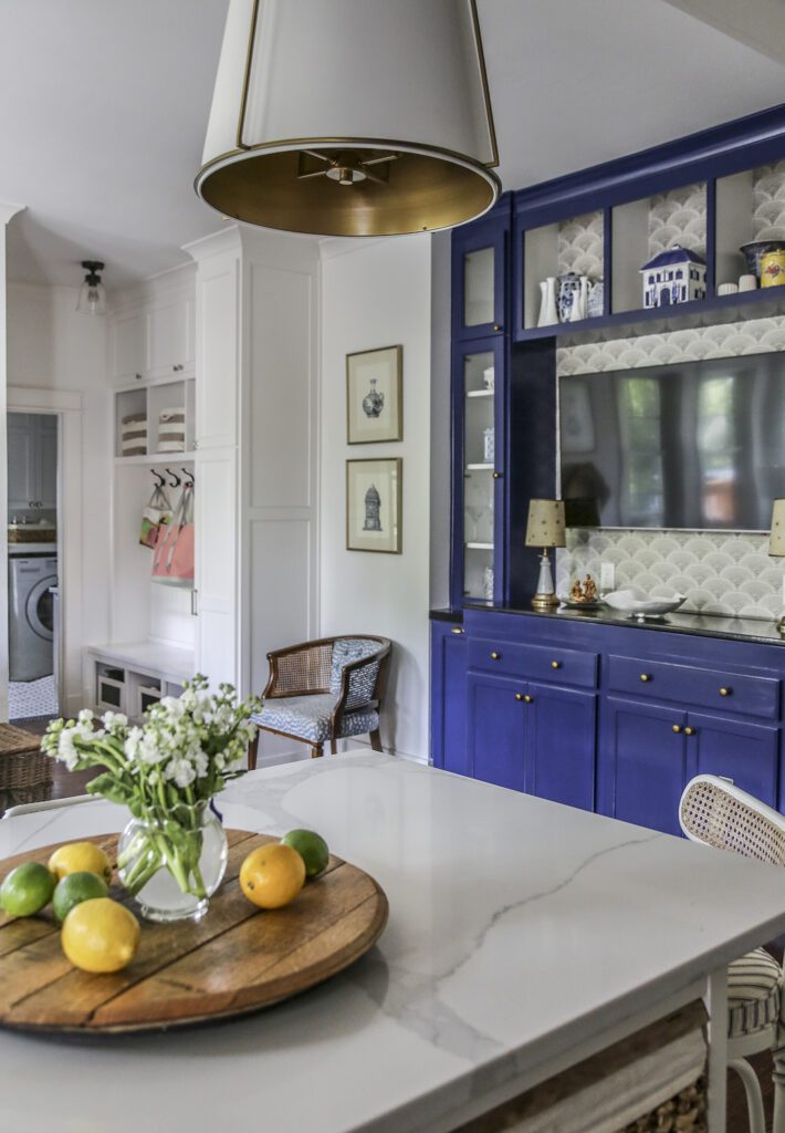
A built-in cabinet off the kitchen was modeled off a vintage bar cabinet that once lived in Brignac’s grandfather’s 1940s Wisconsin bar. Brignac wasn’t afraid to mix metals across the room, contrasting the cabinet’s simple brass antique-finish knobs with the modern chrome pulls on the main kitchen cabinetry. Drawers and shelves house a mix of fine china, snacks and drinks, and tape and scissors. A wall-mounted TV plays double duty for the kitchen and adjacent sitting area, framed by a gray fan-patterned Cole & Son wallpaper.
6. Multi-purpose
Because it is connected to multiple spaces, from a living area to a mudroom, the kitchen serves as a hub of activity and design. With views of the mudroom just off the kitchen, a clean but functional design was crucial. Pull-out bins conceal boots and school shoes, while closed locker cabinets are home to gloves, scarves, hats, backpacks and sports equipment.


