Elements of style in a Willow Grove home
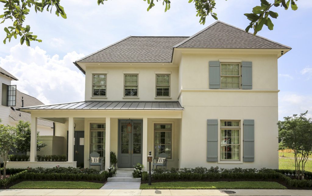
Before they pick up their first paintbrushes, beginning art students are taught about the elements of art. Color. Texture. Shape. Line. Space. All must be considered, they learn, in order to create a composition that is balanced and pleasing to the eye.
As savvy residential design pros know, these details are also the building blocks of a well-crafted home. The perfect color adds life and personality to a room. Texture can create a sense of warmth. The right shapes can soften a room, and lines draw attention or connote strength. As for space? Think of an open-layout living room and kitchen versus a cramped galley, and you know how this element can transform a dwelling.
It’s one thing to study these design elements in a textbook and entirely another to see them come to three-dimensional life. When the Bennett family moved into their new home in the Settlement at Willow Grove last December, they probably weren’t thinking of any of these technical factors. They were too busy unpacking, decorating the tree for their first Christmas here, and swimming in the courtyard pool. To them, it was simply home. To the team that created this new space, though, it was the culmination of several months of minding the details.
“When we saw the original plans for this house, we knew it was just what we had been looking for,” says Stephanie Bennett, who along with her husband Bryon had been interested in the neighborhood since it was first developed. They believed it would be an ideal location to raise their three young girls, and when they found builder Brandon Craft and his plans for this home, they acted quickly.
Guided by an overall concept by architect Michael Hogstrom of Onsite Design, Craft was already in the early phases of site development. The Bennetts called upon interior designer Caroline Flettrich of Richard-Renfro Designs and landscape designer Jeb Barber of Makaira Pools and Landscape to assist with the look of their home both inside and out.
Weekly meetings between client and interior designer began as the drywall was being installed—relatively late in the game compared to when many new-construction décor projects are launched, notes Flettrich. But “it was a smooth process,” she says. “We didn’t have any glitches.”
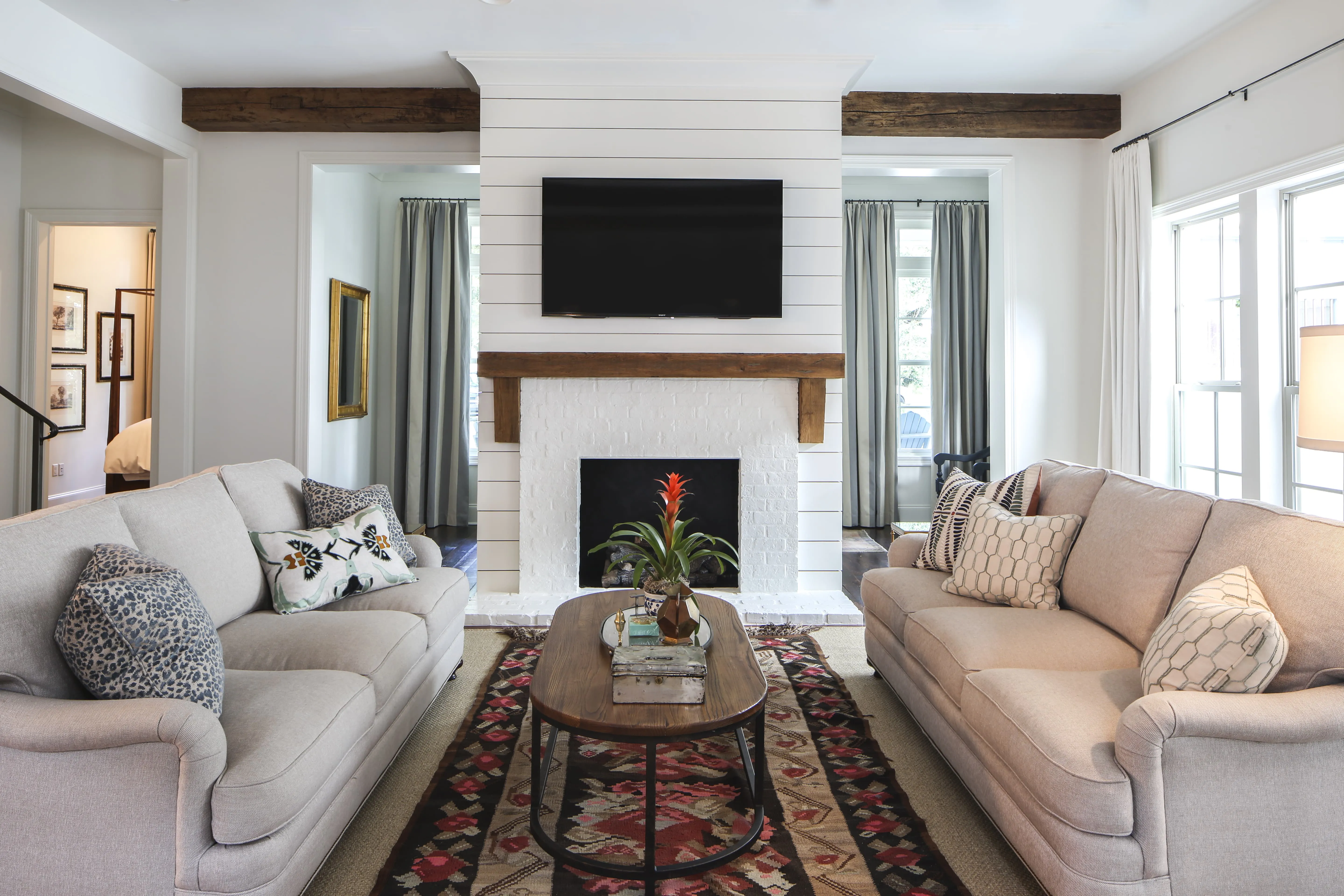
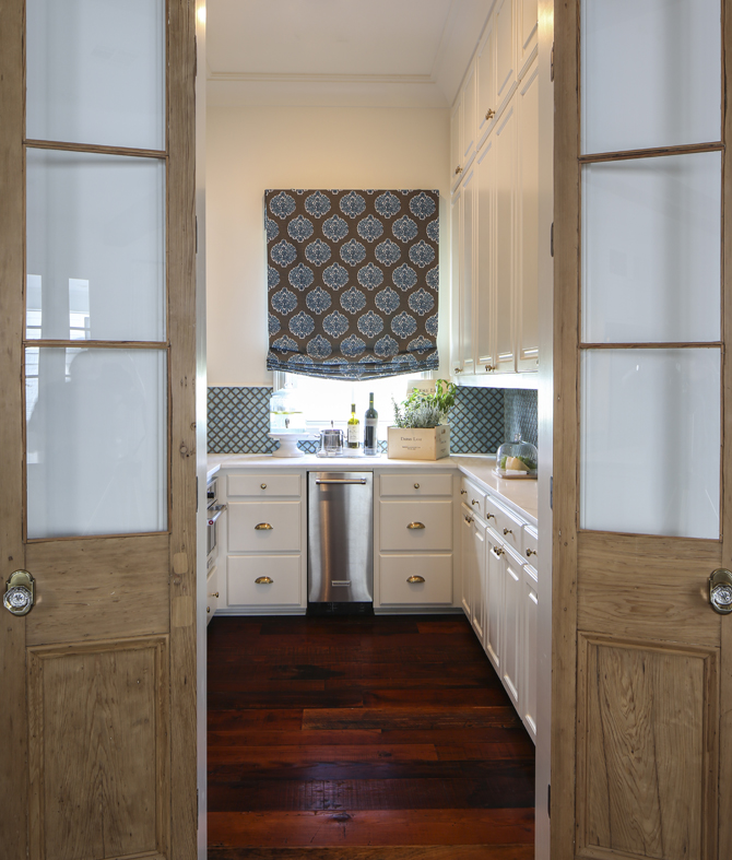
A signature feature of this home’s design was color. The homeowners came into the process with a preference for using soft shades of blue, and those hues became the basis for a cool and casual overall style. Front windows are dressed in blue times two—on shutters outside and wide-striped curtains in the light-filled entryway. An early request to paint the kitchen cabinets blue was abandoned in favor of going heavy on the hue in the nearby butler’s pantry, where a vivid tile backsplash marries with a cotton window shade in a large-scale blue and taupe pattern.
“It’s such a clean and fresh color,” says Flettrich. “We opted to make the overall feeling pretty calm with pops of blue in various places.”
Using the home’s space to maximum advantage was a special focus for Craft in the master suite and the second-story playroom. The bedroom begins with a nook large enough for a sofa and TV. “This is something we try to put in all our houses,” Craft says. “It’s a casual area where the kids can come and hang out, but then you get into the bedroom and it’s more relaxing and formal. Many clients, when they see it on the plans, say they don’t really need this seating area, but once they have it they tell me they would never do without it.”
Upstairs, Craft carved out a space just for the youngest family members to spread out and entertain friends. The playroom floor, a laminate with cork underlay, mutes the sounds of dancing and stomping, and “it’s relatively indestructible,” he says. One wall of this room features a bunk bed niche that’s perfect for sleepovers. “It follows the roofline,” Craft says. “There is zero wasted space here.”
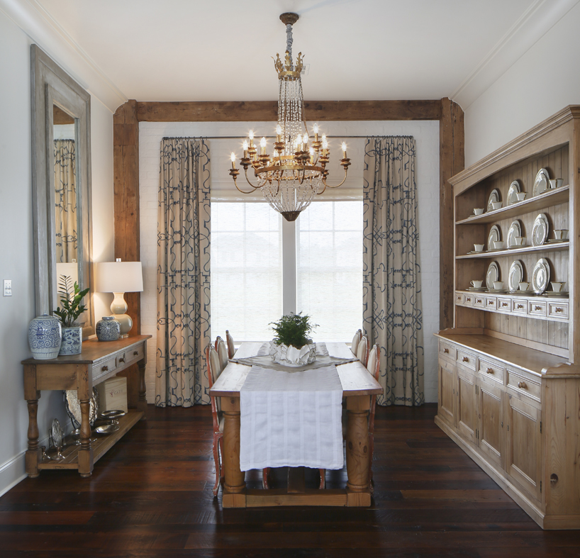
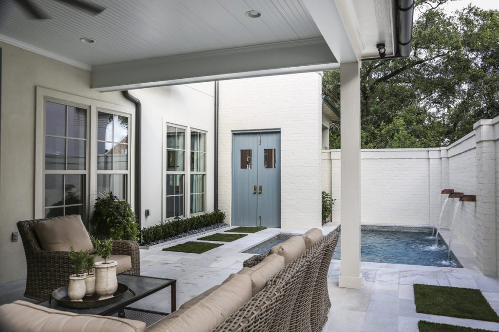
Another element of good design, texture, takes this home from flat to fascinating. The homeowners selected dirty-top pine for their floors, and they even employed scraps from the installation process as the façade for the hood in their outdoor kitchen. The countertops here and inside are leathered quartzite, modified by a process that lightens their color and adds a subtle texture. Also in this brick-walled patio area, just beside the pool, artificial turf “stepping stones” are tucked into cool-to-the-touch white quartzite tiles. “It’s really low-maintenance,” says Craft, “and it has a very clean look.”
Craft says his penchant for modern clean lines was balanced by the homeowners’ and interior designer’s affinity for slightly more traditional décor elements. “It was fun to blend those two ideas,” he says. “It’s classic but still fresh and clean—a great combination.”
Click on the photos below for a closer look at more of this home:

