Designer tip: Carrie Griffin on using dark colors in the home
These past few years of home design have relied steadily on a trend toward neutrals, with white walls, white cabinets and white furniture serving as a go-to for a classic yet modern color palette. But these winter months have us wondering—what about the opposite route? Is there a way to move to the dark side without being too dramatic?
“I think people like moody, dark colors but are afraid to use them in their own homes because it may make the space look dark and dreary,” says Carrie Griffin of Carrie Griffin Design. “It can be intimidating to figure out how to use them in the right way and still keep the space fun and fresh.”
The good news is that it’s possible with the right know-how.
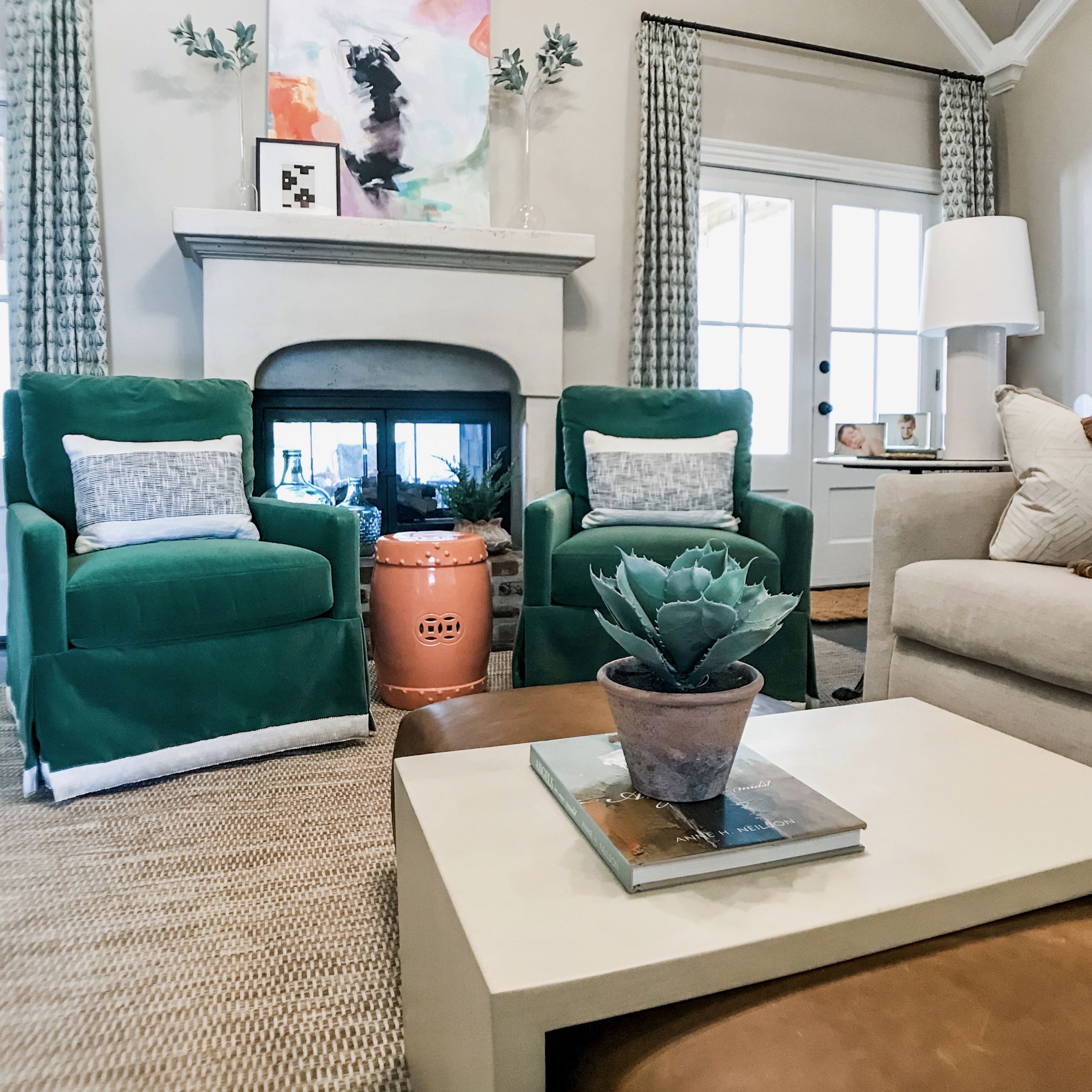
“We love using color! And there are definitely a couple of tricks for using rich colors when designing your home,” says Griffin. “A piece of upholstery is a great way to start. Recently, we did a pair of emerald green velvet chairs in an otherwise pretty neutral space. To lighten them up, we added a fun neutral ombré trim to the bottom of the skirt. Without those vibrant chairs, the room would have fallen flat, but instead if feels fresh, and it gave us a fun color to play off of in the rest of the room.”
“Dark,” after all, doesn’t have to mean “black” or “gray.” Plenty of colors fall in the spectrum of the moody and majestic.
“Another color we are loving right now is classic navy,” says Griffin. “An easy way to incorporate it into your space without committing to painting a whole room would be to use it on decorative paneling. It could work on just one wall or on wainscoting that wraps around the room. The rest of your space could be a bright neutral.”
So next time you’re rethinking a room’s decorative touches, remember that a good, deep color can be just as elegant as the melding of neutrals. Even using it on one important element, notes Griffin, can turn a formerly bland space into a cozy and welcoming retreat—especially as the backdrop for holiday decor.


