Bed, bath & beyond: The curated private spaces of the Ivy House Designer Showhome
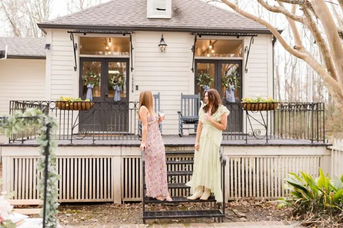
inRegister’s September issue featured the public rooms of the newly constructed Ivy House Designer Showhome, which is currently for sale in the Adelia at Old Goodwood neighborhood. The French-inspired house is the materialization of the shared dream of couple and homebuilding duo Jewel and Vincent Centanni, owners of Ivy Residential Concepts, a design and construction concierge business. Eleven interior designers came together for the two-week showhome event in July and August to benefit local nonprofit Heritage Ranch.
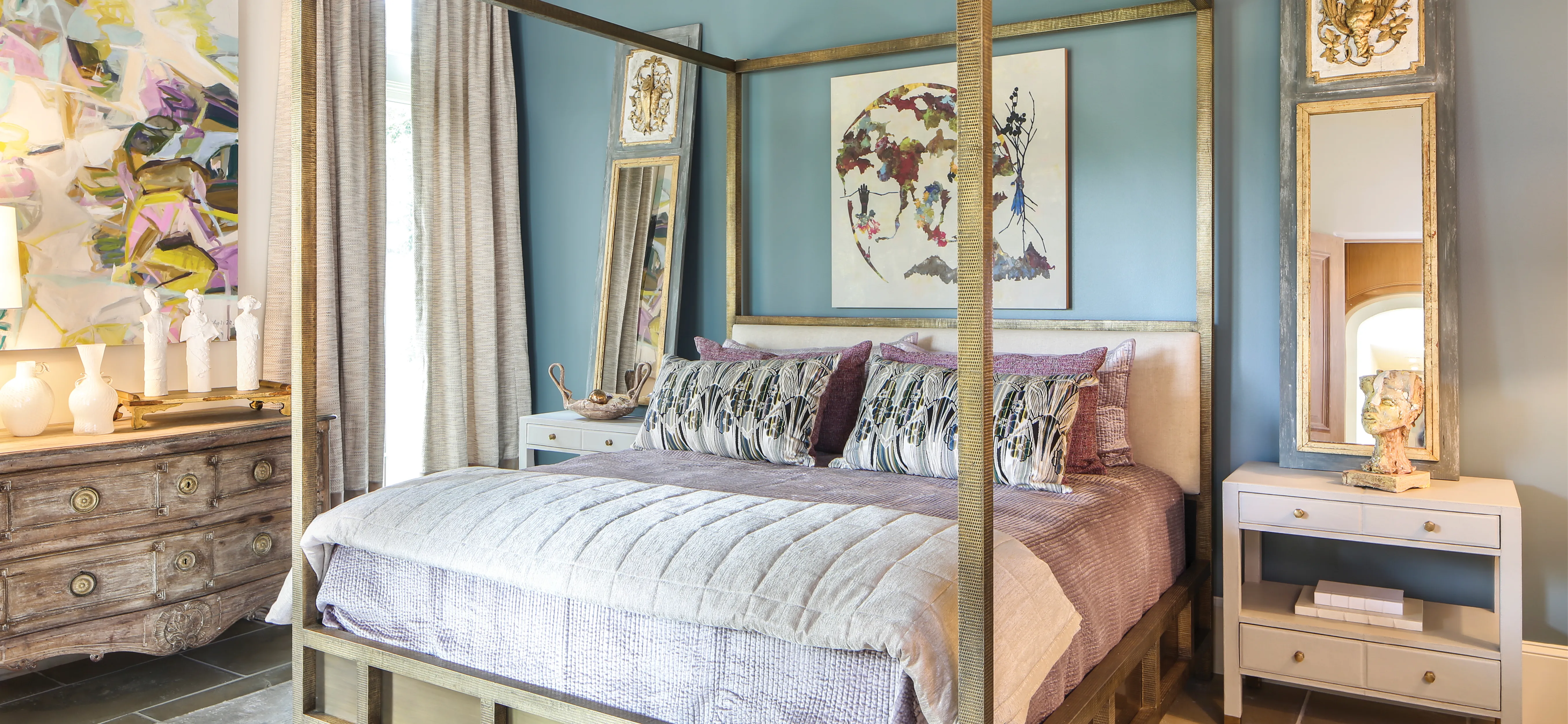
Master Bedroom (above)
In a hidden art studio in Pass Christian, designer Anne McCanless is delicately crafting the third of a series of sculptures titled “The Three Listeners” alongside artist Jolene Kinney. Months later, long after the clay has dried, her masterpiece sits atop a 19th-century Italian chest in the master bedroom of the Ivy House Designer Showhome, popping in front of a geometric painting by artist Saliha Staib.
“I like to mix interesting pieces,” explains McCanless. “With every piece I chose for the room, I wanted to transport guests.”
Channeling the European influences throughout the home’s design, McCanless specifically wanted to evoke the atmosphere of a boutique hotel on the coast of Italy. Rather than outside the window, turquoise waters were brought indoors through an accent wall and ceiling painted in a custom shade.
“Painting an entire room in such a statement color is overwhelming,” McCanless says. “But just one wall didn’t seem like enough. By extending the color to the ceiling, you get the color appreciation without dominating the entire room.”
Picking up where the ceiling leaves off, a hammered gold-hued, four-poster bed imported from England shines like a ring band alongside the jewel-toned walls and lavender velvet bedding. Over the bed is a colorful abstract by artist Rachel Brumer, sourced from Ann Connelly Fine Art. Atop matching side tables are antique Italian mirrors, drawing the gold throughout the room and creating even more interest and interaction between antique and new.
“Don’t be scared to mix the things you love,” explains McCanless. “In this crazy world we’re in right now, I think it’s important to create bold, happy and bright spaces.”
Master Bathroom
Ivy Residential Concepts/Nolan-Kimble Interiors
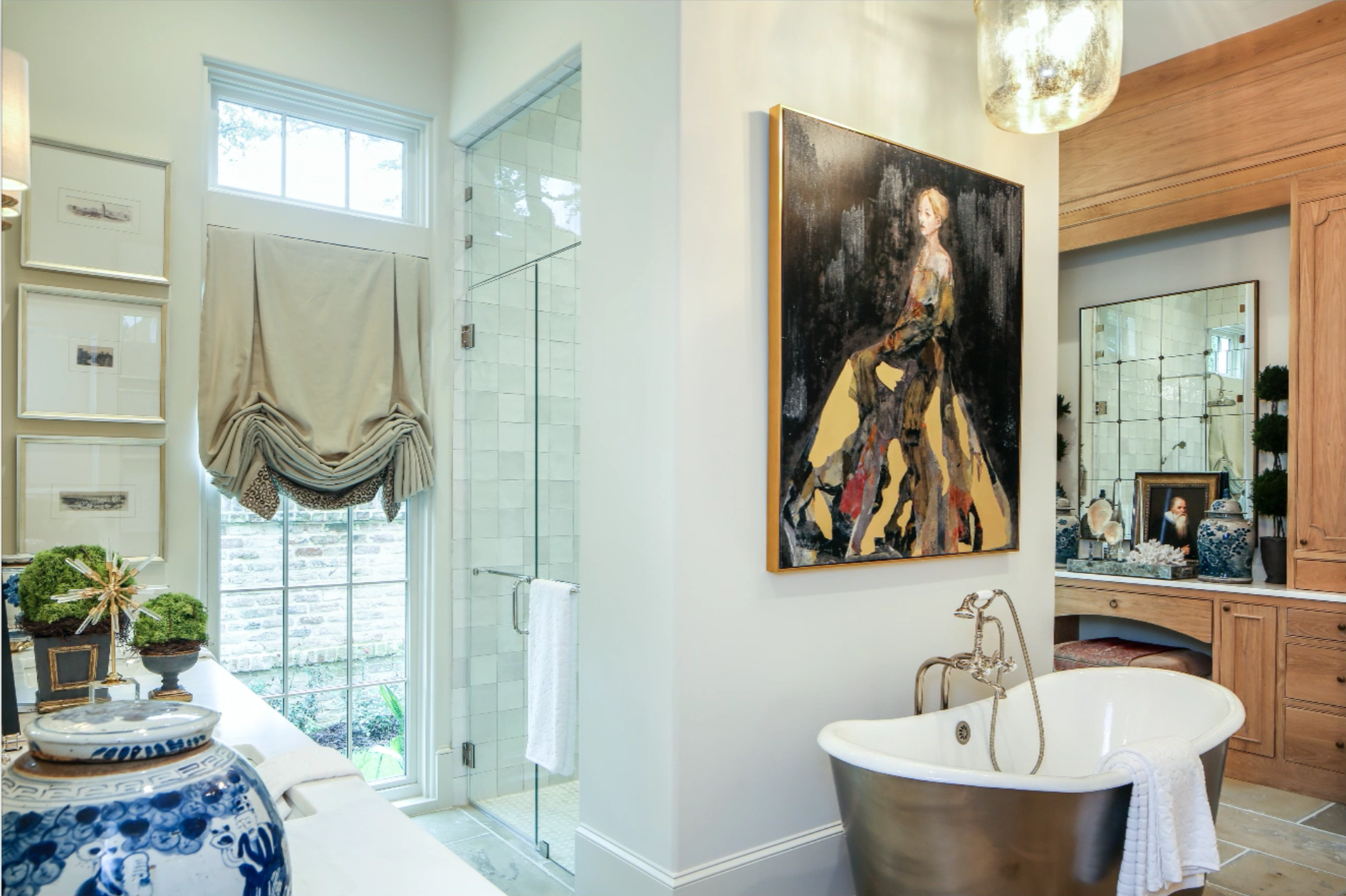
“What’s more impressive than a master bathroom?” Designer Albert Nolan of Nolan-Kimble Interiors’ question is not revolutionary, but it does evoke some thought when the subject of the inquiry revolves around interior design. Often, bathrooms are thought of only in terms of fixtures, tile and other immovable aspects. And while this space shines in the built-in department—with custom white oak cabinetry throughout, an arched shower covered in shining white tile from Stafford Tile & Stone, and a freestanding tub with a stainless steel skirt—the décor elements added by Nolan serve to elevate the space.
“Everything stems from the painting above the tub,” he explains of the work by artist J. Scott titled “My Lady.” “It’s from my private collection and I thought it went with the European feel of the house. She’s like a European princess.”
In the vanity area, an antique Italian suede ottoman that Nolan found years ago provides ideal seating for the lady of the house to prepare for her day. Along the counter, a collection of items from ginger jars to oil paintings and coral give a collected feel. The space is completed with a glass globe pendant from Capital City Lighting, which hangs over the tub and casts a veil of warmth over the room.
“I am a firm believer that bathrooms shouldn’t be ignored,” says Nolan, noting the importance of regular updates, as well as functionality especially in the master bathroom. “You should enjoy every square inch of your house.”
Laundry Room
Rachel Cannon Limited Interiors
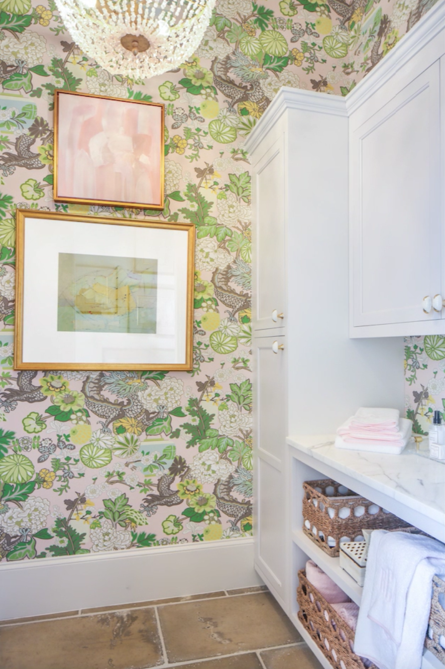
The smallest spaces allow designers to take the biggest risk, at least according to designer Rachel Cannon of Rachel Cannon Limited Interiors. With another statement-making laundry room under her belt from a California showhouse years ago, the space was Cannon’s first choice in the Ivy House Designer Showhome.
“Everyone expects it to be a throw- away room,” she says.
Setting out to prove them wrong, Cannon transformed the alcove off of the kitchen with light and bright Schumacher wallpaper featuring dragons and lily pads on a pastel pink background. A chandelier with rose quartz baubles adds a dreamy touch to the small space alongside art by local artist Erin Lato (top) and New Orleans abstract painter Alexis Walter (bottom).
“Erin created the pink piece using the wallpaper I selected,” Cannon explains. “And the Alexis Walter piece was gifted to me. I had it framed by Daryl & Sons Custom Framing, and I love how the two pieces look together.”
Built-ins painted in Farrow & Ball’s “Cornforth White” were given a little extra dazzle with eye-catching pulls that Cannon chose from a collection typically used on free-standing furniture. Cannon finished off the space’s marble counter and exposed storage with a mixture of accessories from The Foyer and Target, as well as pink-edged towels from Weezie Towels and seagrass baskets from Ballard Designs.
Downstairs Guest Bedroom
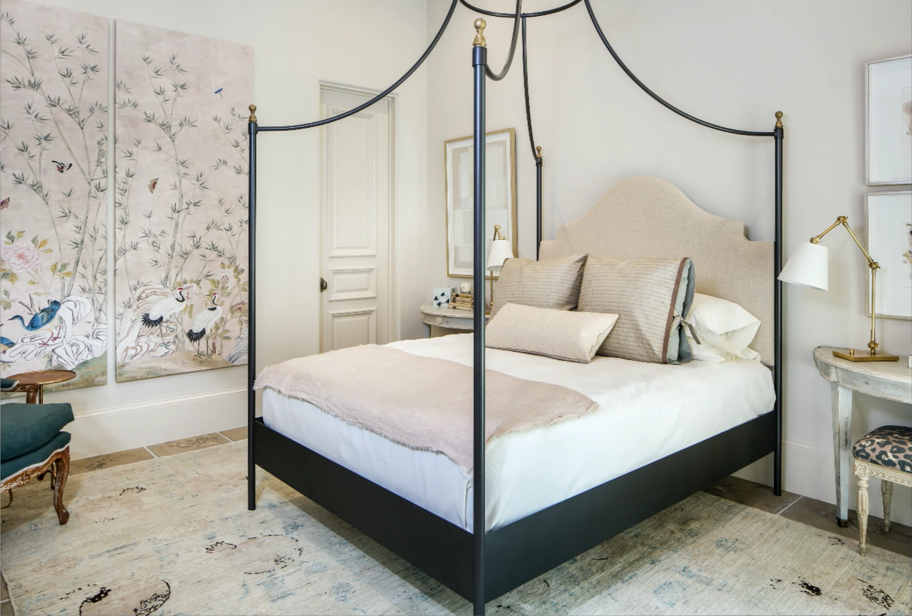
While this soft and sweet guest bedroom designed by Erin Mixson of Erin Mixson Interiors doesn’t scream “Let them eat cake,” subtle touches hint at the opulence that is often associated with the infamous French queen, Marie Antoinette.
“I took a lot of inspiration from the home itself,” Mixson says. “The French architecture was my jumping-off point for the design.”
Starting from a pair of antique console tables, which she used in place of traditional side tables, Mixson’s biggest statement is in a pair of Paul Montgomery wallpaper panels from The Mural Source, which she had framed locally in order to give the impact of a full-wall mural without the commitment and manpower that comes with a wallpaper installation.
“I was looking for that wow factor,” explains Mixson. “Because of COVID-19 and its impact on anything custom, I had to get creative.”
A chair Mixson had lying around was recovered in a statement-making blue fabric to draw out the bright hues of one of the wall- paper scene’s birds. To add further contrast, the room’s muted linens and pastel Oushak rug from Matt Camron Rugs & Tapestries serve to soften an iron campaign bed with a lofty canopy and gold finials from Doorman Designs in New Orleans.
“It’s not a big room but it has tall ceilings,” Mixson notes. “This bed draws the eyes upward so you can appreciate the room’s height.”
Upstairs Guest Bedroom
Rogers & McDaniel Antiques and Interiors
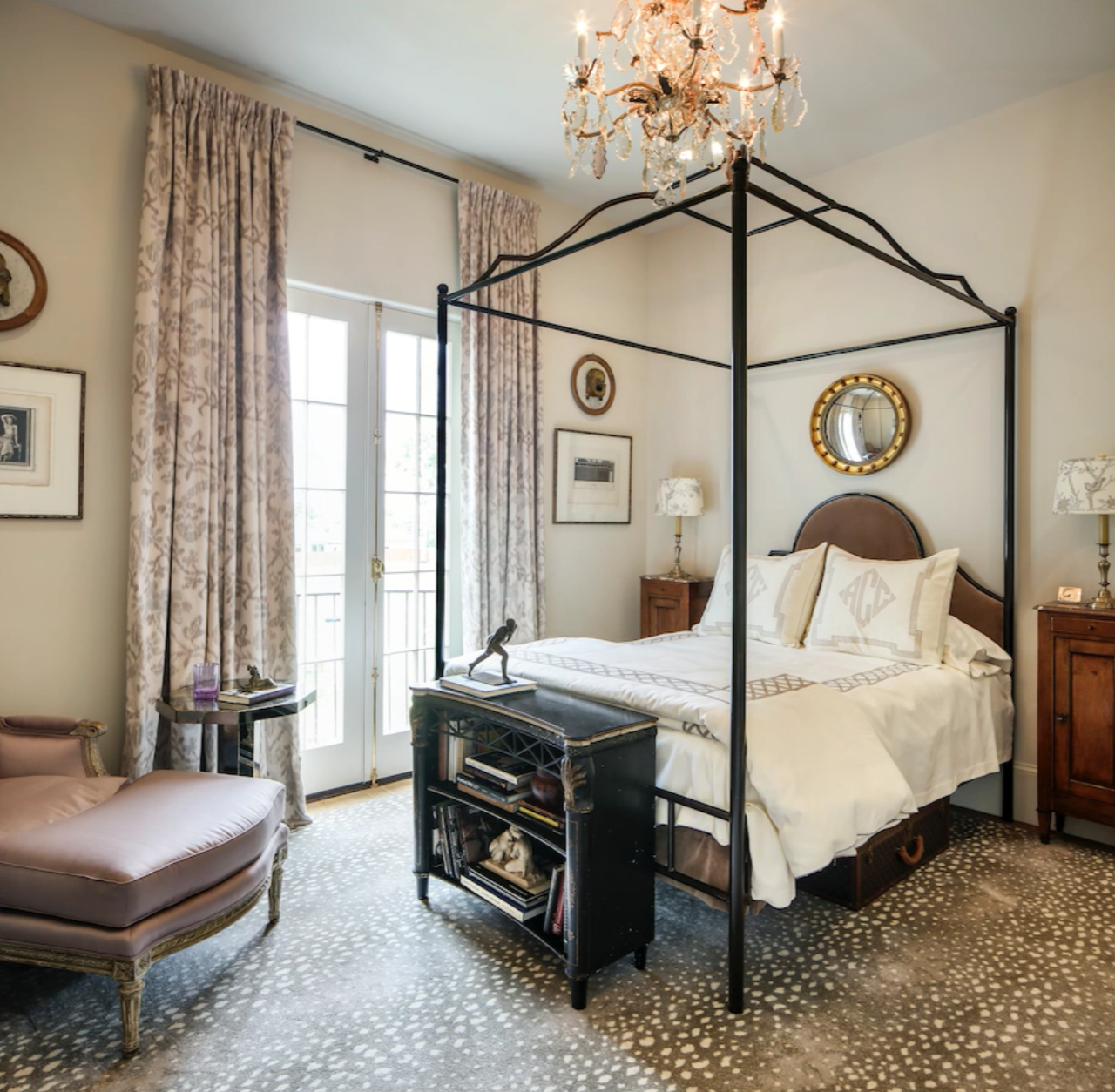
An American ex-patriot. A forbidden love. The glamour of European living. What sounds like the makings of a Hollywood blockbuster instead forms the mythical backstory of this bedroom designed by Gary McDaniel of Rogers & McDaniel Antiques and Interiors.
“When I was designing the space, I couldn’t help but make up a story about the woman who might live there,” he explains, dubbing the room’s style as “restrained luxury.” “I have a watercolor in my office called ‘The Paris Earrings.’ It’s that elegant society woman that I picture in the room.”
Hidden details like a vintage Louis Vuitton suitcase tucked away under the bed, as well as a princess-cut diamond ring on a chest of drawers, all serve to illustrate the woman of McDaniel’s imagination. For him, weaving this story is a device for creating a space that feels lived in.
“Collections are so emotional; they’re sentimental,” McDaniel says. “A layered look tells a story and draws you into the room—even if no one really lives there.”
However, a collected space is about more than accessories. Chalky lavender tones in the curtains and Louis XVI chaise are elevated against the room’s dark wood antiques and animal-print rug. To top it off, a custom-made iron and upholstered four- poster bed adds a touch of masculinity while interacting with a delicate 19th-century silver-plated crystal chandelier.
“The room is dedicated to Daryl Rogers, who passed away in early May,” McDaniel notes. “We hate for our loved ones to be forgotten.”
Upstairs Guest Bathroom
Ivy Residential Concepts/Rogers & McDaniel Antiques and Interiors
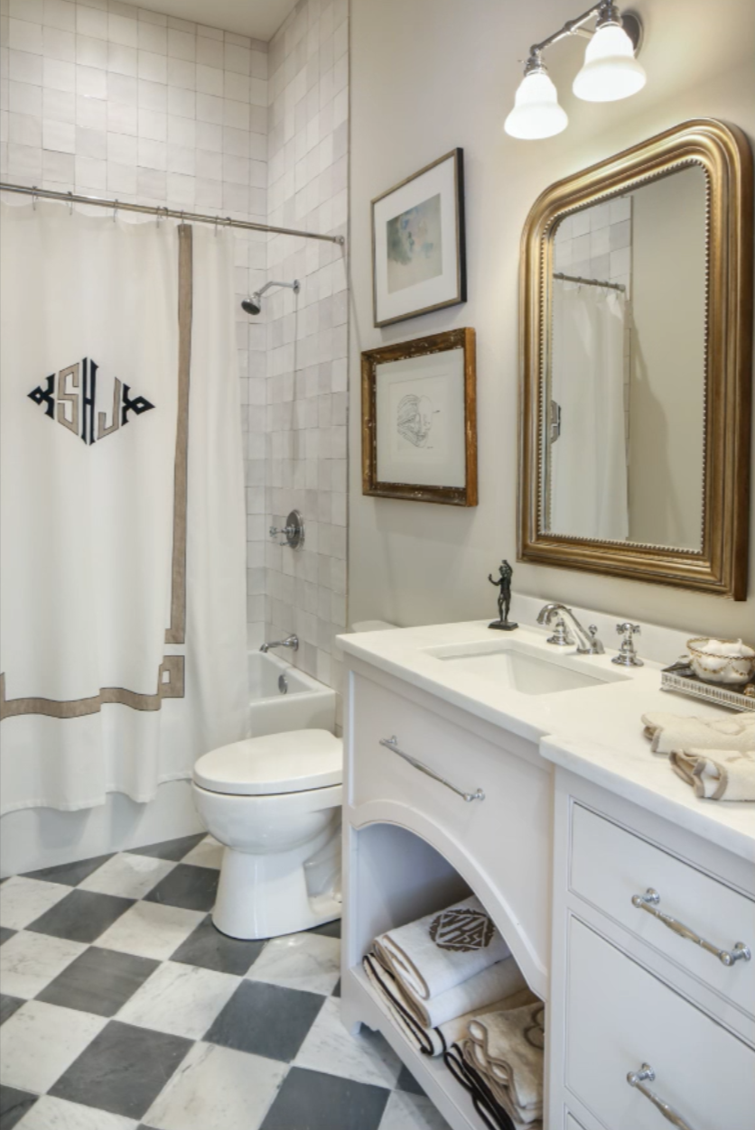
It only makes sense that McDaniel’s well-traveled American ex-pat would be bold enough to mix metals. A gold arched mirror hangs over the en suite bathroom’s sink, while silver fixtures sourced from Renaissance Tile & Bath occupy the shower, as well as the vanity’s pulls.
“It’s tricky to bring the collected look to a bathroom without it looking cluttered,” McDaniel says. “The mirror and the art on the walls help give that look without filling counter space.”
Underfoot, gray and white marble checkerboard tile from Stafford Tile & Stone creates visual interest. In a final touch of personalization, McDaniel added a monogrammed shower curtain by Leontine Linens, tying the bathroom and bedroom spaces together, as a sheet set in the same style sits atop the adjoining room’s four-poster bed.
Nursery
Colleen Waguespack Interiors/Fig & Dove
It’s said that doves symbolize new beginnings. In the past, for Colleen Waguespack’s home interiors line Fig & Dove, that meant the changes that come at the start of the new year, as the brand finds its start in the holiday season. However, during COVID-19 shutdowns, Waguespack expanded her company’s offerings to celebrate the ultimate beginning: that of a new life.
“My team and I were able to take a pause,” she explains. “We discovered that we wanted to offer not just any baby products, but a small selection of thoughtful items that help people pare down and invest in pieces that are useful for a child’s whole life.”
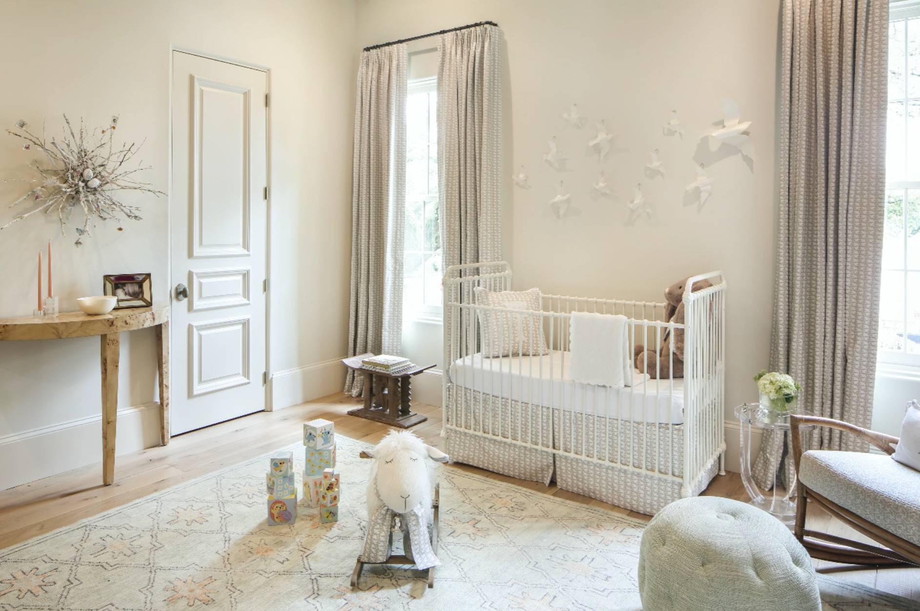
Scrapping her previous guest bedroom design concept, Waguespack shifted her focus in the Ivy Showhouse space to focus on the home’s imagined youngest resident. Adding an iron crib, the room came together, incorporating Fig & Dove’s new line of dove-adorned details—from crib skirts to draperies, as well as items from numerous artisans the brand hopes to spotlight.
“The new perspective allowed us to go back to the artisans we already use and love and utilize their work in a new way,” Waguespack explains.
On the far wall, a sculptural nest created by artist Kaki Foley extends from a flock of acrylic doves— hallmarks of the classic Fig & Dove collection—that hang over the crib. Underfoot, a LillieKat area rug adds a touch of muted color while pulling together the classic style of the crib with more modern elements like the acrylic side table that sits beside a rocking chair.
“If you make a nursery using only one genre, they’ll outgrow it quickly,” Waguespack says. “A mix of traditional and modern keeps the space fresh even as it changes over time.”
Nursery Bathroom
Ivy Residential Concepts/Colleen Waguespack Interiors/Fig & Dove
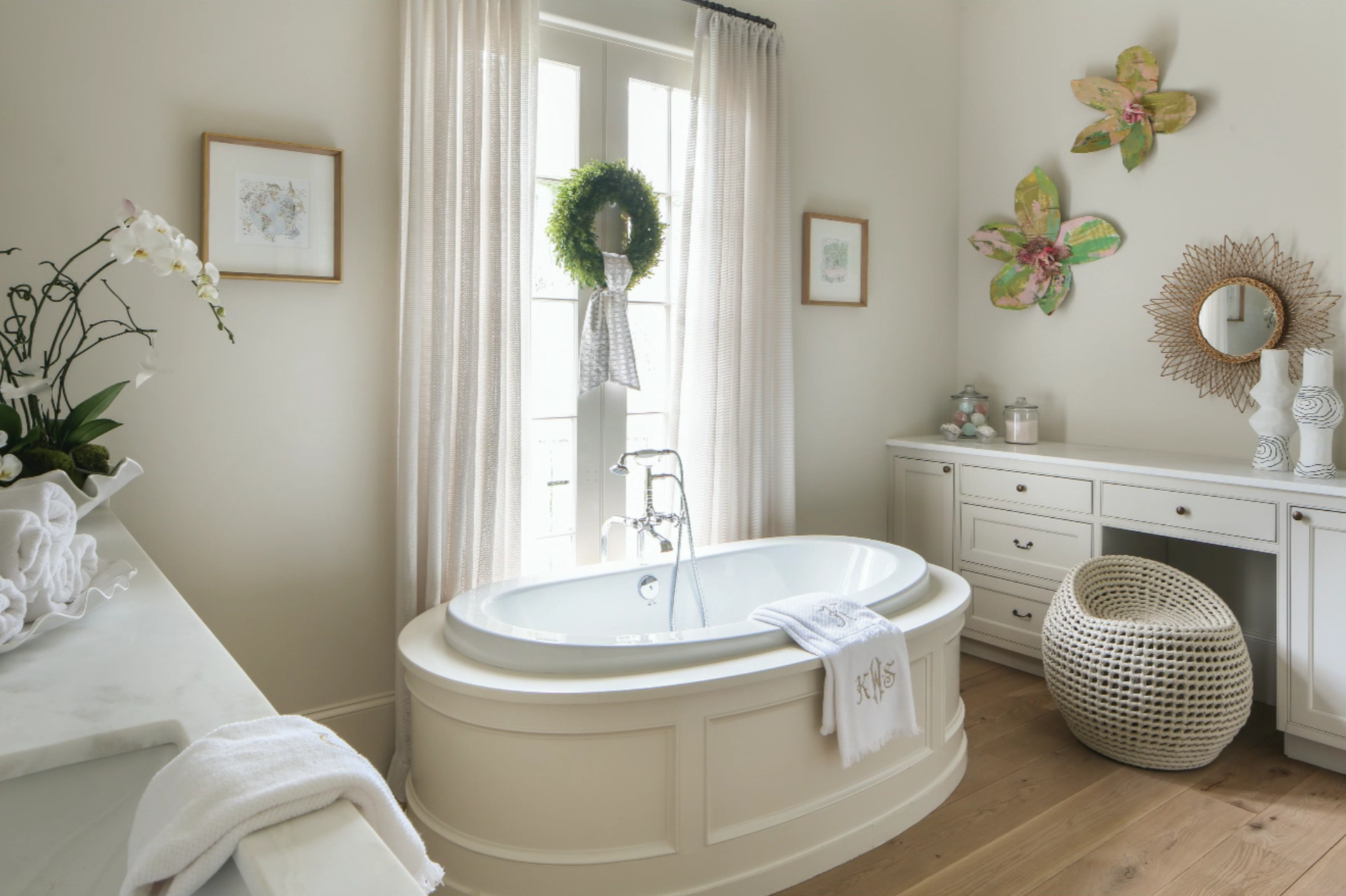
There’s only one thing that could distract from French doors leading out to a second- story balcony, and that’s a statement tub. This oval specimen is set off by a custom-built surround, giving the soaking-depth tub an Old Word feel with all the luxuries of a modern bathroom.
“We just thought it would be a cool and unique way to do a tub,” says homebuilder Jewel Centanni. “It makes a statement.”
Since the bath connects to the showhouse’s nursery, designer Colleen Waguespack of Colleen Waguespack Interiors and Fig & Dove added whimsical touches to transform this sophisticated space into something fit for a child. A wreath with a sash in the same neutral dove fabric from the nursery bedding and curtains adorns the doors. Oversized sculptural flowers fill the far wall, while a rattan mirror from Fireside Antiques creates the ideal vanity space alongside playful vases made by artisans in Haiti, which Waguespack sourced from Found in Houston.
“I think the most important thing to remember is that you want the pieces you decorate with to grow with the child,” Waguespack explains. “Art is something that can be carried throughout their lives.”

