Clear view: Erin DeBosier Tew’s new take on a holiday home
Editor’s note: The print edition of this article cited the wrong photographer. All photos were taken by Melissa Oivanki. inRegister regrets this error.
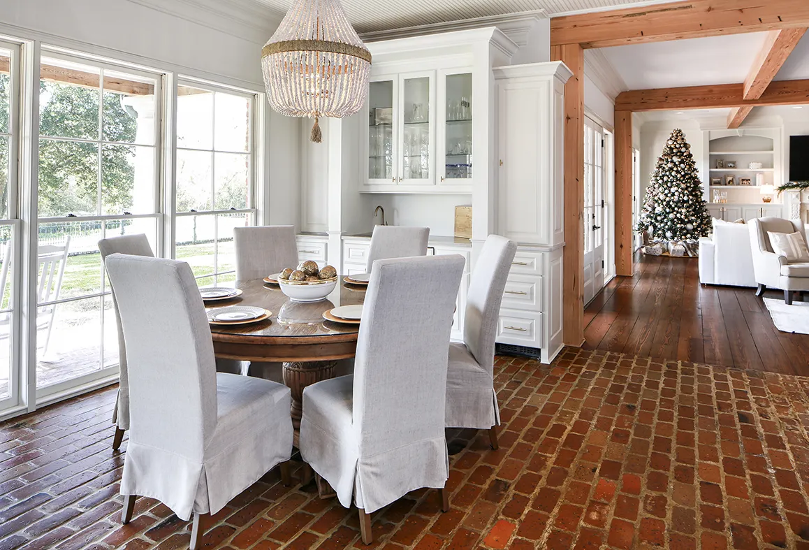
Fifty shades of beige. No, it’s not a saucy new romance novel but, in fact, a real-life dilemma that homeowner Val DeBosier found herself in. Sample-paint can after sample-paint can of varying shades of white, gray and beige were slathered onto walls and cardboard during the reconstruction of her home in the Country Club of Louisiana. The hue chosen would go on everything—all walls, cypress cabinetry, beadboard ceilings and wood doors. Choosing the right color was imperative.
“You know the saying ‘watching paint dry’? That’s really what Val was doing for days on end,” says decorator Erin DeBosier Tew. “Val has a very discerning eye. She has great taste, but it is very specific.”

This discerning taste led Val to seek the help of Erin in the remodeling of the dark and dated 30-year-old house that she purchased with her husband Steven. They needed to create a comfortable home for their family of six. Erin knew the couple well—her late husband Matt was Steven’s brother—and Erin was eager to delve into a remodeling project for someone else from start to finish.
“I have always loved remodeling, but it was typically for myself,” says Erin, who, until recently, owned the well-known home and seasonal décor store Red Door Interiors. “I was ready for a new adventure.”
This new adventure included rethinking the entire layout of the DeBosiers’ spacious but choppy house. A formal living room, formal dining room and enclosed kitchen and keeping room were opened up to create an inviting, light-flooded space. The three spare bedrooms downstairs were transformed into a master suite that now includes a bedroom, private laundry, master bathroom and oversized closet. Upstairs—formerly the master bedroom area which encompassed a sun room and morning room as well as his and hers master bathrooms—is now home to their four children and includes four bedrooms and three full baths. Erin’s vision for the entire house, and the knowledge that major zones could be reconfigured, made the difference.
“I know what I like, but I need to see it,” says Val. “Erin drew the new layout on graph paper to show me how it could be done. Before that, I had not considered flipping the bedroom configurations.”
Erin took the graph sketches to Kevin Alford of Remson Haley Herpin Architects, who then drew up the plans. Chad Roper with Alfred Roper Construction spearheaded the renovation. Interior walls came down, and cypress-clad steel beams were installed for support while adding aesthetic appeal. Thick wood floors were removed, stained and laboriously reinstalled throughout the downstairs. And everything received a fresh coat of the critically considered paint color— “Classic Gray” by Benjamin Moore. It took painters seven months to sand, caulk and paint the entire interior of the home, which was laden with dark woodwork before.
“While working so closely with Val, I realized that so many homeowners going through the building or renovation process need to see the items and colors in person before making a decision,” says Erin. “That formulated thoughts in my head about using my design experience in a new way.”
Erin signed the lease on a storefront in Southdowns Shopping Center—formerly home to Ann Connelly Fine Art—with only an idea in mind: to create a design finishing showroom. She wants a place that will allow homeowners to see in person how elements of a certain style work together, including lighting, floor covering and furniture. Spaces, opening in December, features different design vignettes such as Transitional, Classic European, Seaside, Modern Farm and Factory, Cosmopolitan and Modern Organic. Through these scenes, Erin hopes to inspire others and ease the building and decorating process.
“It was very hard for me to make the decision to close Red Door. It was started in my backyard,” says Erin, who was burdened with the long hours and high inventory of the large retail store. “But I had finally come to a place where I realized it was OK to go in a new direction. And working on this project made me realize that there is a need to take away the design mystique for people who may not have the vision.”
Half of the Spaces business is showroom-specific retail, while the other half is consultation and home design. Many items that are offered through the company were chosen for Val and Steven’s new abode. Brand new rugs, lighting, furniture, hardware and more were needed in stocking the restructured home. And Erin’s vision for reconfiguring rooms and tearing down walls along with choosing the right elements to make these new rooms zing made the difference.
“This project was easy because Erin and I worked so well together. I needed someone to help guide me to make sure we were on the right track,” says Val. “She’s so patient and has an idea for everything. The result is a beautiful family home we love.”
To see more photos from this home renovation, click on the gallery below:


