Joan Rivers’ lavish penthouse brings Versailles to the big city
The late and great comedian Joan Rivers was undoubtedly unforgettable in many ways, from her controversial humor to her over-the-top style that directly translates into her former Upper East Side penthouse. Rivers dedicated herself to decorating her residence, drawing inspiration from French Baroque architecture to create an apartment fit for Marie Antoinette.
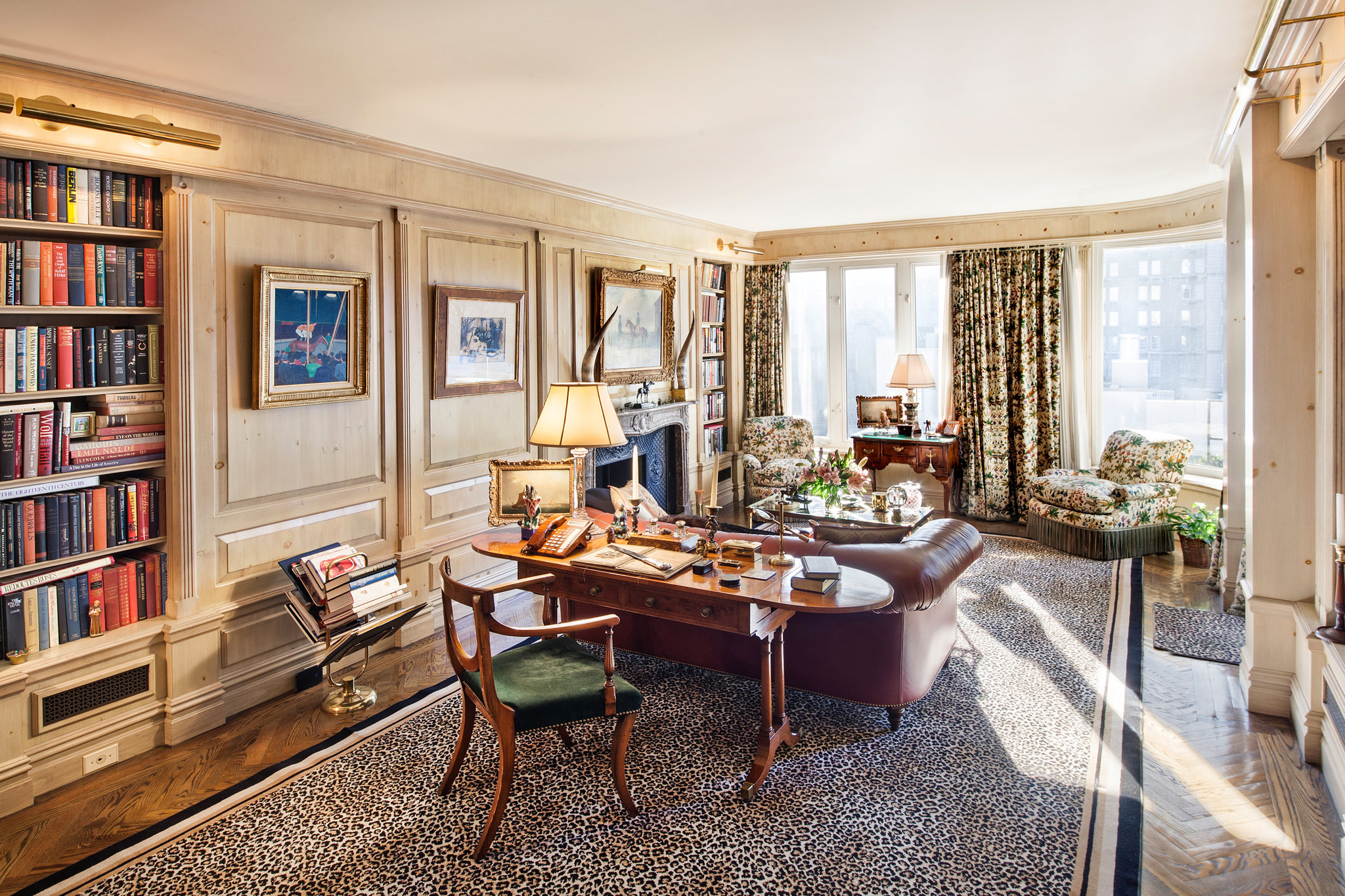
The four-bedroom residence features grand entertaining spaces with a ballroom, music room and antique columns all decorated in Rivers’ lavish style. Although the Versailles-inspired interior is rarely recreated in modern-day homes, Rivers’ sunny sitting room/office space has a contemporary touch that may be worth drawing inspiration from. That’s why we spoke to Caroline Flettrich from Richard-Renfro Designs for her expert analysis on the luxurious space.
“The overall design of the study of Joan Rivers’ personal home is not the aesthetic that we see in Baton Rouge homes today,” Flettrich says. “However, after evaluating the space closely, there are several elements that many designers incorporate often in a room with an end result that looks nothing like the space pictured here.”
See Flettrich’s tips alongside more rooms from Rivers’ penthouse below:
• Raised panel walls have been a characteristic of libraries for many generations. In this particular room, the wood appears to be bleached or limed, which gives it a traditional yet updated look.
• The brass picture lights above the bookshelves are a beautiful complement to this wood tone and provide another means of illuminating the space and artwork. The original artwork has been carefully placed within the “frames” of the raised panel, as well. Although the artwork is not a series, there is consistency in the placement of the individual pieces.
• Furthermore, the raised panel partners with the decorative grill of the air conditioner returns. These grills are located beneath each of the bookshelves and are framed with the raised panel molding, which minimizes the “eye sore” result that A/C returns often create in a well-designed space.
• The leather Chesterfield style sofa frame exudes a masculine yet comfortable environment, a common goal when designing a study.
• The placement of the desk behind the sofa works well for multiple reasons. First, the height of a Chesterfield sofa is somewhat shorter than most sofa styles and marries perfectly with the height of a writing table. Much deeper than your standard console, the writing desk allows for functionality while maintaining the ability to accessorize with far larger items than would fit on a narrower piece. The lines of the desk chair are lovely and lend an almost a sculptural detail to the space.
• The club chairs in front of the windows have quite a few interesting design details often seen in our local residences here in Baton Rouge. The fringe applied to the chairs is a classic element that has made an amazing comeback in the design trends of today. This type of textile is presently seen on the skirts of sofas, chairs or tailored table skirts in casual and formal spaces.
• These chairs are upholstered in the same fabric as the drapes. This design trick is often used by repeating wallpaper and fabric patterns in bathrooms, dining room, etc. in addition to how it is utilized here. It allows for a strong pattern to be incorporated into a space without having the layers compete with one another.


