Make your home multidimensional by mixing patterns and textures
When preparing to design a space, the blank canvas of possibilities can sometimes veer into overwhelming territory. Fabrics, patterns, colors, textures, materials—the list goes on and on. But fret not: Interior designers and decorators are able to use their trained eye to create a cohesive look that effortlessly blends a combination of textiles, no overthinking required. To discover the artistry behind mixing fabrics, we spoke to Allyson Hicks of Allyson Hicks Design Consulting for her insight on combining distinct elements to create a layered appearance with plenty of depth.
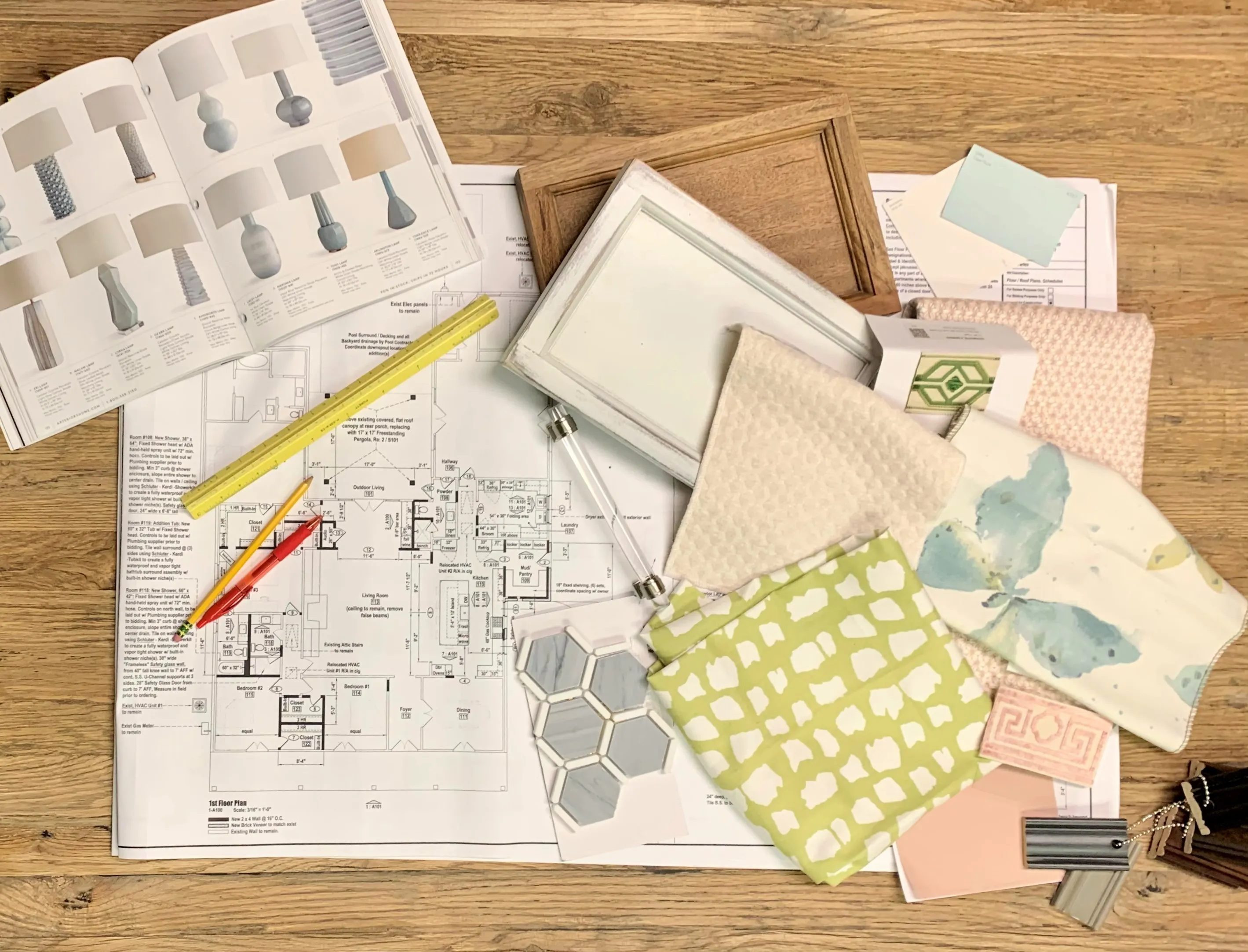
“Fabric details are often the perfect way to give your space a unique and custom look,” says Hicks. “In preparations for a project pictured here, for example, we combined modern solid velvets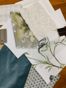 with traditional embroidery and linens.”
Right away, combining the dense and wintery velvet with light and summery linens may seem to be an incongruous choice for mixing textures. However, as Hicks explains, it is important to balance the weight of heavier fabrics with lighter ones to create visual and tactile interest.
The theme of balance also comes into play when mixing patterns in a single space. “Don’t be afraid to step out of the box with a bold color or a detailed pattern in small doses,” Hicks says, emphasizing the need for confidence. Keeping colors in the same family can also lend an unexpected ease when combining different patterns, minimizing potential clashing between a blue stripe and a blue floral, for example.
Speaking of stripes and florals: how are we supposed to know which variation of a pattern works best on a certain piece of furniture, or in a spacious room versus a cramped one? In the fashion realm, we’ve heard it said that vertical stripes make figures appear leaner, or that petite figures should aim for something like mini polka dots instead of overwhelmingly large prints. For home design, many of the same principles apply.
“The argument for small and large patterns could go either way,” Hicks explains. “It depends more on how much of that pattern you want to be the focal point of the space. If it’s wallpaper in a bathroom, small prints work better to blend or to act as a neutral background, whereas larger prints take center stage over a custom sink or on a shower curtain.”
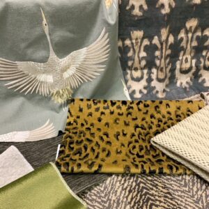 And like everything else in the world of design, patterns come in and out of style, though certain classics will never go out of fashion. Whether you roll with tradition or hop on every trend, fabrics can be used to showcase your personal style.
“You can’t go wrong with an animal print as an accent for a timeless touch,” says Hicks. “And that holds true for as long as I’ve been in the business, which is over 25 years. One example of a more current trend would be solid, heavily textured fabrics almost sheep-like in texture.”
At the end of the day, confidently making bold decisions often leads to the very best execution. “Combining the unexpected often leads to an overall more collected, richer space,” says Hicks.
For more information on Hicks, check out her website and Instagram page.

