After the rain: Peek inside a home brought back to beautiful life beyond devastation
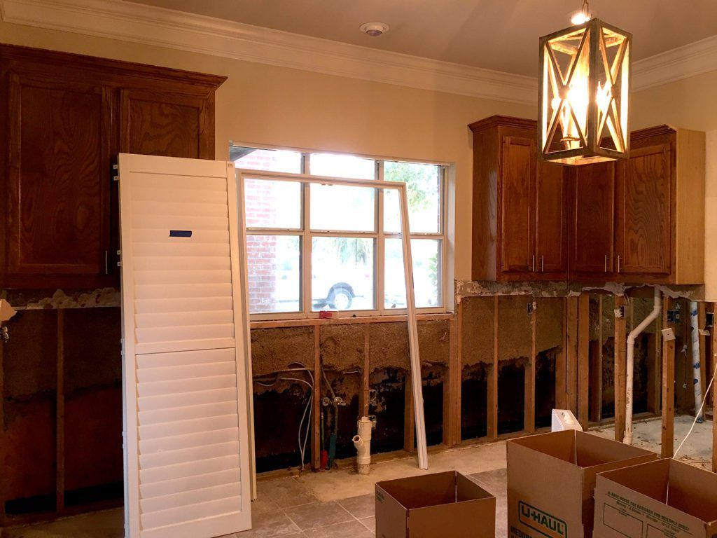
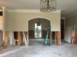
Sixteen inches. That was how high the floodwaters crept. High enough to turn nearly every piece of furniture, every appliance, every rug in this house into fodder for a towering roadside garbage heap, just like so many other piles that lined so many other streets in Denham Springs in August of 2016.
It was a bleak time for the family who lived here, but with the help of a loved one who happened to be a local interior designer, they were back inside a thoughtfully reinterpreted version of their abode by the following April.
“We undertook a complete renovation,” says Brinley Barkurn, senior designer with The Design Studio of Louisiana, whose aunt and uncle own this home. Design Studio owner Becky Walker assigned this project to Barkurn and it became a special one for the young designer. “They had to take out four feet of drywall through the entire house, so we took the opportunity to rework the layout to meet their changing needs.”
As Barkurn explains, the house was built in the early 2000s when the couple was just starting their family. By the time of the flood, their children were teenagers. The family’s style had changed during that time, too, and the Acadian style and traditional floor plan were no longer working as well for them. But that didn’t mean they wanted to knock out all those walls altogether.
“We did not make an open floor plan,” says Barkurn. “We wanted to create separate special spaces but to have an improved floor plan for entertaining.”
That meant rethinking the way houses around here had typically been built. Why did the family need a large formal dining room when they rarely used it? Why wasn’t the kitchen big enough for them to cook the lavish meals they loved to prepare, or to allow guests to hang out during that cooking process? And why, oh why, did there have to be a massive asymmetrical hole carved out of the living room fireplace wall for a two-foot-deep TV?
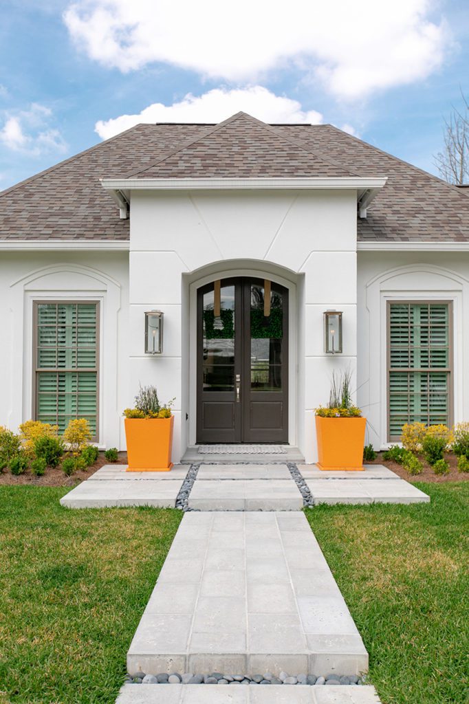
With Level Homes serving as contractor on the project, Barkurn and the Design Studio team set about transforming both the interior and exterior of the house—without adjusting the square footage. It was a blank slate, a fresh start, amid all the anxiety caused by the flood.
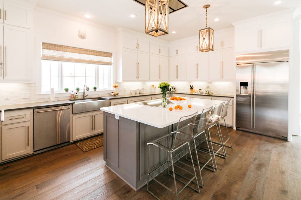
The first area to be addressed was what Barkurn calls the “tiny kitchen.” By turning an adjacent guest bedroom into a media room and eliminating its closet and bathroom, the team was able to add five feet to the cooking space. That meant there would now be room for an 8-foot-long center island, as well as double ovens and a large stainless-steel refrigerator. The cypress cabinets were removed and replaced with painted ceiling-high Shaker-style cabinets in three complementary shades: Sherwin Williams’ “Pure White” on the upper cabinets, “Agreeable Gray” on the base cabinets, and “Dovetail Gray” on the island. And the floors, which were once covered in square ceramic tile, are now—like the rest of the home’s main areas—topped with warm gray-stained wide wood planks.
The kitchen facelift also included new quartz countertops and a white marble tile backsplash, as well as bar pull cabinet hardware, a stainless-steel apron-front sink, and a family-favorite touchless faucet. Small appliances are now tucked away inside an appliance garage, and the microwave is installed inside the enlarged pantry. “No one really wants their microwave to be sitting out anymore, so we hid it,” Barkurn says.
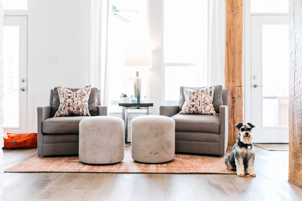
Two of the next big moves dealt with dining spaces. “We got rid of the breakfast nook after we realized they had so many distinct areas to sit down and eat,” Barkurn says. “We turned that into a sitting room with swivel chairs. Now this has become a popular spot when the extended family gathers here; we all love this space, so we wind up practically sitting on top of each other.”
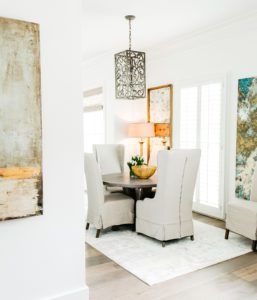
The formal dining room also got the boot, in favor of a smaller dining area with an expandable round table and extra chairs that can be brought out for larger get-togethers. “It’s also a great place to play card games,” says Barkurn, adding that a rarely used doorway to the old dining room was replaced by a white-painted brick wall.
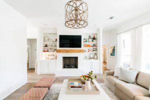
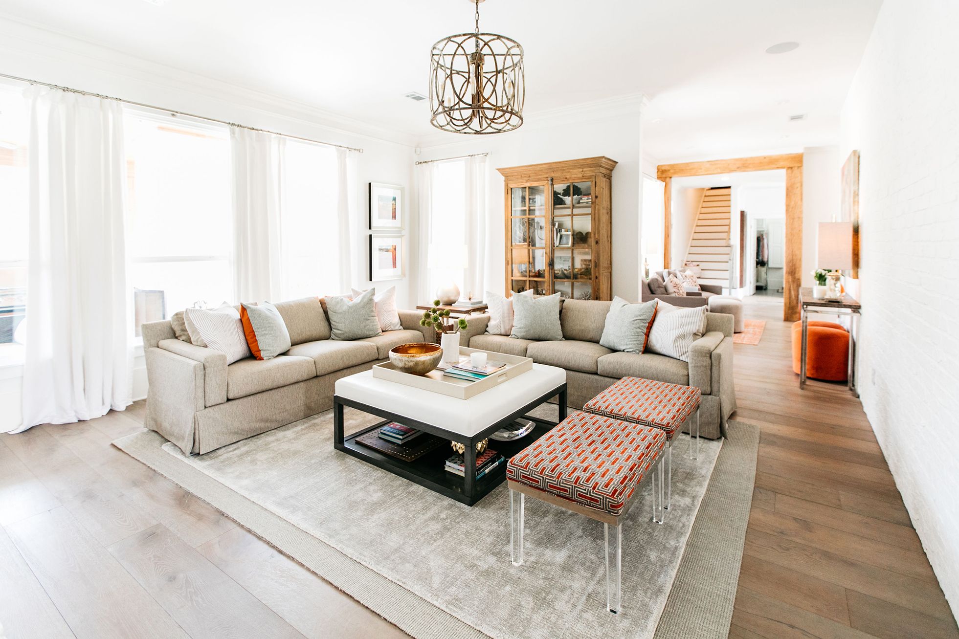
The living room—home to that off-center TV niche—found its balance through the recentering of the hearth and new flat-screen TV between a pair of equally sized built-ins. The new mantel is a cypress beam that was distressed for an antique appearance by local artist Frances Walker, who also added her touches to cypress columns used to frame expanded interior doorways.
“Overall, the house is a blend of traditional elements with modern touches,” Barkurn says. “We used things like cypress beams that won’t go out of style, but then we added some contemporary things because the clients wanted it to feel updated.”
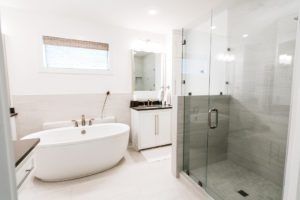
Those modern touches really shine in places like the master bathroom, where a dated corner bathtub with a tile deck was ripped out and replaced by a freestanding oval version. The furnishings throughout the house, too, take their cues from both classic and contemporary style, with acrylic-legged benches sharing space with more traditional pieces in the living room and acrylic stools tucking under the island overhang in the kitchen.
Another bright spot: the fixtures illuminating each room. “We were able to keep all of their existing lighting, which was fairly new thanks to a mini upgrade that took place before the flood,” Barkurn says. “
Since completing the renovation, Barkurn has had a designer’s rarely held opportunity to revisit her work over time, as the extended family comes together for holidays and parties. “It’s that one project that I’m still very tied to,” Barkurn says. “I get to see how it functions in real life. They say never to work with family, but this was a special case. We took it and turned it into their forever home.”
See more images from this home in the gallery below:

