Let there be light: The design inspiration behind the new Rêve Coffee Lab’s sleek and chic interiors
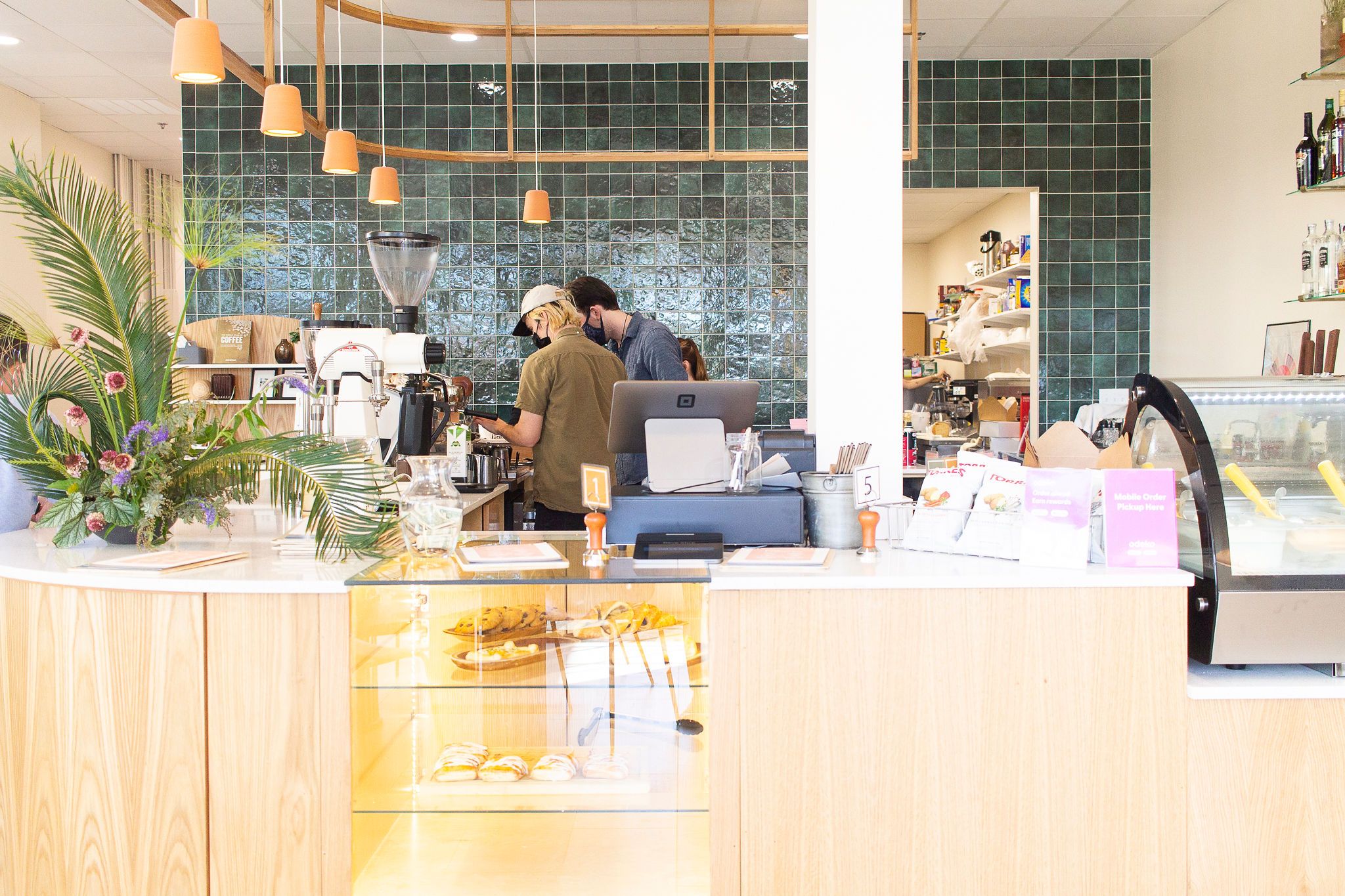
Word has it that the new Rêve Coffee Lab in the Village at Willow Grove welcomed quite the collection of caffeine aficionados when it opened its doors on January 18, a testament to its resilient popularity last found in the now-closed White Star Market. Even better, when our sister magazine 225 took a tour of its new, sunny digs last week, it found a clean and clear space designed by interior decorator Victoria Treuil of Victoria Isabelle Event + Design—so we knew we had to get in on the magic behind the madness, too.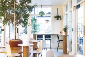 To begin with, the sense of calm and productivity at the hands of natural woods and frothy green houseplants is the result of an expertise in ambiance, thanks to Treuil’s early career in event planning.
“I’ve always been passionate about creating memorable experiences and settings,” she says. “My favorite part is the styling and functionality aspect, which easily carries across both mediums of design.”
Working closely with founders Nathanael and Courtney Johnson throughout the whole design process, Treuil put their original vision for an airy, comfortable, bright space in line with colors and elements from Rêve’s Lafayette location, also recently renovated, fine-tuning details until each element worked in tandem.
“All the natural light in the space was a big part of picking colors,” she says. “For the walls, I went with a very warm white to allow for the light to reflect softly in the space and not become blinding. The use of terracotta, greenery and white oak bring in natural and familiar elements that immediately put you at ease. Basically, our goal was to create a space that people would want to spend time in. From the warm colors to the comfortable seating to the wide variety of items on the menu, it allows for customers to relax and stay a while.”
As Treuil recalls via the words of Walt Disney: “People can feel perfection.”
“It’s really important to me that spaces are both functional and beautiful,” she says. “If a space is only one of the two, it will be hard to relax in or feel comfortable. The planter seating is a great example of that—it allowed us to utilize a very large, beautiful tree without giving up usable space. Having to custom-make the seating allowed for it be a focal piece and really makes a statement when you enter.”
So, enter in, take a seat, sip on a S’more Than a Feeling (a.k.a: a wintry treat made with chilled graham cracker milk, white chocolate, espresso and a torched strawberry marshmallow), or maybe just revel in some time away from the confines of your kitchen counter coffee maker.
Follow @inRegister on Instagram for more home design inspiration.

