Kenneth Brown dishes on Gov’t Taco’s tongue-in-cheek design
When we saw our sister magazine 225’s sleuth into the brand new space of Jay Ducote’s Gov’t Taco, we knew we had to find out more about the secrets behind its irreverent interior design scheme. Just in time for the restaurant’s grand opening today, November 3, we reached out to designer Kenneth Brown , whose firm was responsible for this look, for the inside scoop on how a conspiracy-theory-themed eatery came to be, and why–even in a high-concept space–holding back often means giving more.
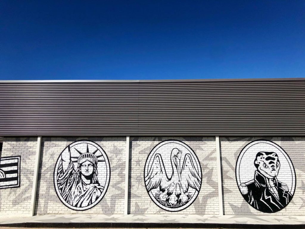
“The challenge when you come across a themed idea is that you want to make sure it’s executed in a way that doesn’t feel cheap,” Brown says. “Jay had the concept in mind already, but the execution became very important in terms of how we were going to put that concept to work without the space feeling like a theme park.”
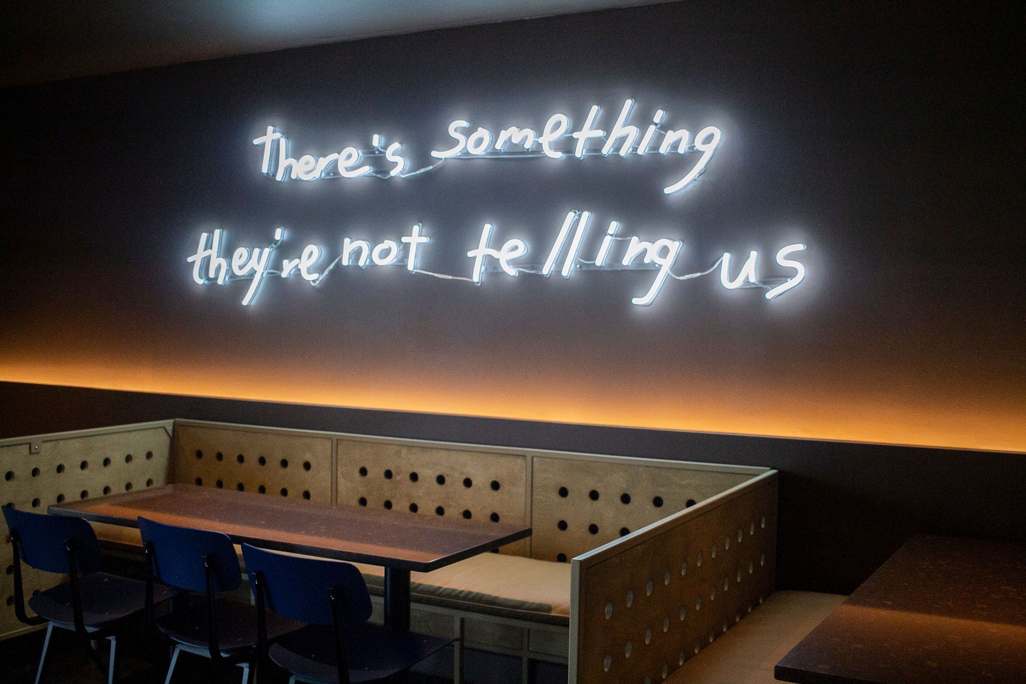
The key, Brown says, lies in subtlety. You don’t want actual UFOs hanging from the low ceilings, but a UFO-adjacent shaped pendant light, especially when paired with a wall’s neon script reading “There’s something they’re not telling us”? The tip of the hat is clear enough.
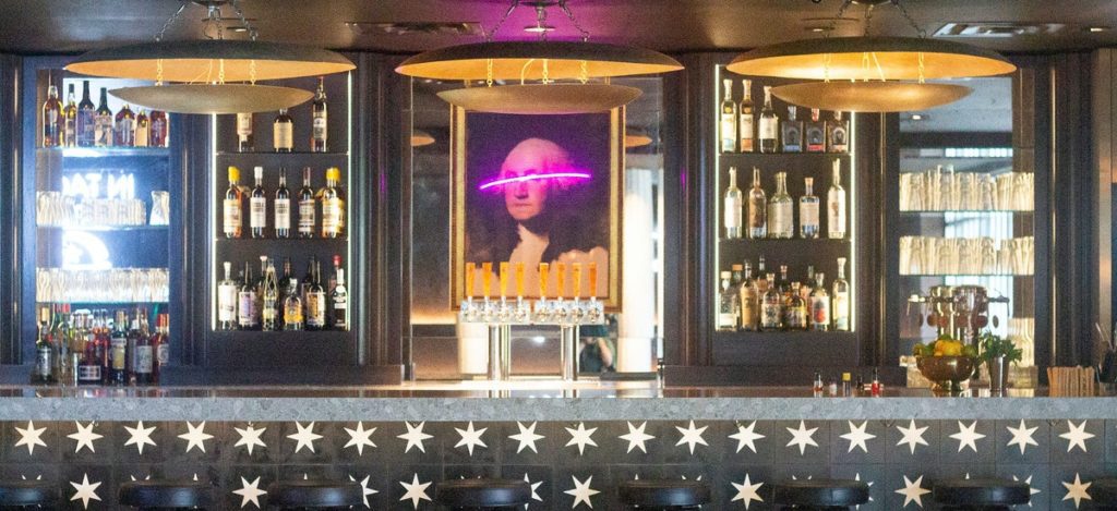
“I’ve designed for hotels and other restaurants in California, and the goal was always to create moments,” says Brown. “Since our challenge this time was to work with low ceilings, for example, we were able to create moments with interesting focal points, like the Washington portrait behind the bar and the cheekiness of ‘turning a blind eye’ via the pink neon slash of paint.”
Since the building housing Gov’t Taco existed before it bore that name, much of the inspiration behind its design came from restaurants in New York City, where space is often a limited resource and preexisting architecture plays into any new renovations. Focus and intent play a huge role in design under those types of restricted conditions, and Brown knew just the person to help lay the groundwork.
“I definitely want to spotlight our designer Jake Loup, who really spearheaded this project,” says Brown. “I basically gave him the metaphorical paintbrush and let his artist’s hand go free. I always say that one of the most important achievements in design is having a very clear point of view, and Jake really buried himself in this concept and executed it brilliantly.”
Not to mention that these days, point of view takes on a more literal feeling than ever before, with the prevalence of “Instagrammable” spaces playing a role in any restaurant’s built-in marketing plan.
“Design has to be memorable, and it’s got to be a unique experience, because that’s what people want nowadays,” says Brown. “They don’t just want to eat great food, they want to experience great design, and so we really played up the Instagrammable moments.”
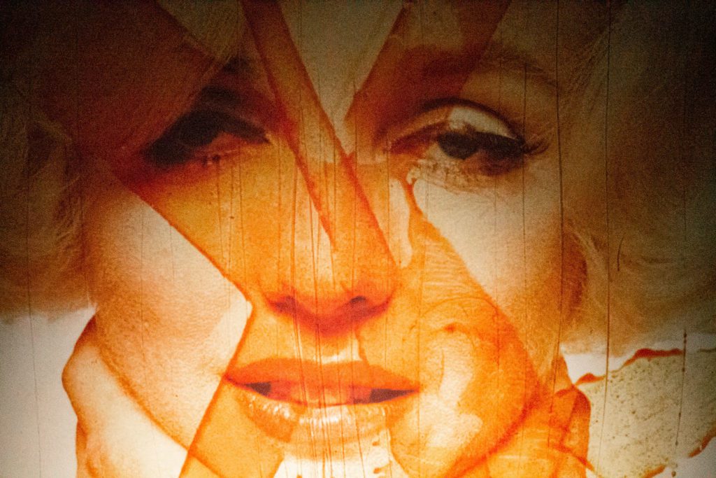
Whether it be the “eat more tacos” logos, the moon landing imagery in one bathroom, or the Marilyn Monroe graphic facing JFK’s portrait in the other bathroom, every turn of the head is meant to add new elements to a larger narrative.
“The idea revolves around conversation and letting the design tell a story,” says Brown. “It’s easy to throw a lot of stuff at a concept, but it’s important to hold back a little bit, too. Conspiracy itself is all about letting you have a little taste of something but never the whole enchilada, and that’s what I think makes this space more interesting. Everywhere you turn there’s a little something that makes you think.”
To learn more about the treats and eats inside Gov’t Taco, check out the full piece by 225. And read more about Kenneth Brown’s design work in homes around the country in this story from inRegister’s June 2020 issue.

