Show and tell: The Ivy House Designer Showhome brings local professionals together to transform a new home
As the French-inspired home on their lot in the new Adelia at Old Goodwood neighborhood began to take shape, Jewel and Vincent Centanni were across the world in the South of France soaking up sunshine and design inspiration. Traveling throughout the idyllic region for several weeks last summer, the couple, who owns home design and construction concierge company Ivy Residential Concepts, were on a mission to bring authenticity to their new build, which would soon serve as the canvas for the first-ever Ivy House Designer Showhome.
“It’s always a challenge making a new-construction home look old,” notes Jewel of the house designed by Andy McDonald of Andy McDonald Design Group and built by contractor Colony Homes. “We spent a lot of time fine-tuning the details to create spaces that brought together the French style I was going for while using timeless materials that stand the test of time.”
Two years earlier, the Centannis made the move to Baton Rouge from the Northshore to oversee the project and fulfill their dream of hosting a showhome that married sophisticated new construction with creative interiors. However, as the house neared completion, a new obstacle stood in their way, one they hadn’t in all of their hours of planning prepared for: COVID-19.
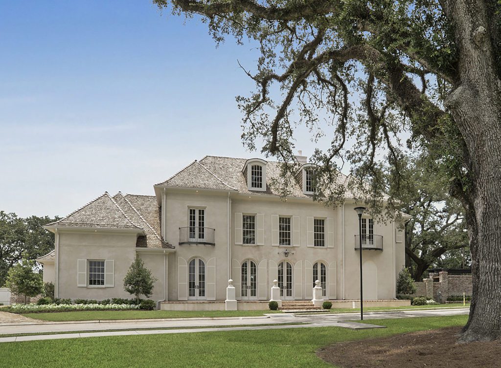
The 11 interior designers and numerous specialists who had been lined up to transform 13 empty spaces in the 4,291-square-foot home were facing delivery delays, not to mention that amid quarantine, the idea of hosting hundreds of guests in a single space was unimaginable. Finally, near the end of July, the designers were able to install their room elements, and a plan was put into place to ensure social distancing.
“Luckily, we had a great response from the community,” says Jewel of the two-week event that benefited local nonprofit Heritage Ranch. “And we’ve also created new resources so that people who are just hearing about the home now can virtually walk through and shop the spaces.”
While the five-bedroom, four-and-a-half-bath house is still up for sale, Jewel and Vincent are already busy at work on their next project: a holiday showhome in Bocage set for 2021.
“This whole process is a lot, but our energy comes from our passion,” Jewel explains. “We have wanted to do this for so long, and we are truly living out our dream.”
Below, find photos and designer details from Ivy House’s public areas. Stay tuned for a closer look at the showhome’s private spaces in inRegister’s October issue.
And take your own virtual tour of this showhome through September 15 at liveivy.com/showhome. Tour proceeds benefit Heritage Ranch.
 Living Room
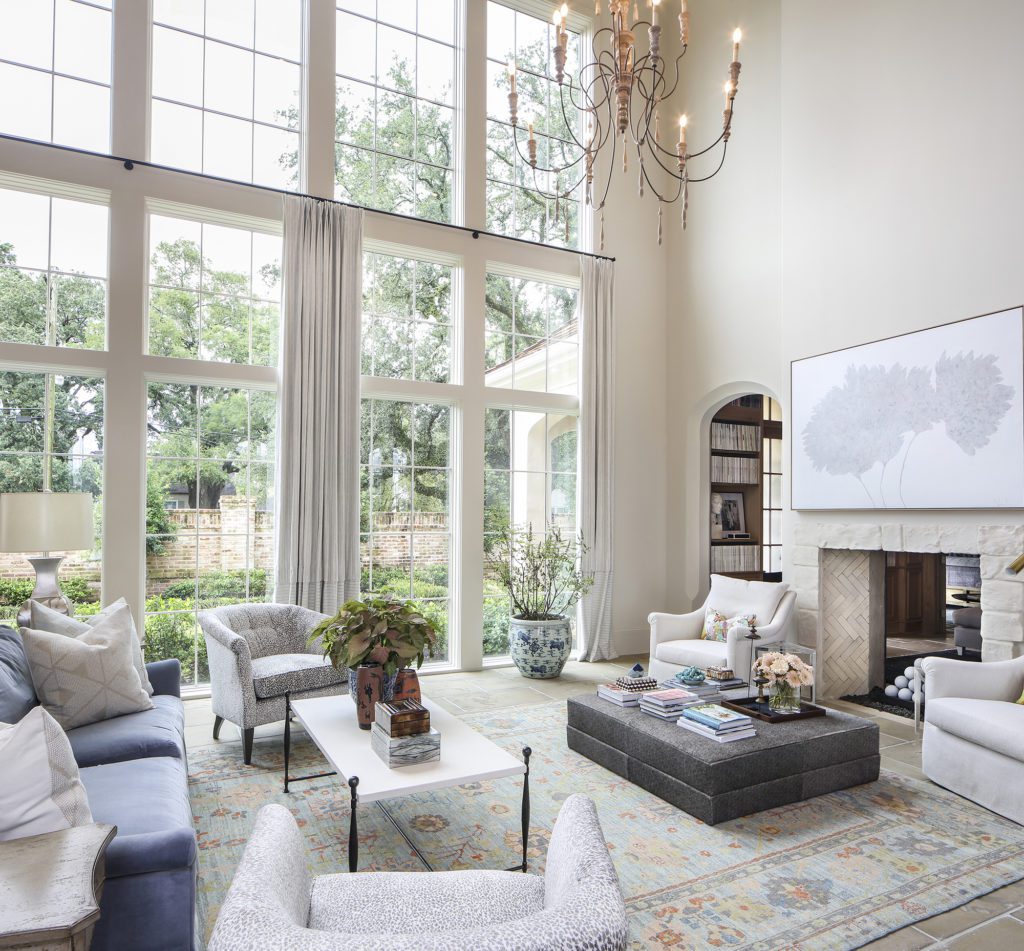
It all started with a blue velvet sofa. An unlikely item for all three Dixon Smith designers—Hilary Smith Kennedy, Joel Fazende and David Coco—to readily agree upon, the statement piece set the stage for the transformation of the showhome’s largest space: an open-concept living room that feeds seamlessly into both the kitchen and entry.
“There’s no stopping and starting,” says Fazende of the space. “Therefore, everything needed to work together.”
Filling the space with a mixture of showroom pieces and special-order items, the three designers tackled the challenge of creating a space intended to accommodate a lot of foot traffic. “There are so many ways to get through the room,” explains Coco. “That made it a tricky space.”
Orienting the sofa to face the fireplace, the designers added four chairs to allow for uninhibited views through the room’s floor-to-ceiling windows. Travel paths are left open as a small coffee table occupies one side of the room and a dark grey ottoman is utilized in the other.
Underfoot is one of Kennedy’s favorite pieces: an orange and blue rug. Pairing the floor covering with a bit of chinoiserie fabric in the form of throw pillows, the pop of orange coincidentally offers a sense of continuity between the living and library spaces, as it went along with Ty Larkins’ design.
“We didn’t plan that,” says Kennedy with a laugh. “I think the pop of color was just what the room needed.”
 Entry
Entry
Dixon Smith Interiors
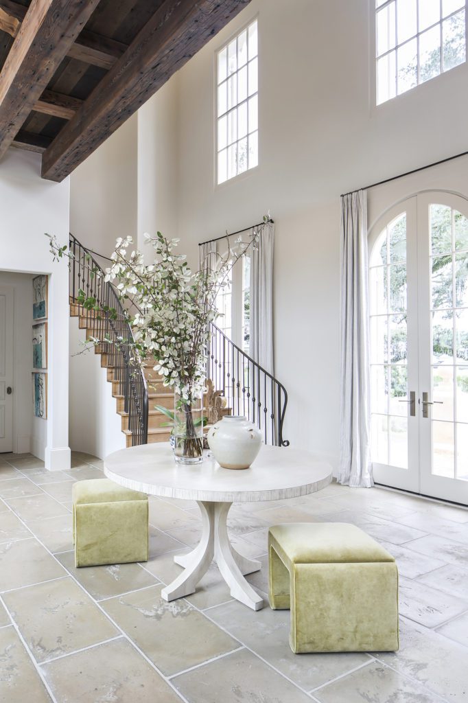
In the absence of a defined foyer, the Dixon Smith team outfitted the space between the white oak staircase and the dining room with a round white table and two chartreuse velvet stools. Overhead, the beams bearing the weight of the second floor bridge, which connects upstairs living spaces, take the place of a grand chandelier, providing a dose of warmth and grounding the home’s high ceilings. FireRock pavers in the color “Ore” were chosen by Jewel Centanni to cover the entire first floor. The manmade concrete flooring helped pull together Centanni’s French vision, as it has an antique stone look while still providing durability.
 Kitchen
Ivy Residential Concepts/Dixon Smith Interiors
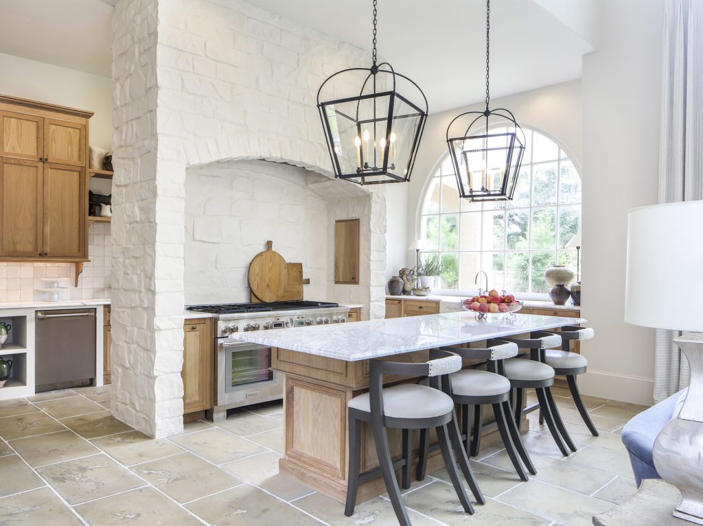
Nowhere does the French country style shine more than in the large kitchen space. A limewashed stone wall housing a 60-inch Thermador range from Ferguson sets the scene for the interaction of rustic and luxe, while a white oak island and cabinetry add warmth that ties in with the finishes throughout the rest of the home.
“The key to giving a home a more upscale look is to home in on what you want the house to be,” explains Jewel Centanni. “Stay consistent with construction materials and style. Only add in the trends when it comes to interiors that can be changed.”
Dixon Smith Interiors provided that dose of creativity with shearling-accented barstools in a dark wood, echoing the black shade of two large overhead lanterns. “We didn’t want high-back chairs that would block off the kitchen from the living space,” says designer Hilary Smith Kennedy. “The curved shape combined with the shearling touch made them a cool and funky addition to the room.”
To the side of the room, the main sink has been moved under a large window to provide a view while also opening up the main island, which features the same Carrara marble used throughout the room. Behind the stone wall, a service space with a second sink, two dishwashers, an ice maker, individual fridge and freezer columns, and a wine fridge complete the kitchen’s functional and entertaining-oriented layout.
 Dining Room
Fireside Antiques/Laura Roland Interiors
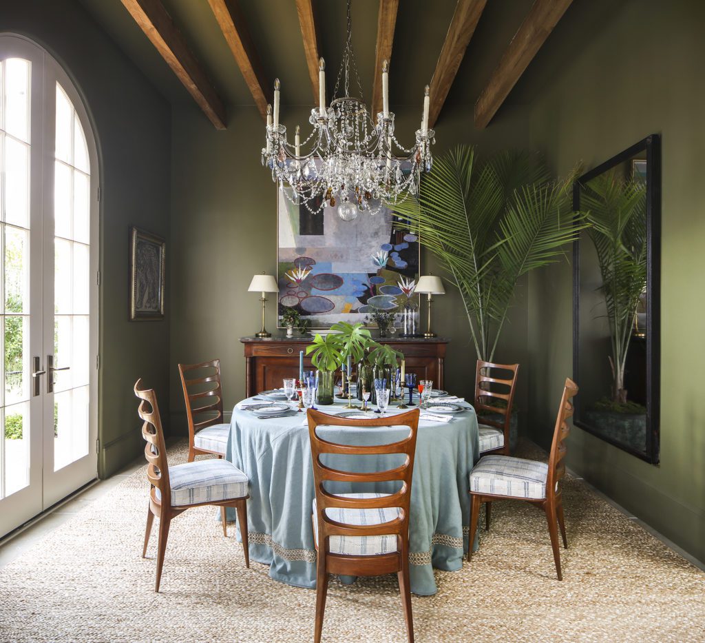
At the front of the house, the dining room sits flooded with natural light. Rays interact with the room’s statement chandelier, a one-of-a-kind piece created by Laura Roland of Fireside Antiques and Laura Roland Interiors, who collected each of the crystals and hand-strung them one by one. The tiny light reflections create Roland’s intended illusion of water on a sunny day.
“The John Evans painting was the first thing I found, and it was my inspiration,” explains Roland of the pond scene hung over the buffet. “I wanted you to feel like you’re in the painting.”
Algae-hued paint, Benjamin Moore’s “Mountain Moss,” sets the room off from the larger living spaces to which it connects. A jute rug further immerses guests into Roland’s nature-oriented vision. “I wanted to bring people down to earth,” she says, “but still touch on the elegance of nature that I think fits well in a dining room.”
When it came to adding those refined touches, Roland struck a balance between casual and formal. Simple green pickling jars with garden clippings fit seamlessly beside a setting of Haviland & Parlon “Syracuse” plates. Antique Venetian port glasses and etched drinking glasses stand alongside taper candles in a variety of colors.
“Unexpected is my thing,” Roland notes. “When I was thinking about the space, I was stuck on the question of what you put on your table that’s meaningful. I think that comes from a collection.”
 Mudroom
The inclusion of a mudroom—an often forgotten but invaluable space—demonstrates the Centannis’ focus on the function behind the aesthetics, a theme they carried throughout the home.
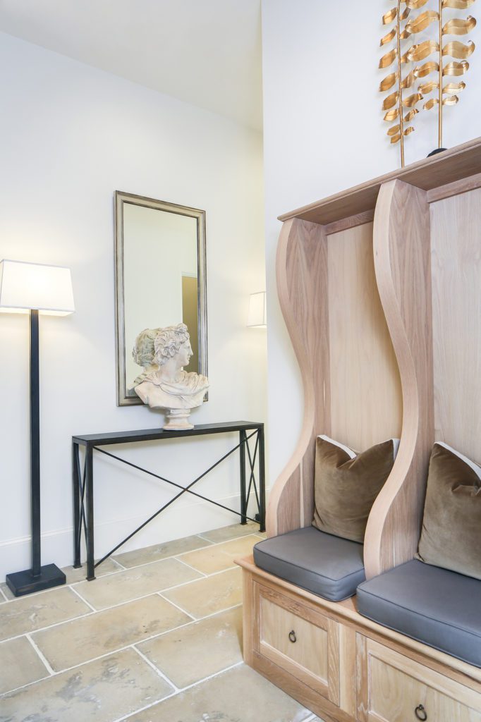
A white oak built-in with drawers and seats for setting down bags or putting on shoes is the major statement in the small space. Rivaling for attention, though, is a bust perched on a custom iron table, both added by Abat-Jour Interiors owner William Evans.
“I try to get things you don’t normally find,” explains Evans, noting that the two iron lamps are his own design, nicknamed the “perfect floor lamp” for their hidden bulbs and wires.
To finish off the space while bringing comfort to the all-wood built-in, Evans added custom-made grey cushions, as well as brown velvet throw pillows sourced from McMillin Interiors.
 Pantry
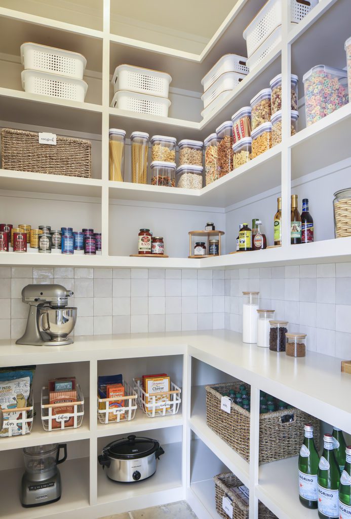
Cans arranged in color order, baskets with dry erase labels, Lazy Susans galore. This pantry is Instagram-worthy. However, according to organizer Anna Napier of In Line Organizing, the elements that she brought to this space are more than just easy on the eyes. Each basket, bin and jar is rooted in practicality.
“Often, organization fails because the person who did the organizing knows where everything goes but the other family members might not,” she explains, noting that labels and a can riser are her must-haves in any pantry. “A good system keeps everything in its place no matter who is putting away the groceries.”
However, this space is also about the bones from which Napier was working. A counter with space for appliances, as well as large storage shelves below for more rarely used small gadgets, helps cut down on clutter on the kitchen counters.
 Library
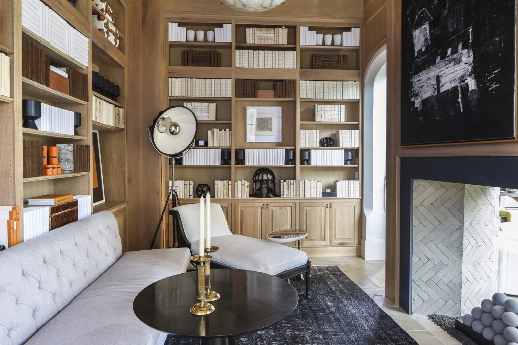
This oak-paneled library is one of the many touches contributing to the home’s Old World feel. Right off the living room, the area serves as a quiet sanctuary while acting as a grand entrance to the master suite.
“Dedicated spaces comprised of floor-to-ceiling bookshelves are rarely installed in new homes today, so this space felt like a throwback,” explains designer Ty Larkins. “We wanted this space to not be a slavish recreation of a past library, but one that reflects how we currently live today and what might be found on the shelves of a modern-day family.”
For Larkins, that meant magazines. Lining one wall are the white spines of publications including Architectural Digest and Vogue. “We wanted to make the point that magazines, unlike books, reflect the type of physical reading that still takes place today,” he notes.
Monochromatic books handmade specifically for the space fill the remainder of the shelves, creating a soothing backdrop for statement pieces including a pair of framed Hermès bags and a large painting by Tony Mose, titled “Houses.” For seating, a simple but effective arrangement was dreamt up by Larkins to maximize useable space without inhibiting foot traffic. The space is centered around a custom-designed tufted, armless sofa and chaise lounge, and overhead is a 19th-century antique alabaster chandelier.
 Powder Room
Nancy Zito Interiors
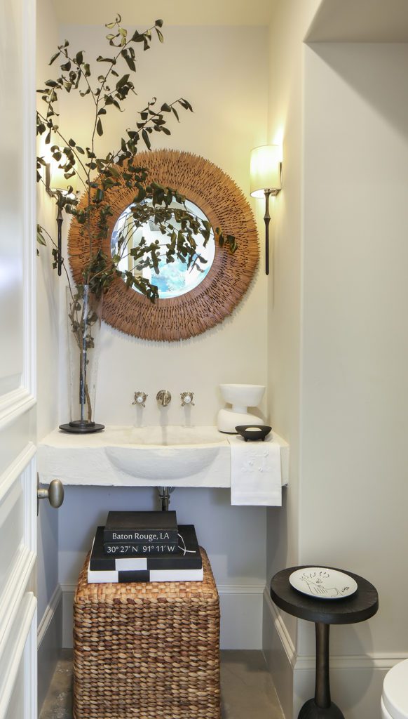
Every powder room needs a statement piece, and in this one, it’s a French limestone sink that Jewel and Vincent Centanni found at Crown & Colony on an antiquing trip to Fairhope, Alabama. Giving it the same limewash finish as the stone in the kitchen, the sink stands out without overtaking the space.
To draw some warmth into the small space, designer Nancy Zito of Nancy Zito Interiors added a textured wood mirror over the vanity, as well as a seagrass ottoman underneath. “The right mirror is a must-have in any bathroom,” Zito notes. “In this room, the round mirror softened the strong linear elements of the space and complemented the woven ottoman under the stone vanity.”
 Backyard
Ivy Residential Concepts/Centanni Grounds Management/Red Onion
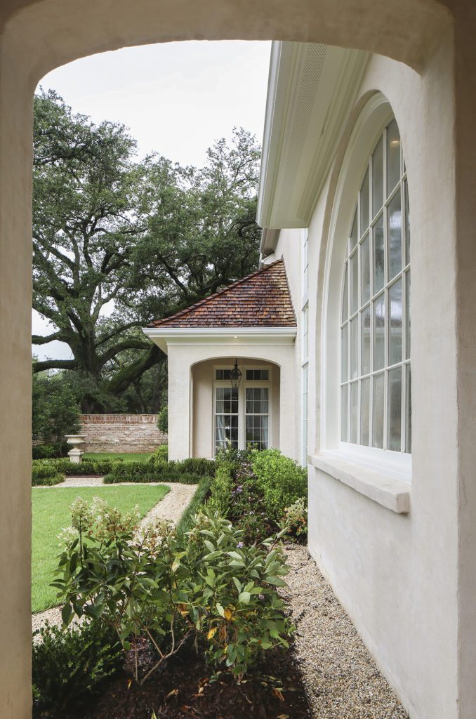
A fitting setting for a period film, the home’s backyard features one of the most envied hallmarks of French design: a manicured garden. Evoking visions of the famous Garden of Versailles—though on a considerably smaller scale—Jewel Centanni says the outdoor space was meant to transport guests straight to France. Centanni did a majority of the landscape design herself, enlisting Centanni Grounds Management to help with the execution. To complete the space, a grand urn was sourced from Red Onion as a centerpiece of the garden, from which the hedge-lined pathways diverge.

