Your guide to Pantone’s spring/summer 2022 color trends
Pantone may have released its color trends for spring/summer 2022 back in the fall, but now that the seasons are finally upon us, we’re diving into some of our favorite suggestions. While there are 15 color trends that Pantone has predicted to define everything from interiors to clothing, we picked three that speak to the bright vibes we associate with longer days spent outdoors.
Scroll down for some local Pantone inspiration and see how you can incorporate each color into your life:
“Super Sonic” is a rich, royal blue that Pantone describes as “electric in intensity.” It surely demands to be seen and can be a strong staple piece for when you’re feeling extra confident, or it can be a vibrant pop of color to a home that needs a little lagniappe.
View this post on Instagram
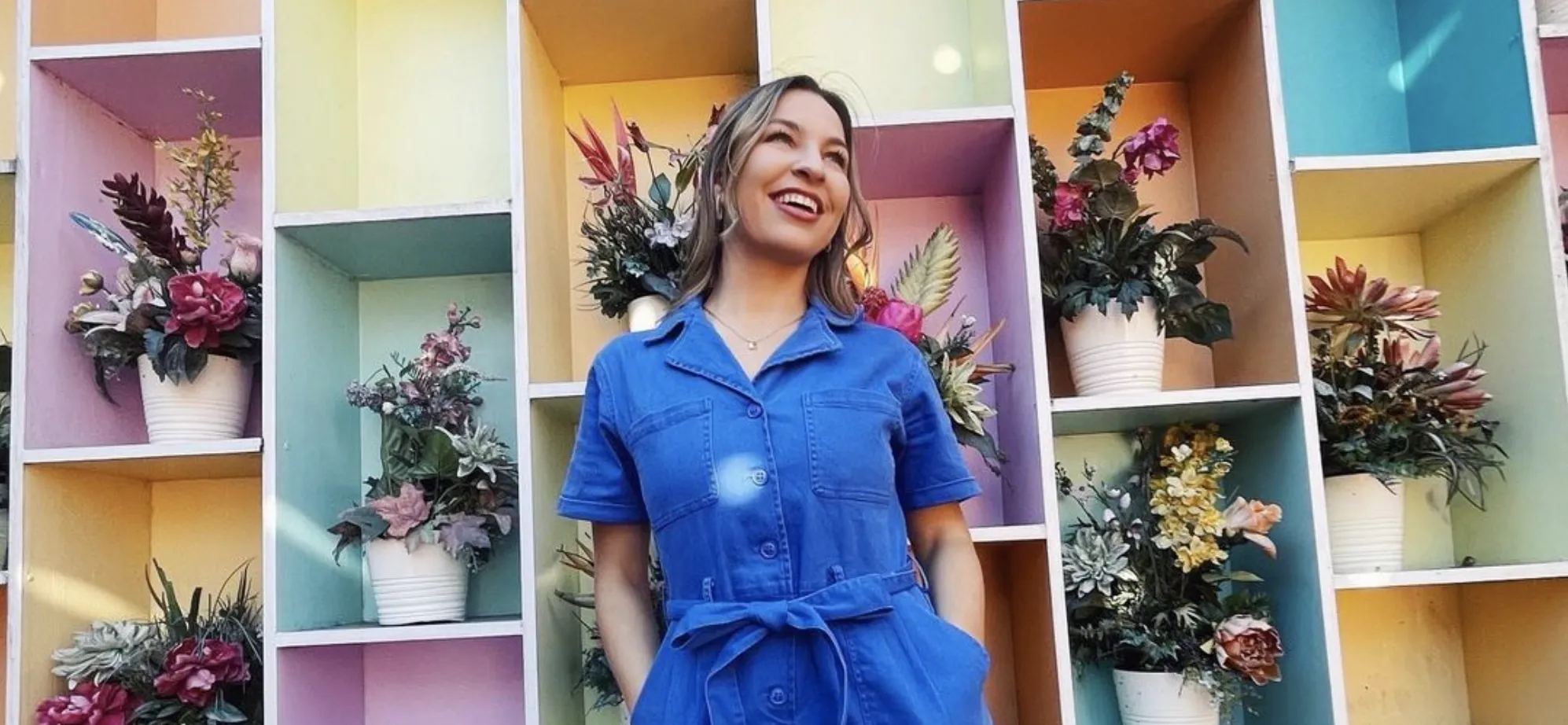
This show-stopping royal blue jumpsuit from Marem is everything Pantone meant when they described Super Sonic as “electric in intensity.” No power cord required.
View this post on Instagram
The Tayla shoulder bag from Hemline is giving us mid-aughts Devil Wears Prada vibes and we are here for it this summer.
View this post on Instagram
Denicola’s refurbished an old bench for Butler Snow LLP, turning an otherwise ordinary object into a easy way to bring some color into even the most mundane spaces.
Our August-born readers might recognize this next color as their birthstone—peridot—but Pantone describes this yellow-green color as sharp and acidic, naming it “Fragile Sprout.” This vivid color is not in the business of subtlety.
View this post on Instagram
This suit set from Moxi has us getting into the swing of spring and trying new things—like a vibrant pop of green.
View this post on Instagram
While “Fragile Sprout” can be an intimidating color to think about, when used in small doses, it can add vibrancy to a space without becoming overbearing. It’s a soft touch that adds some youthfulness to a space, especially in artwork from The Foyer.
View this post on Instagram
For our August babies, this color is what you’re most likely familiar with as peridot—like this example from Elgin’s Fine Jewelry. It’s a subtle touch of color that you can bling with you everywhere.
Lastly, we have “Coffee Quartz,” a flavorful, warm-toned brown with a hint of cool undertones added in. It’s the perfect palate cleanser for those looking to neutralize their color scheme. “Coffee Quartz” brings more earth tones into your space to give it more depth and coziness. With fashion, it helps bring together everything in an outfit for a more sophisticated, timeless look.
View this post on Instagram
This leather button-down from Style by Soho is a refined addition to any wardrobe that needs simplicity and calming neutrals.
View this post on Instagram
This chocolate backpack and purse from Maylea Bags are a great way to stay trendy while also being practical. We’re envisioning it at the workplace, or just out for brunch with the girls.
View this post on Instagram
You can’t go wrong with leather furniture, and keeping your couch neutral gives you more freedom to decorate more boldly elsewhere. This warm-toned brown leather couch from Bassett Furniture accomplishes that sleek, modern look while matching almost any decor.
For more interior design and style inspo, follow us on Instagram @inregister.


