LA Story: West Coast meets Gulf Coast in a home with effortless modern style
The bright lights of California lured Blaine Lourd away from south Louisiana shortly after he graduated from LSU in 1985. Three and a half decades later, Baton Rouge beckoned him back home.
The native New Iberian made headlines early last year when he took ownership of a house that had formerly been owned by LSU football coach Les Miles in the Settlement at Willow Grove neighborhood. But with help from interior designer Kenneth Brown, Blaine and his partner Christina Ellender put their own bold stamp on the contemporary space. The result combines the best of the West Coast aesthetic with their desires for a place comfortable enough both to entertain and to kick back as only Louisianans can.
“This house attracted us because of the large glass windows, high ceilings and airy feeling,” says Blaine, the founder and CEO of the Los Angeles-based wealth management firm LourdMurray. “We liked the neighborhood and the fact that it’s in the center of town.”
Designed by architect Dwayne Carruth of The Front Door Design Studio, the house’s unique layout—with its jewelbox-like rooms wrapping around a central courtyard and L-shaped pool—also resonated with the couple.
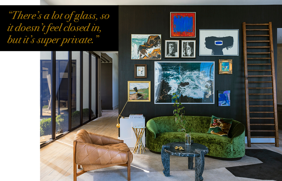
“We looked at houses for a full year,” Christina says. “When we met with Kenneth, we felt confident that this could be what we were looking for. There’s a lot of glass, so it doesn’t feel closed in, but it’s super private.”
Blaine and Christina tasked Kenneth with taking this residence in a decidedly different direction than Blaine’s southern California home. “My house in California is a beach bungalow,” Blaine says. “It’s much more Ralph Lauren-esque and much smaller. It’s full of colored textiles and designer rugs. The house in Baton Rouge is much more modern; we wanted a simple, modern design with little clutter.”
Christina says she also told Kenneth she didn’t want the house to look like anyone else’s in Baton Rouge. “A lot of houses had that Rosemary Beach feel,” she explains. “We wanted something different—modern, but not cold. We wanted it to still be homey and family friendly. We love color and beauty, but we didn’t a house where people are scared to touch anything.”
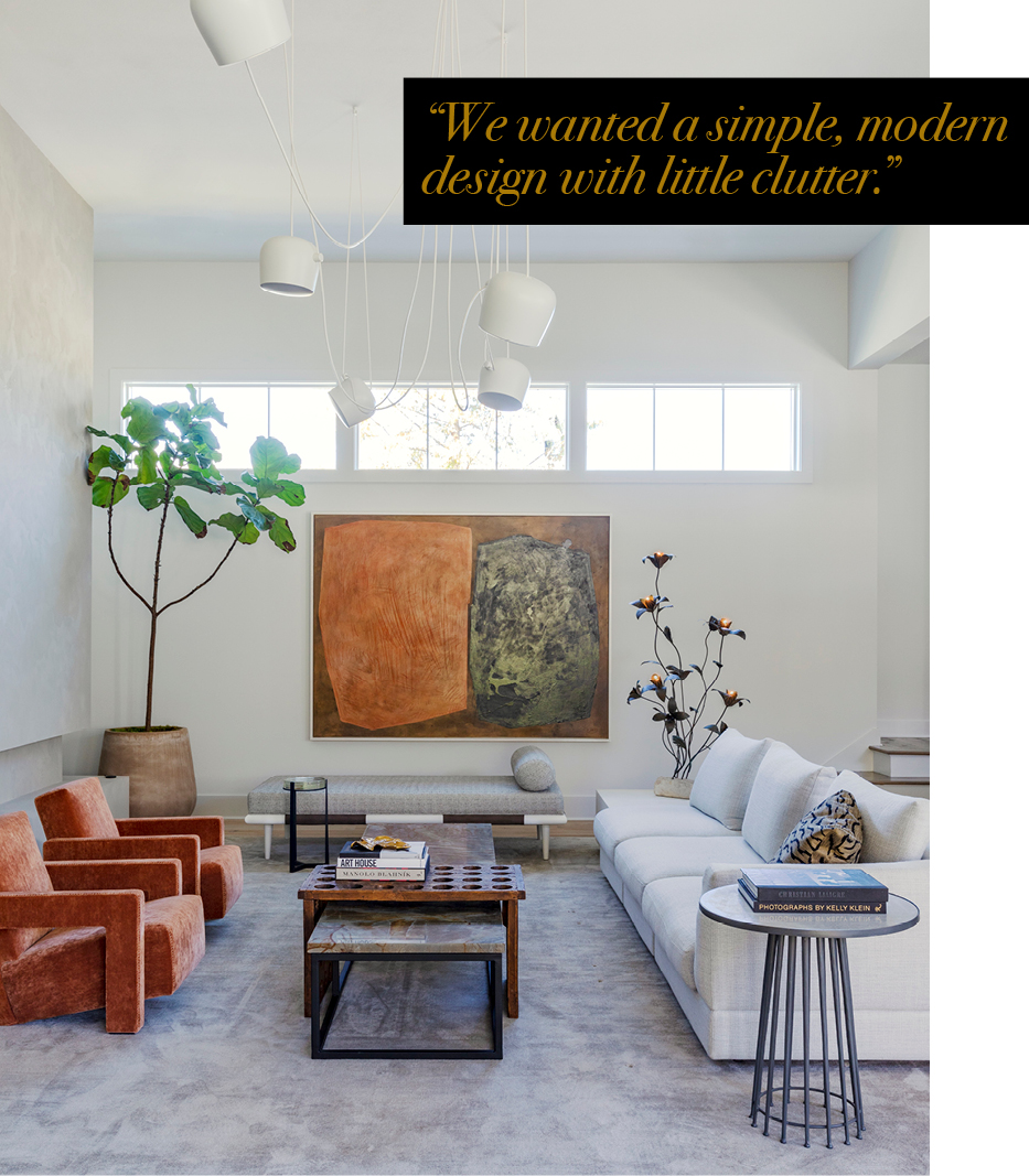
For Kenneth, the major challenges in the design project were in reimagining the way two of its most important rooms functioned. “We had to redefine the spaces because they weren’t really working for what Blaine and Christina wanted to achieve,” he says.
First on the agenda was the large entry hall. This was initially a space that lacked a strong sense of purpose, one that “you felt like you wanted to get through as fast as you could,” Kenneth says. But he gave it new life as a moody lounge-like room with both conversational seating and a workspace. In came bookshelves and a desk in one area, and a lenge wood-veneered gallery wall behind a slinky green velvet sofa in another. Underfoot, he added a custom rug for which the pattern was created onsite and crafted by Design Rug Works.
“There’s something really magical about that front room,” Kenneth says of the space, which Christina calls her favorite place to have morning coffee and meditate as runners go by outside the front windows. “It really reflects who they are and gives you that big first impression.”
The second spot that Kenneth found a fresh focus for was the master bedroom. The long room, positioned with the courtyard just outside its wall of windows and glass doors, had a sitting area on one end but lacked a strong connection with the landscape. Kenneth added a new wall upon which to anchor the bed, providing a direct view outside. The dark coffee-colored walls felt a little unnerving to Christina at first, but now she says the room just feels comfortable.
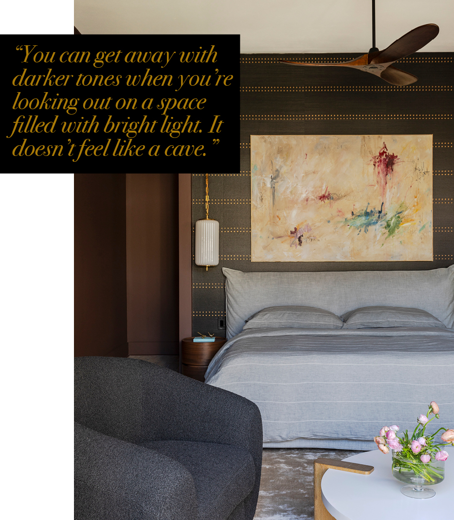
“Kenneth said, ‘Just trust me,’” she recalls. “Now it’s amazing how well I can sleep in a dark bedroom. And everything just pops against the dark background.”
Adds Kenneth, “You can get away with darker tones when you’re looking out on a space filled with bright light. It doesn’t feel like a cave. If anything, the walls feel like they recede into the darkness.”
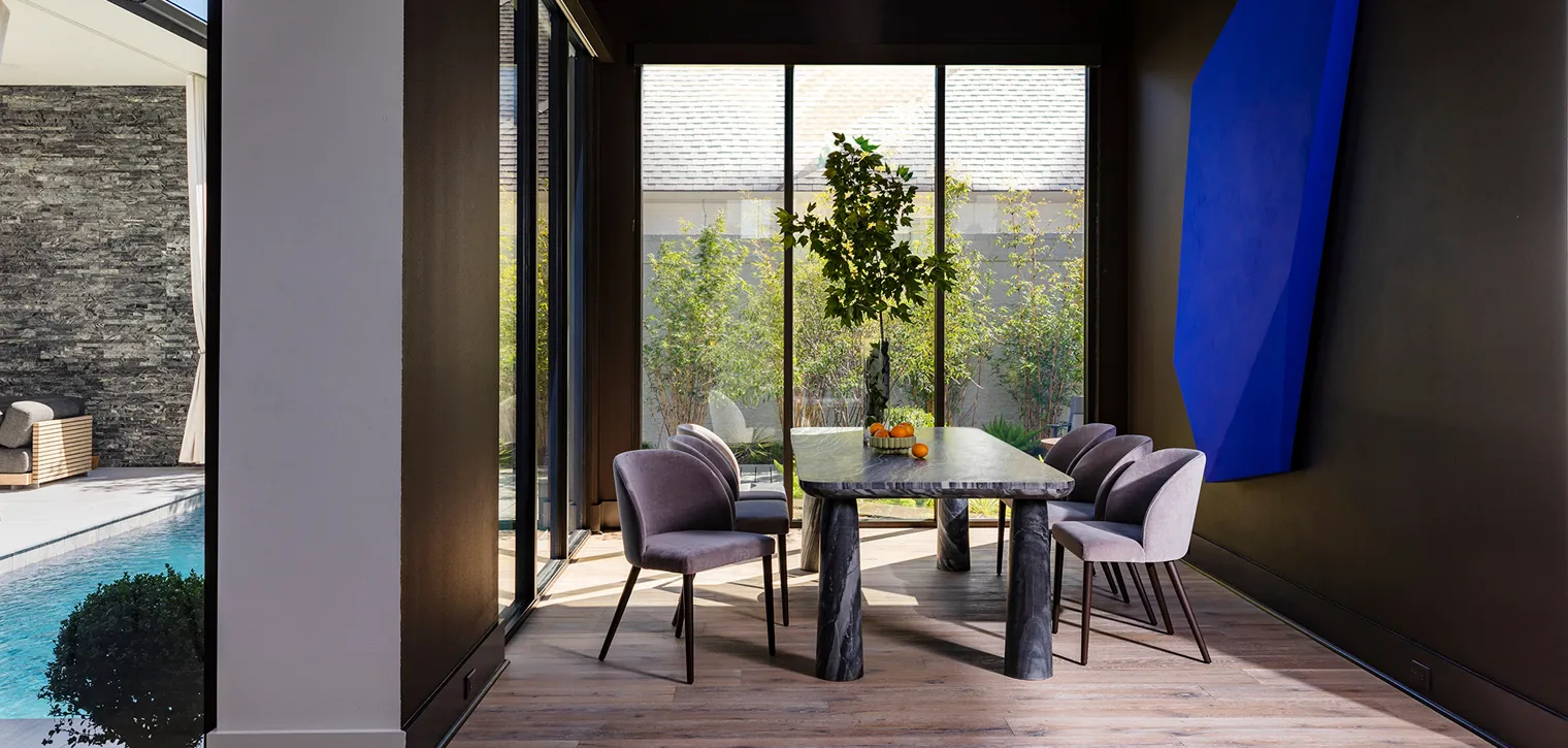
That link between indoor and outdoor is evident throughout the house, which Kenneth describes as “opening up like an onion being peeled back as you walk in.” Two walls of windows in the dining room allowed Kenneth to apply the same color principle as in the master bedroom. In this dining space, he painted the walls in a rich black hue punctuated only by a massive three-dimensional hanging sculpture created in his design studio. The artwork is electrified by the designer’s chosen paint color, the famed “International Klein Blue” created by French artist Yves Klein in the 1950s. Combined only with a set of wooden rafters that Emil Fonseca added to the ceiling, the sculpture makes a big statement in a room that is a study in stunning simplicity.
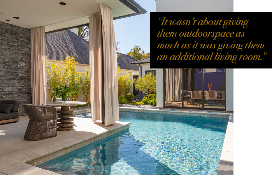
The private courtyard and pool area also take a cue from SoCal, where outdoor spaces take full advantage of the always-sunny climate. Jeb Barber of Makaira Landscape brought the couple’s West Coast landscape vision to life, while Kenneth selected bold but comfortable furnishings that could easily be part of an indoor room, complete with drapes. “We really treated the outside as part of the inside,” Kenneth says. “It wasn’t about giving them outdoor space as much as it was giving them an additional living room. And that all goes back to their California connection.”
Back inside, the living room is another focal point, with its framing better balanced now that Kenneth had the fireplace wall extended and plastered by ASA Painters. The furnishings here are modern but the space feels far from sterile, just as Christina requested. Beneath high clerestory windows, a painting by Jake Loup was inspired by an antique textile rug. A cluster of dangling shaded lights sourced from Monochrome is suspended overhead, while an antique floral-style lamp came from Fireside Antiques. The contrast of old and new continues with a two-layered coffee table that includes a centuries-old piece from Fireside over a new marble and iron table.
Christina says the house now ticks all the boxes for Blaine and her as well as for her 8-year-old son, who goes to school nearby and loves all the friends he has made in the neighborhood. Beyond the big and bold brushstrokes, all of the little details—including a revamped closet installed by Inspired Closets and a pantry organized by Simple Living—come together to make this place home.
Blaine still divides his time between Baton Rouge and California, but he says he plans to live in Baton Rouge—where he has the only outpost of LourdMurray outside of the Golden State—full time when his youngest son goes to college. What does he love about the Capital City? “The people, of course,” he says without hesitation. “I last lived in Baton Rouge in 1985, so it’s a big city now, with small city charm.”
Seeing this project now complete, Kenneth says he appreciates the trust Blaine and Christina put in him to execute their vision. “Projects like this don’t come around often,” Kenneth says. “I love a challenge. A house is only as good as the lengths that your clients will allow you to push them as you interpret their vision. In the end, the result is a space that is connected to the people who live there.”

