Life in the fast lane: A mod and masculine Willow Grove home
“Really loud and really fast.”
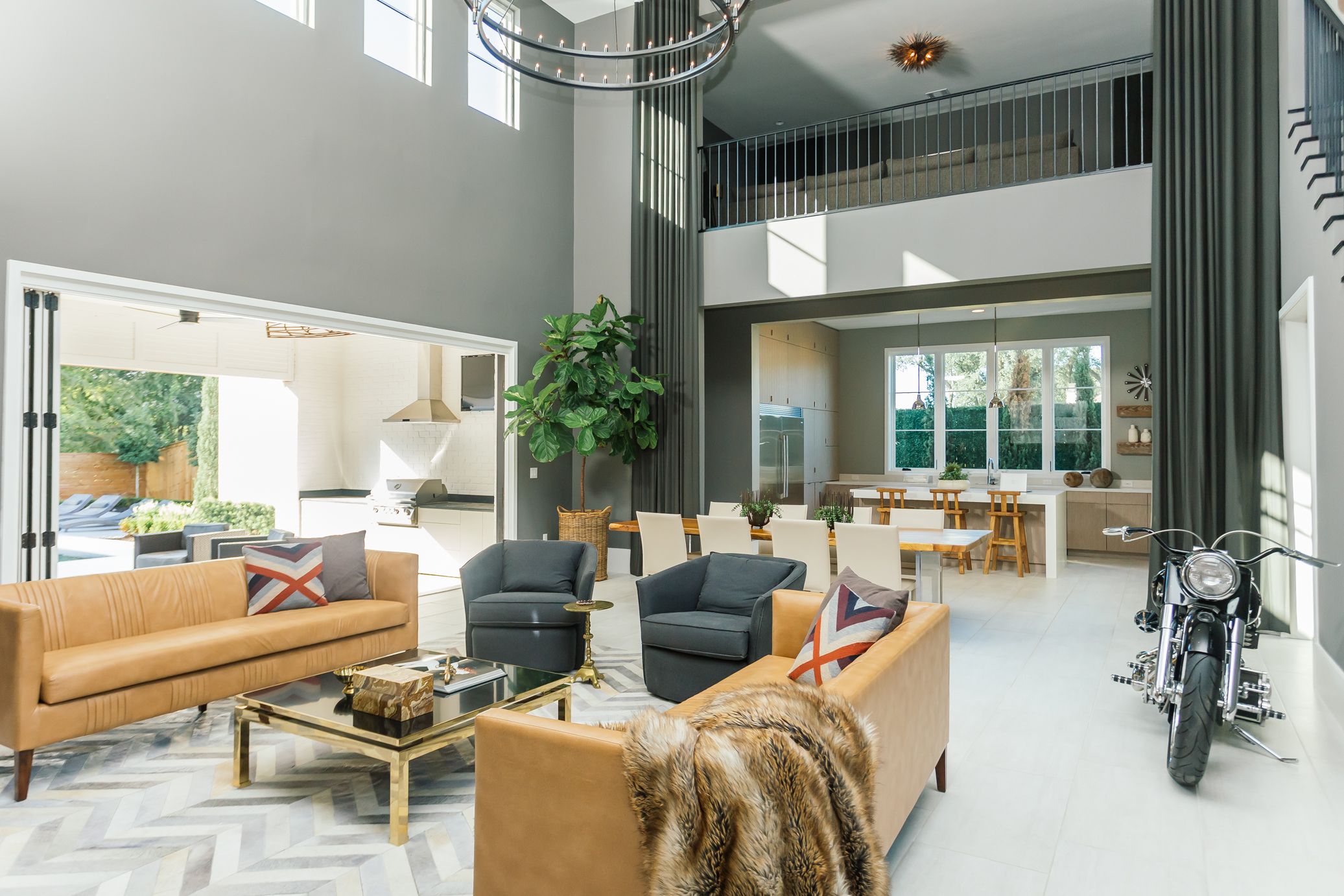
That’s how Jason Guerin describes the motorcycle that is one of his prized possessions. He had the bike custom built on a Harley-Davidson frame with souped-up parts designed for speed. He may not ride it often, but that doesn’t mean he’s not enjoying it every day. Instead of parking his chrome and steel baby outside of his home in the Settlement at Willow Grove, Jason gives it a place of prominence right in the living room.
“After I let it cool, I just wheel it through the front door,” he says. “In here, it functions like another work of art. I get to see it all the time.”
Most Baton Rouge homeowners probably wouldn’t consider a motorcycle an option for interior décor. But Jason is not like most Baton Rouge homeowners. In fact, when it came to designing his new house, he wanted a look far removed from traditional south Louisiana style.
“I love to travel, and when I started staying in nice hotels in places like New York and Miami, I saw things I never knew existed,” Jason explains. “I loved the modern look, and that’s what I wanted for my own house.”
To create a contemporary space with the custom features he craved, Jason assembled a team including architect Mike Sullivan, interior designer Kenneth Brown, and builder Tom Guerin, Jason’s father and the owner of Siegen 7 Developments. Kenneth helped to steer the project from before the first brick was laid.
“When I first told him what I was looking for, Kenneth was finishing my sentences,” Jason says. “I didn’t want to live in a spaceship, but I really wanted that contemporary style I had seen in the other cities when I traveled. Kenneth was on the same page.”
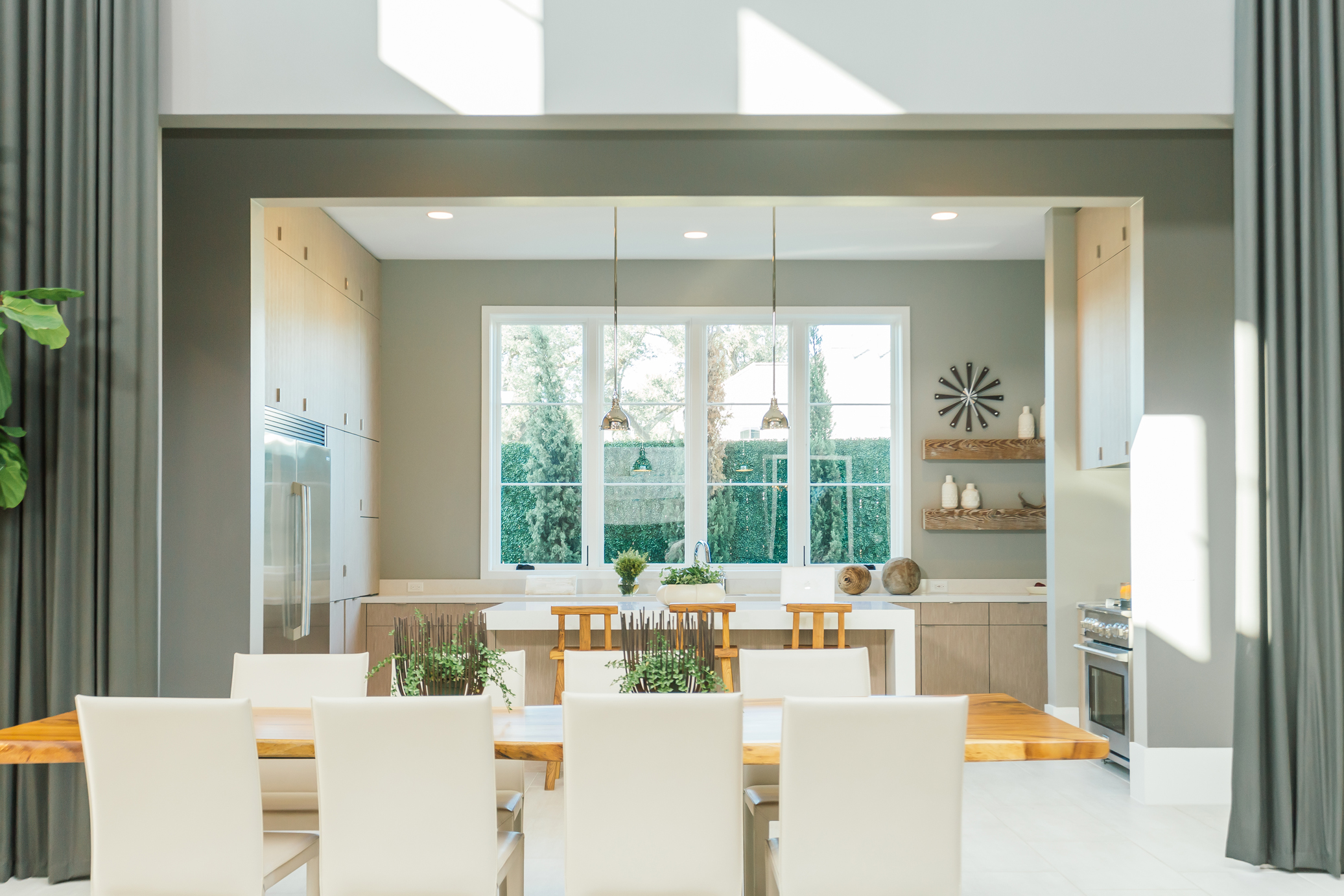
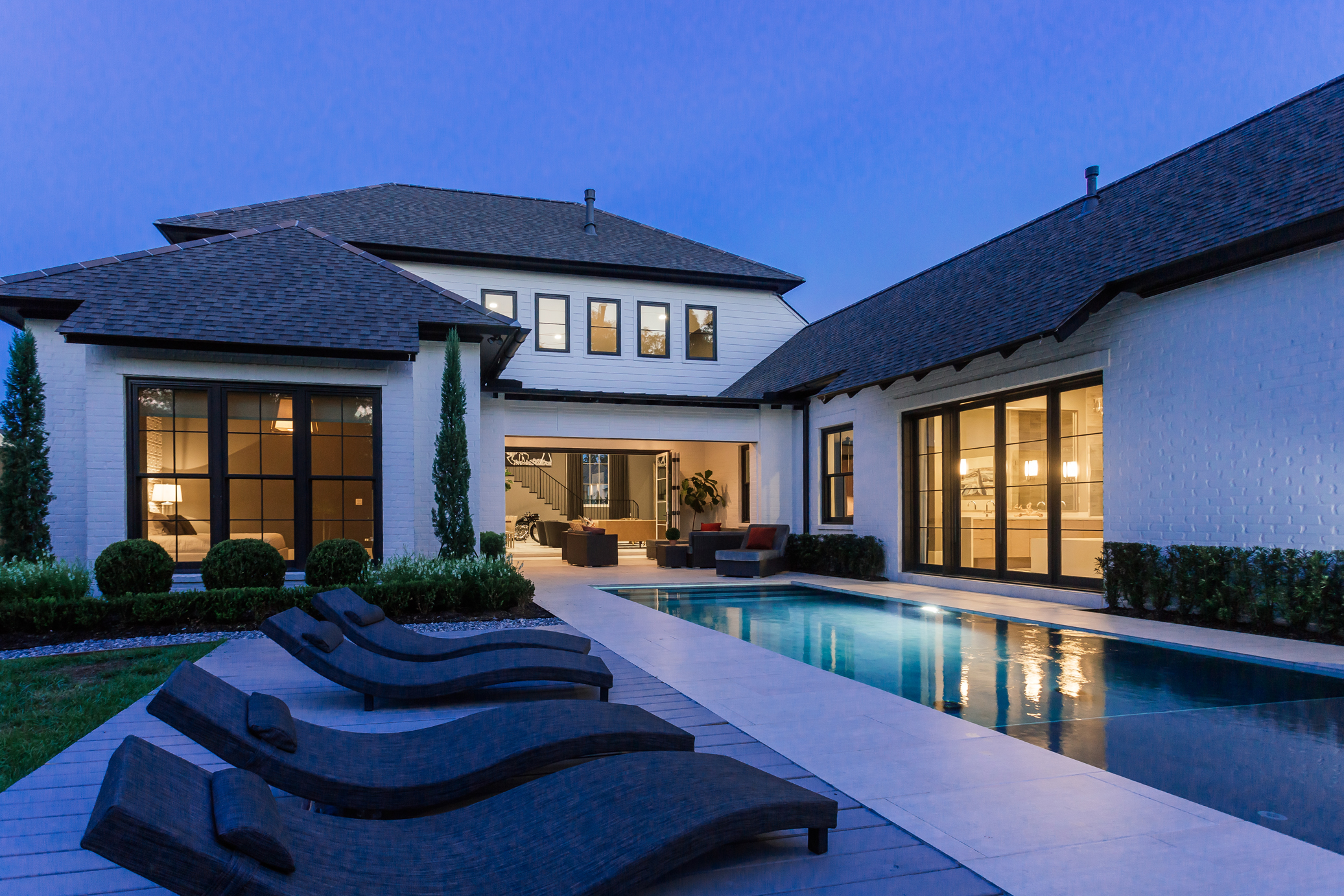
Jason’s vision for the new house involved clean lines, dark colors and lots of glass. Because he entertains often, he wanted it to be conducive to hosting big parties, and he wanted the indoor and outdoor spaces to visually connect.
“He gave me the range to push him out of his comfort zone,” recalls Kenneth. “Together we created a design intent that it would be a warm, tailored, masculine and sexy space that still had some traditional bones in it to fit in its location.”
As plans for the house came together, Kenneth helped to “massage the spaces a little bit” to suit his client’s style. “When Jason said he wanted a more modern look, it required me to go into the plans and do some editing,” Kenneth says. “I took out things like old beams that didn’t fit with the language; modern is often more about what you take out than what you put in.”
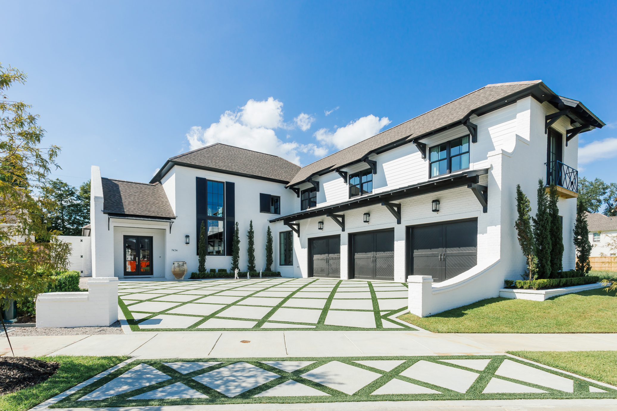
The home’s exterior bright white façade, influenced by the architecture of Alys Beach in northwest Florida, was set off by black trim. “When those eaves were being painted, I think everyone thought we were sort of out of our minds,” Kenneth says. “But the black eaves are so important to the whole design—they play into what’s happening inside.”
Passersby might also have been raising eyebrows about the driveway when it was under construction. Kenneth, who maintains a design practice in Los Angeles in addition to here in his hometown, borrowed some of his favorite West Coast ideas for this project, including the use of artificial grass to help break up the sea of concrete. “It took six months to convince the developer to let us do it,” Jason says. “But I love it—it looks real, but there’s no maintenance.”
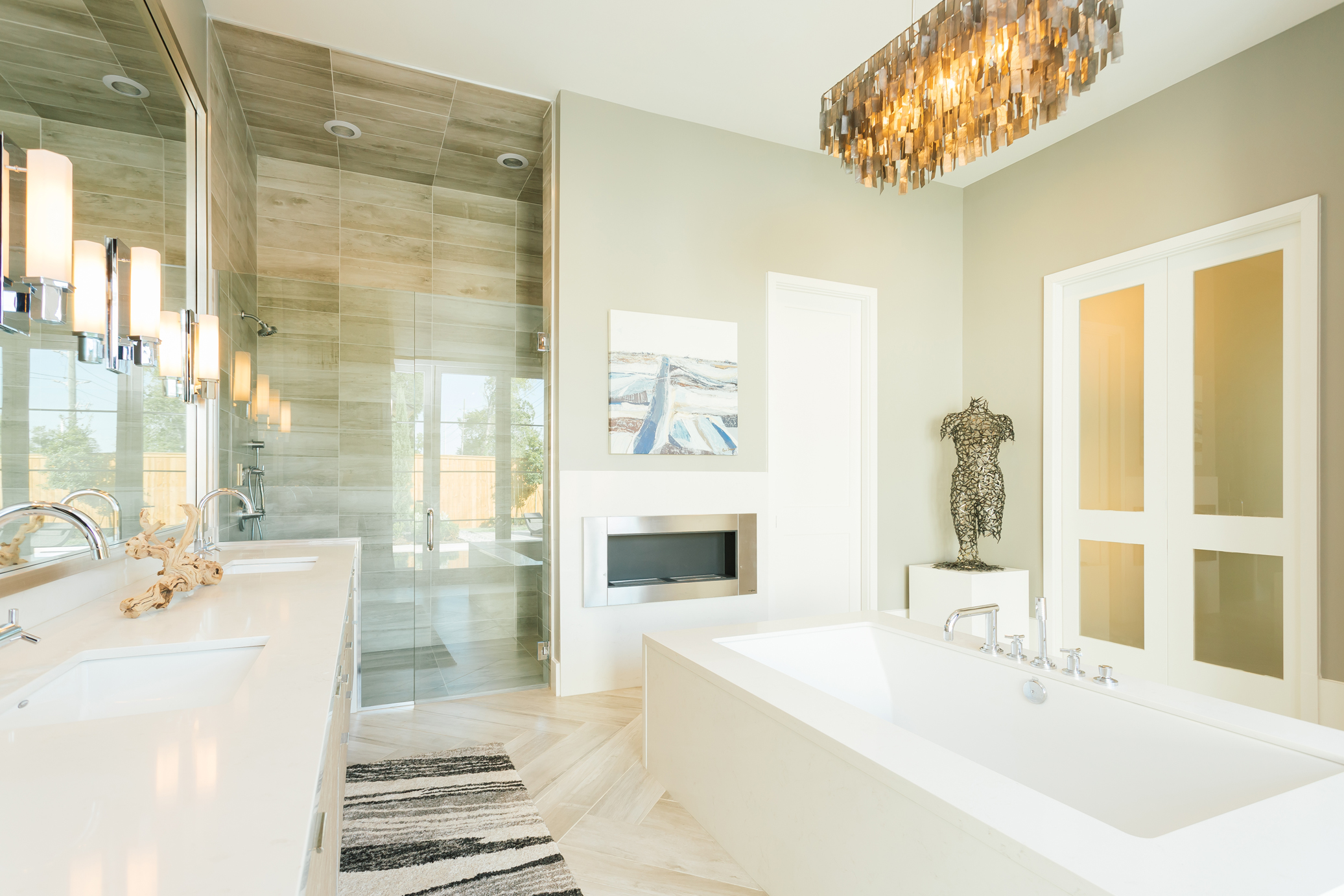
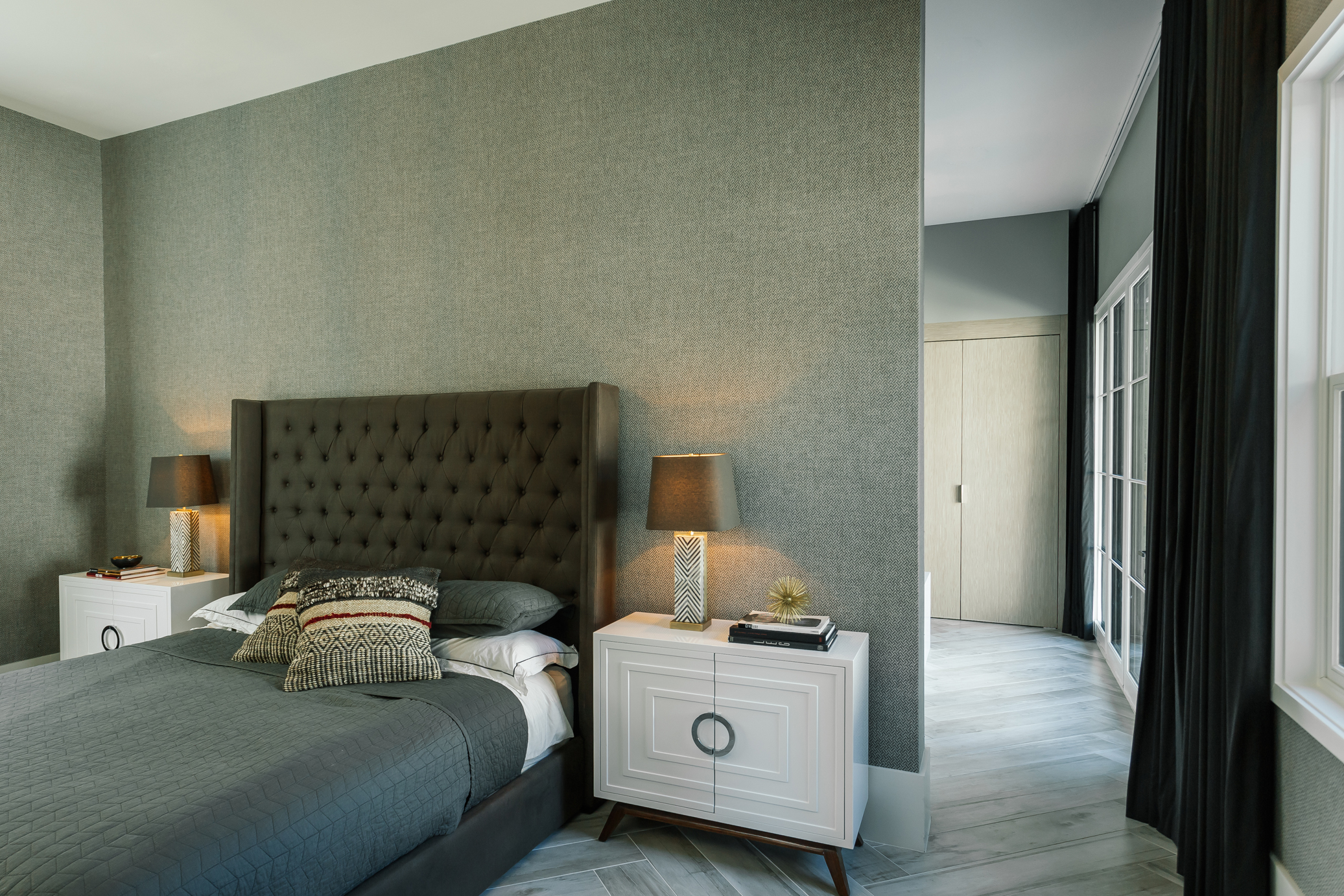
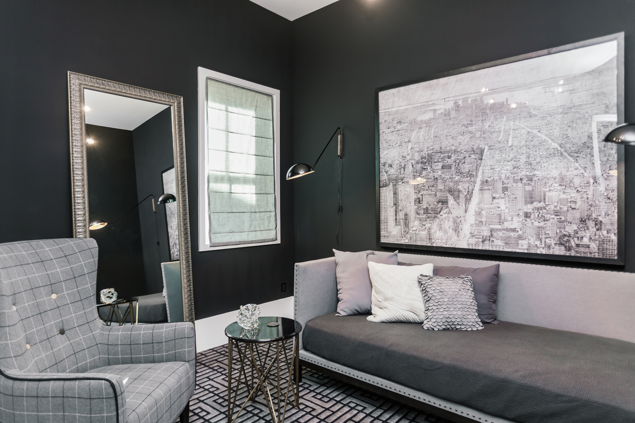
Indoors, Kenneth was focused on creating rooms that tied directly into that vacation vibe. The master suite was designed like a haven on the top floor of a chic hotel, with luxe fabrics and finishes and equally stunning views of the pool. Instead of standard wallpaper or paint here, Kenneth obtained a herringbone-patterned New Zealand wool suit fabric from a Los Angeles store and had it backed and made into an unconventional wallcovering by artisan Clay Fairbanks.
“Jason appreciates quality and materials, so we were able to focus on the little things like that,” Kenneth says. “He was willing to take risks.”
Though several furnishings and accent pieces were purchased locally from shops and galleries including Monochrome, Rogers & McDaniel at Home, Ann Connelly Fine Art and Red Onion, many others were found either in California or online.
“The design process is changing so much,” Kenneth says. “You used to take your client shopping all day long, but now so much can be done electronically. We were emailing each other about options at 11 o’clock at night.”
Other key items came from even more unexpected sources. A pair of black cowhide-covered chairs in the master bedroom was originally in actor Zac Efron’s home, which Kenneth designed. When Zac bought a new house and again called on Kenneth for help, the chairs were no longer needed—and Kenneth knew they would work perfectly for Jason. The new seats arrived complete with autographed photo, Jason recalls with a laugh.
In the living room, 22-foot ceilings required large-scale decorative elements. Kenneth brought in floor-to-ceiling drapes, again in a wool suiting material. Dramatic glass folding doors—or, more accurately, “operable walls,” allow this space to open up wide to the outside when guests arrive. And at any party, of course, the biggest conversation piece here is the bold and shiny bike. “Everybody has an opinion of what art is,” Kenneth says. “Jason happens to like motorcycles.”
With his big-city-worthy abode complete and everything in place just as he first imagined, perhaps this homeowner won’t be lured to leave town quite so often.
“I love the colors and the art, the furniture and the whole feel of it,” Jason says. “It just gives me a good feeling when I’m here.”
